Manufacturing guy-at-large.

Filtering by Tag: CAD

Snapshots of a day

Added on by Spencer Wright.

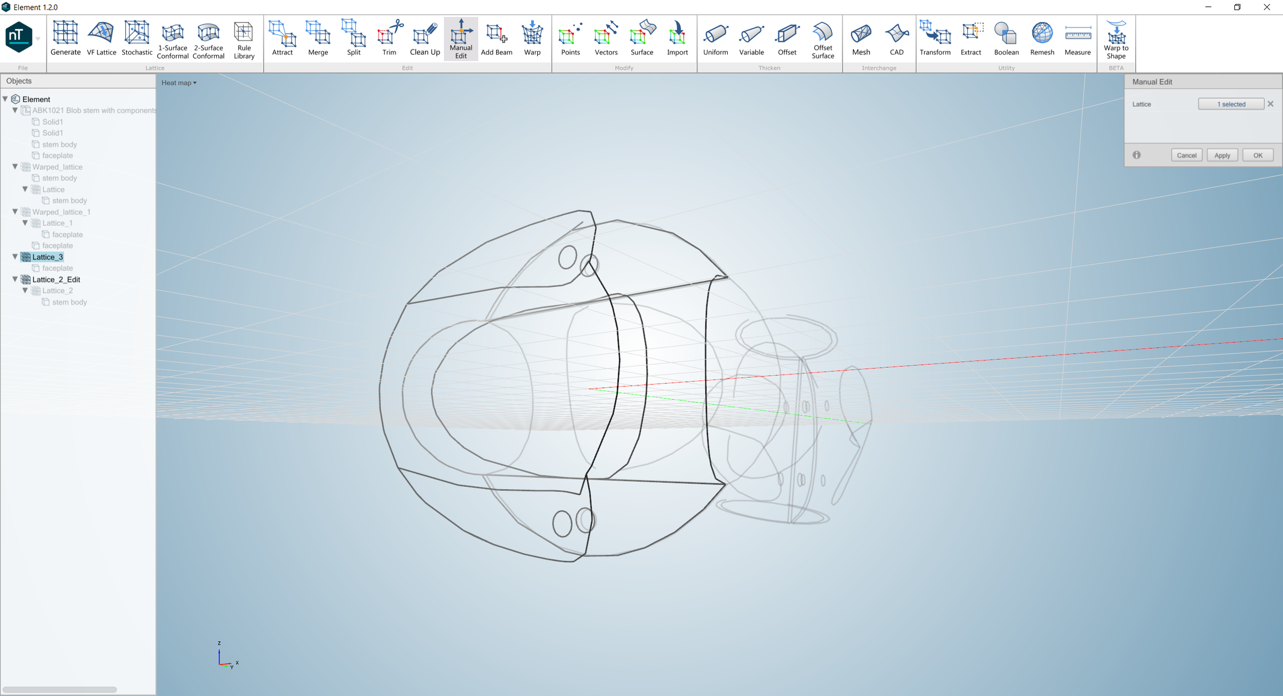
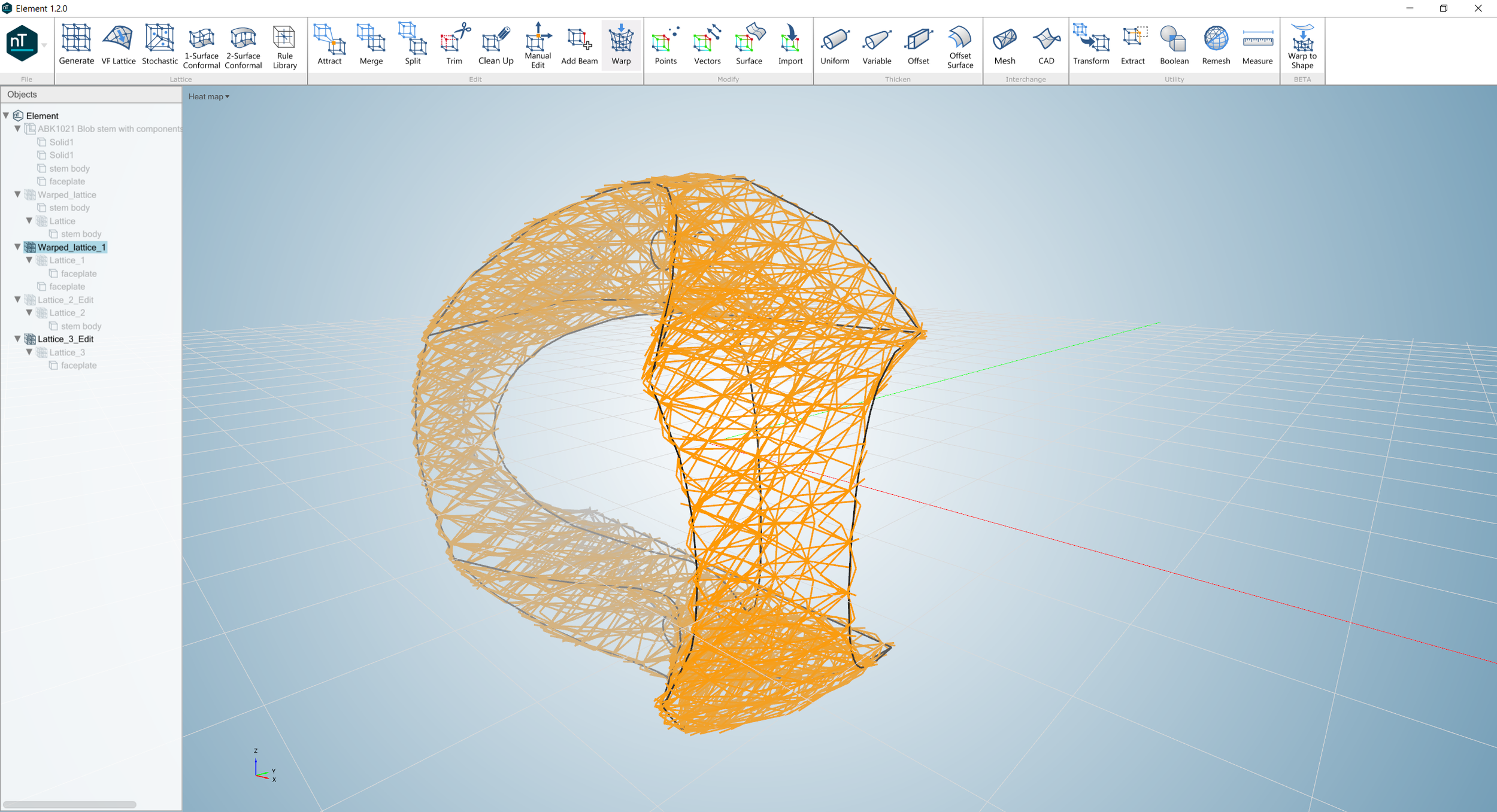
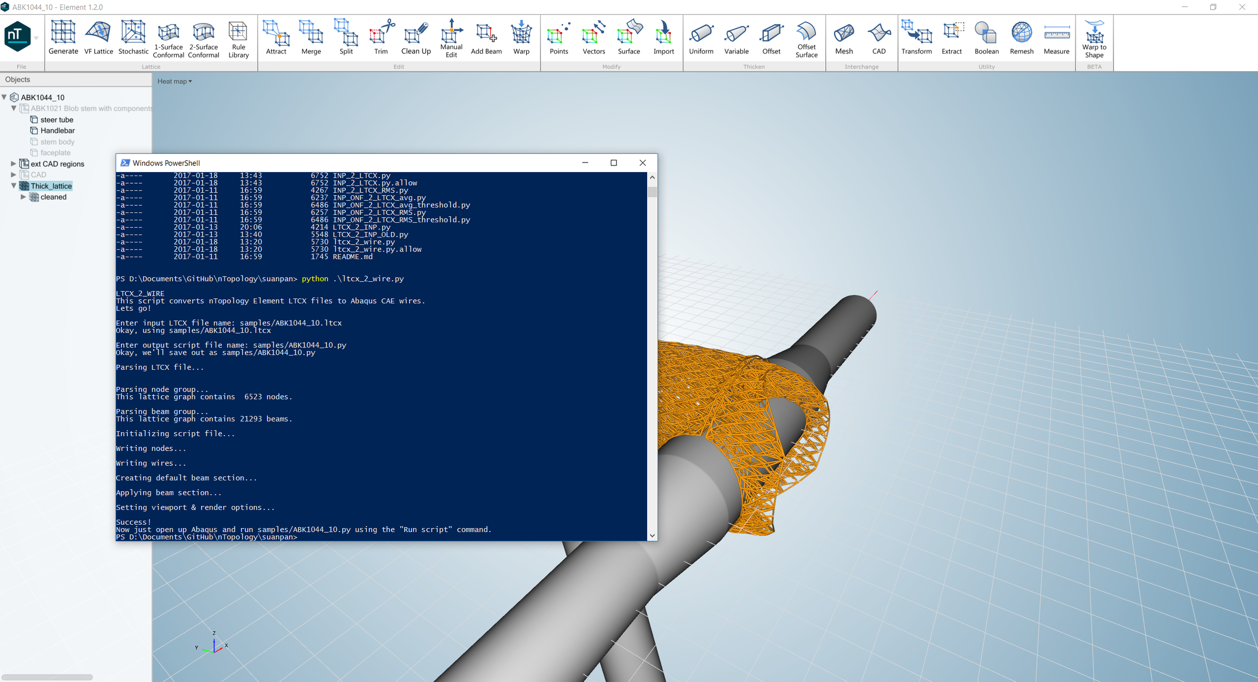
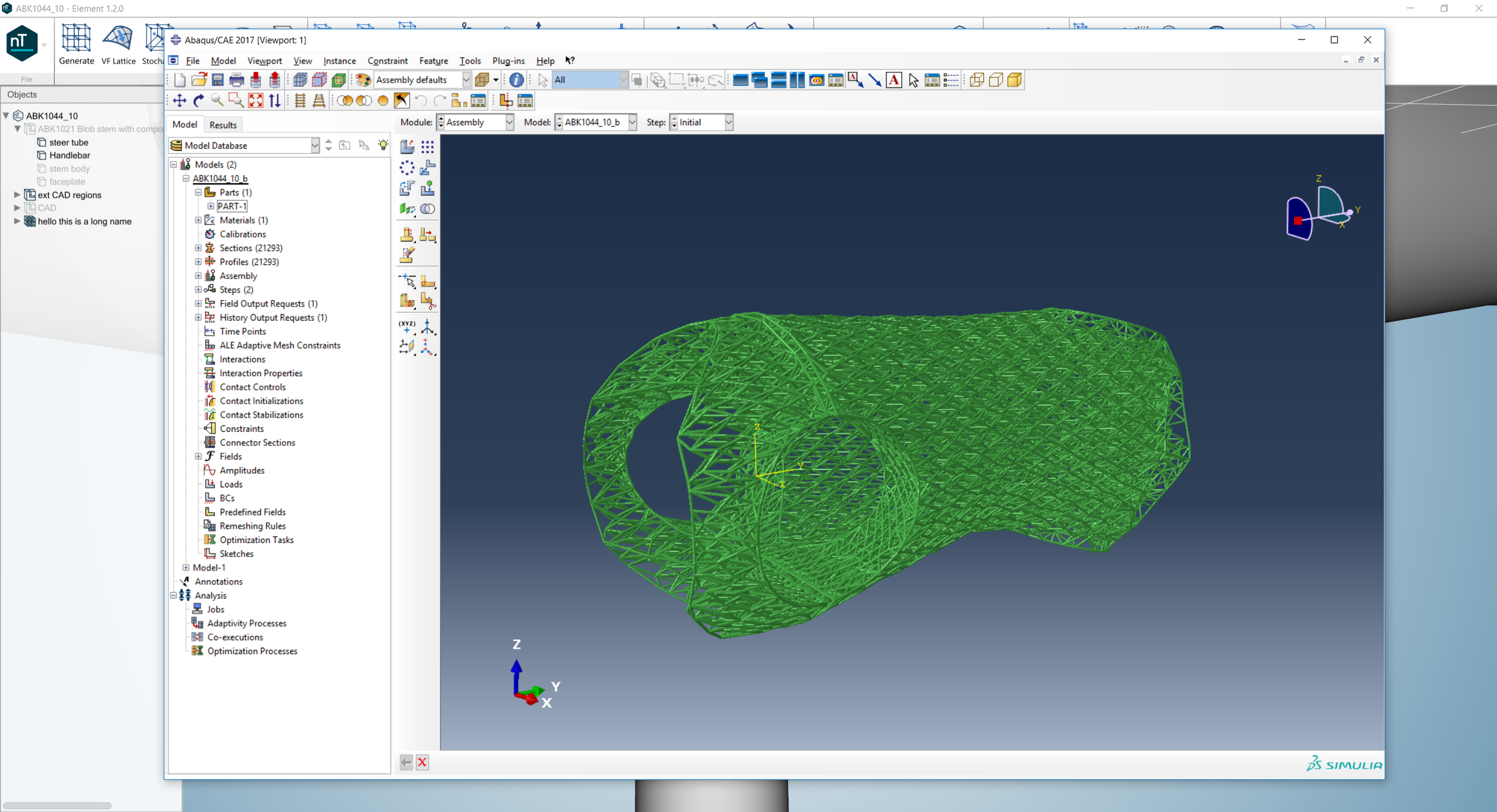
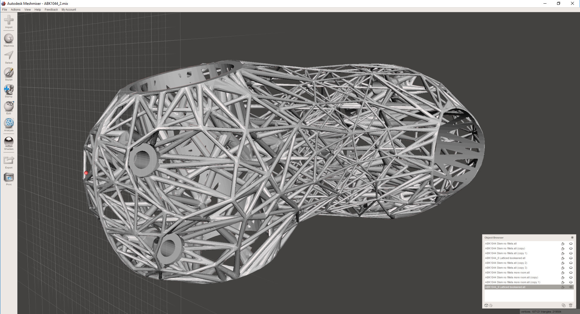
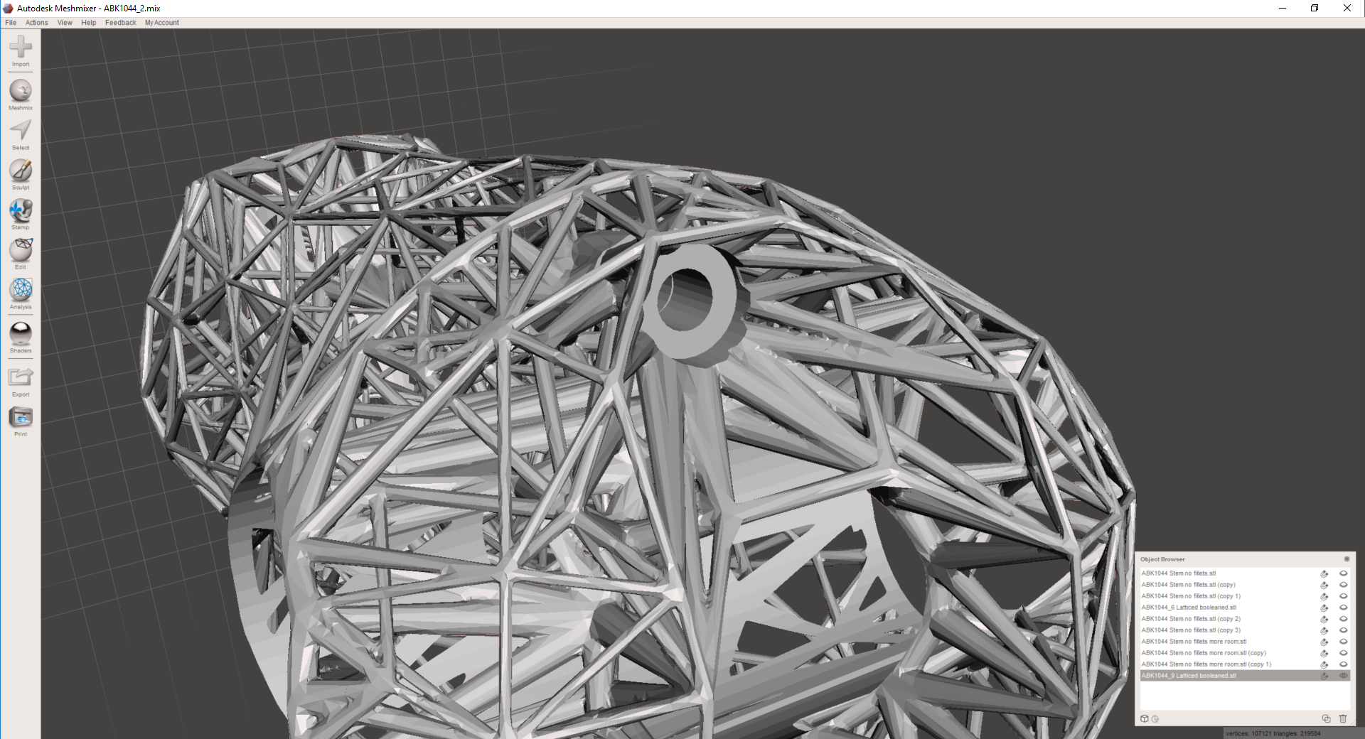
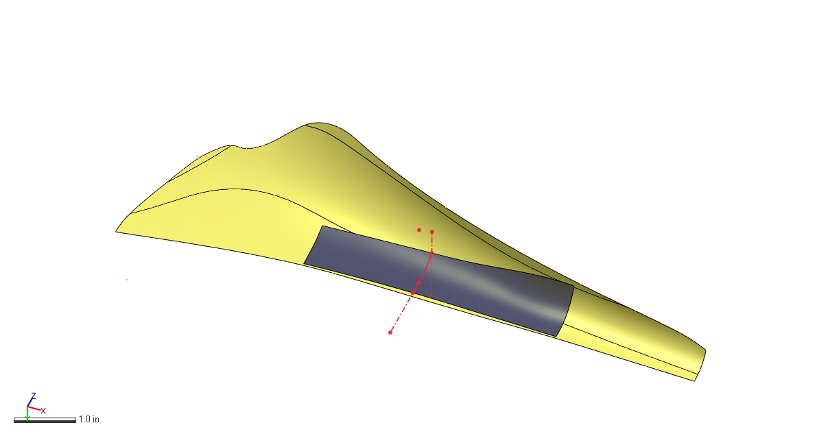
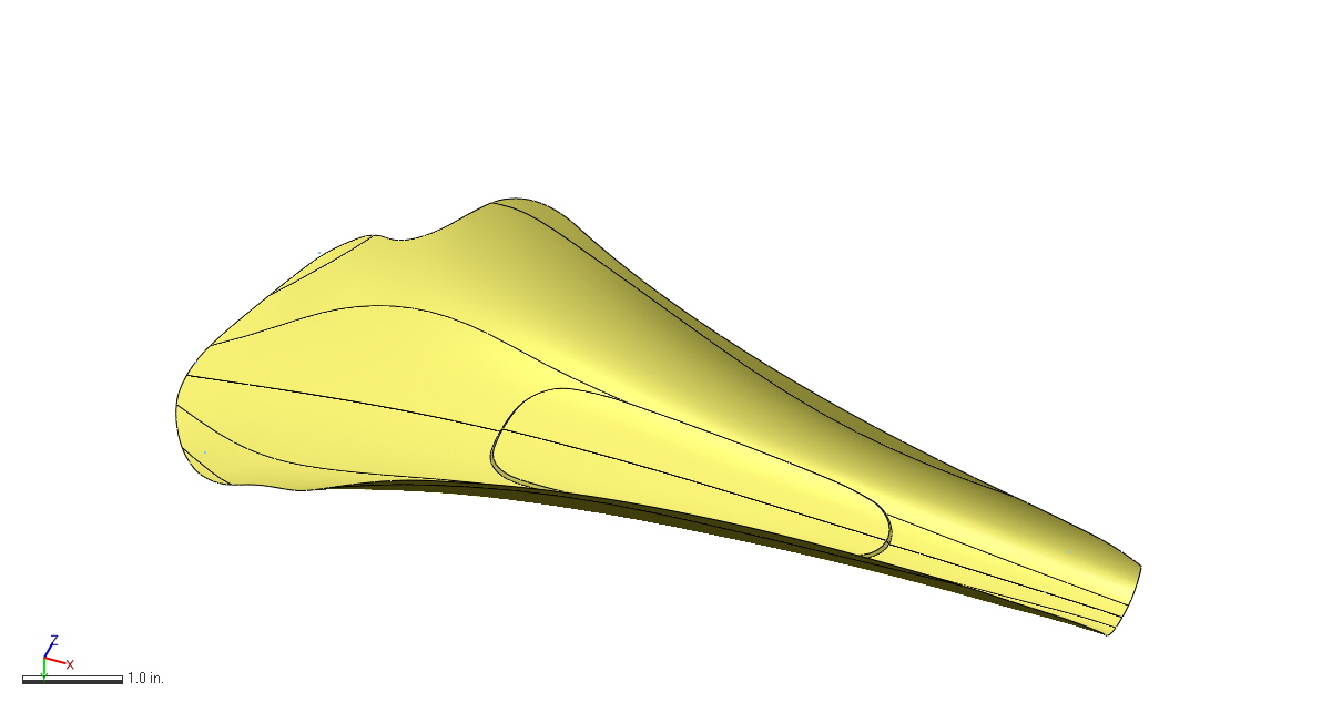
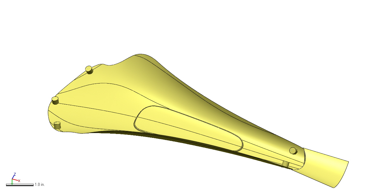
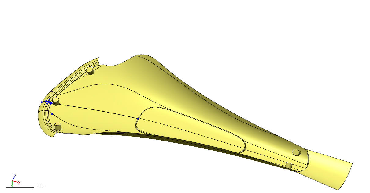
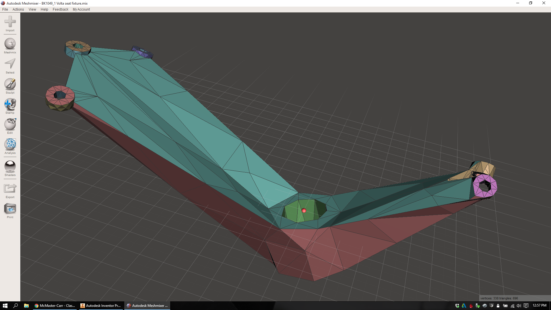
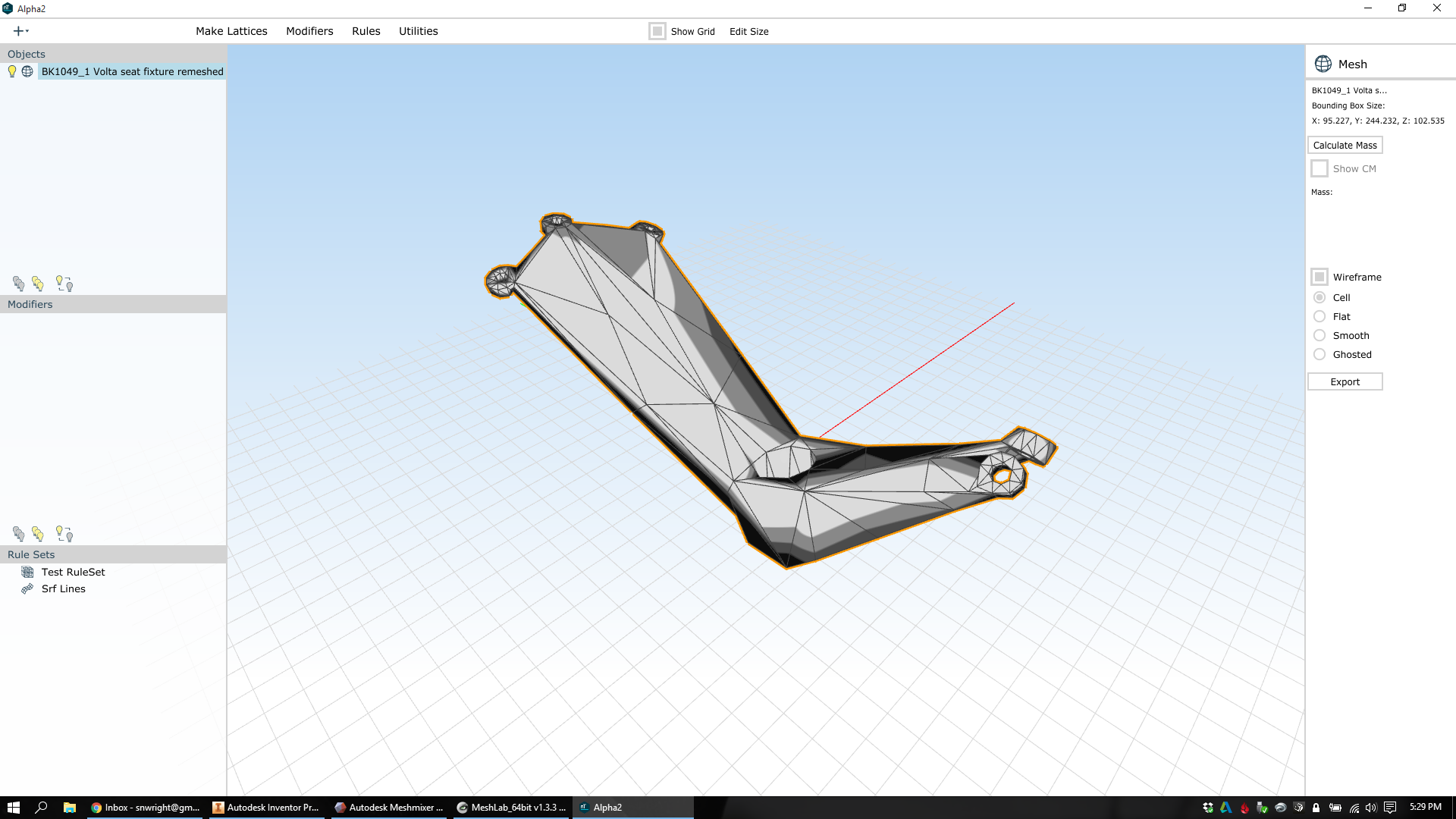
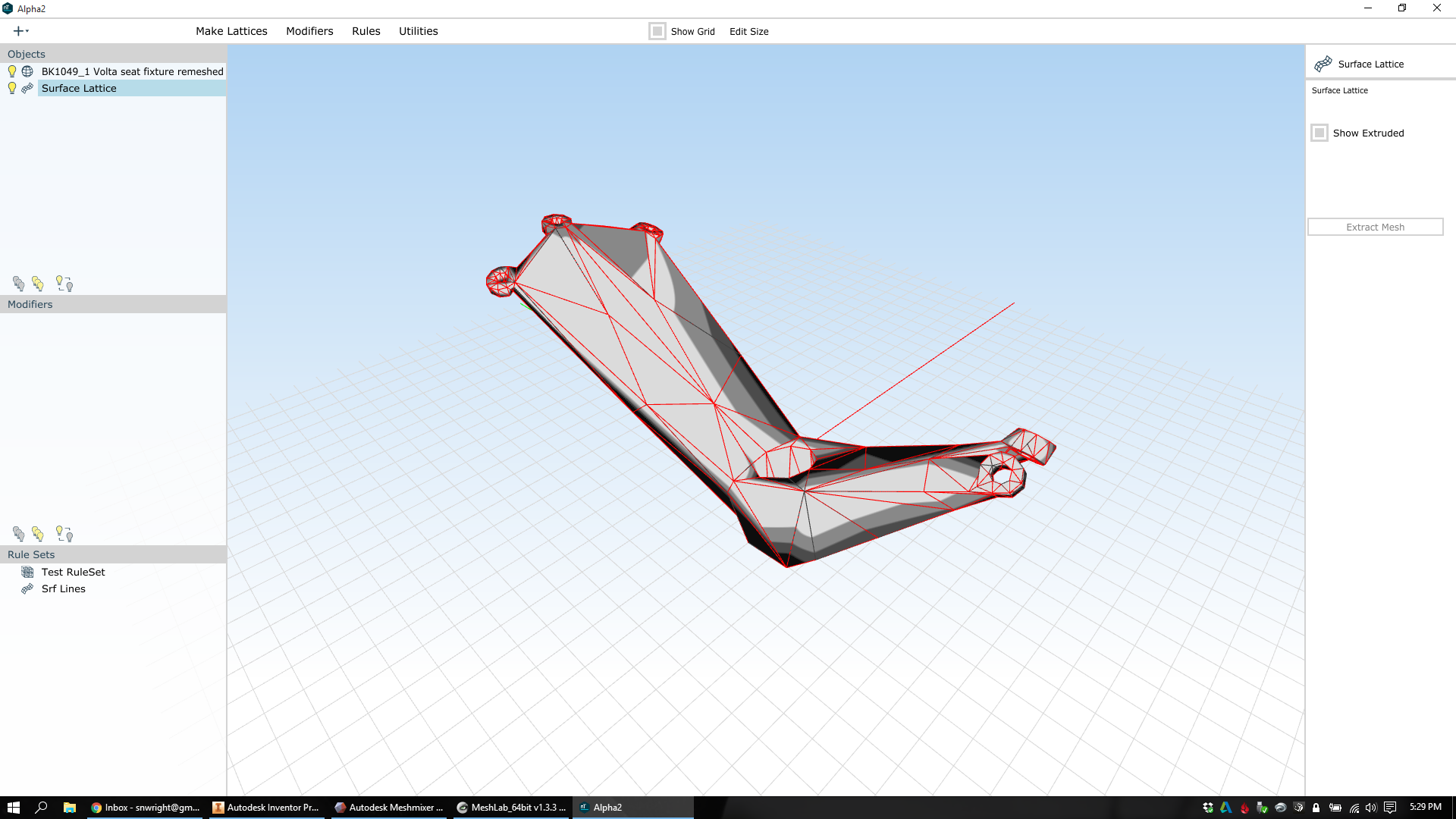
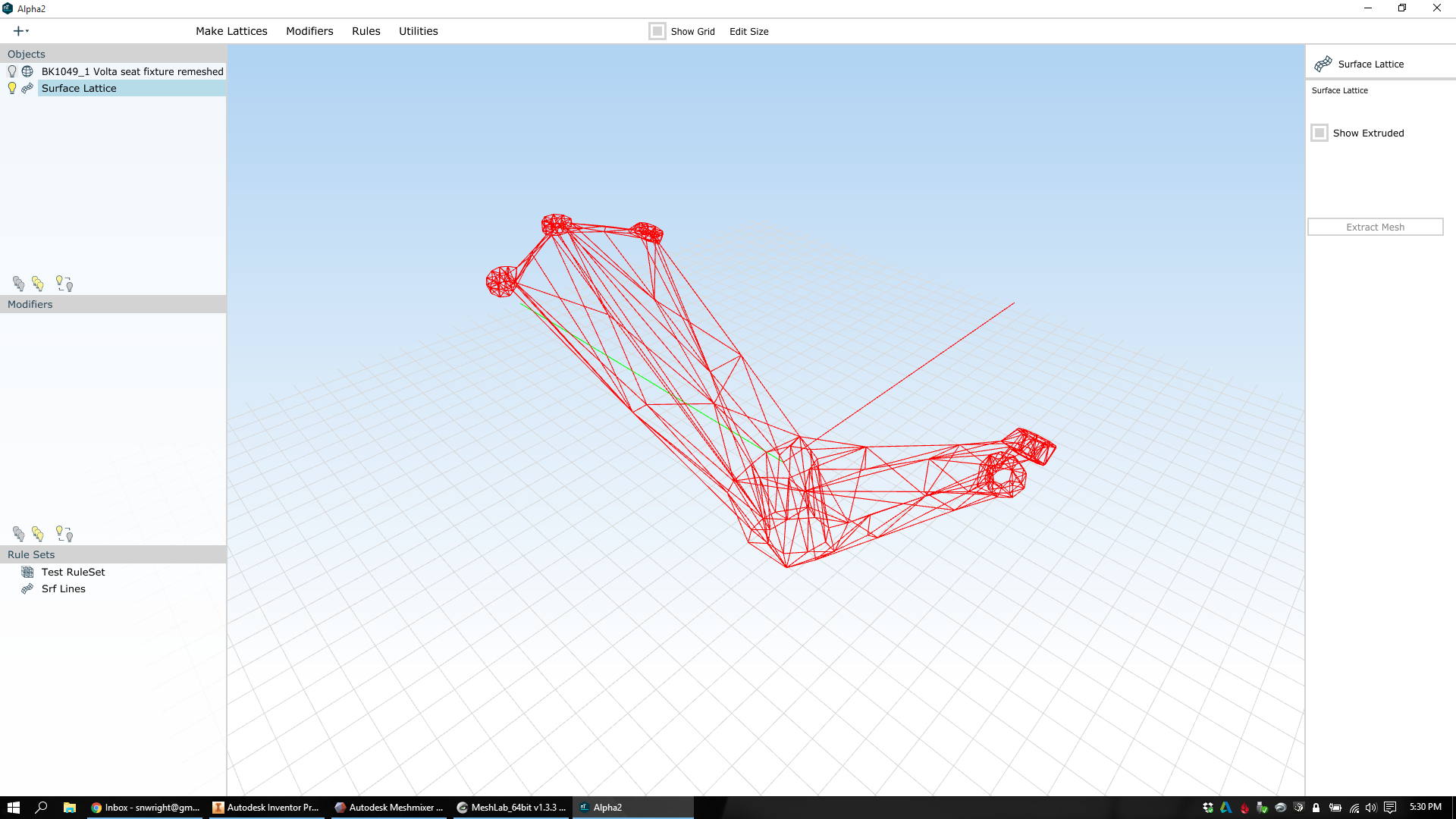
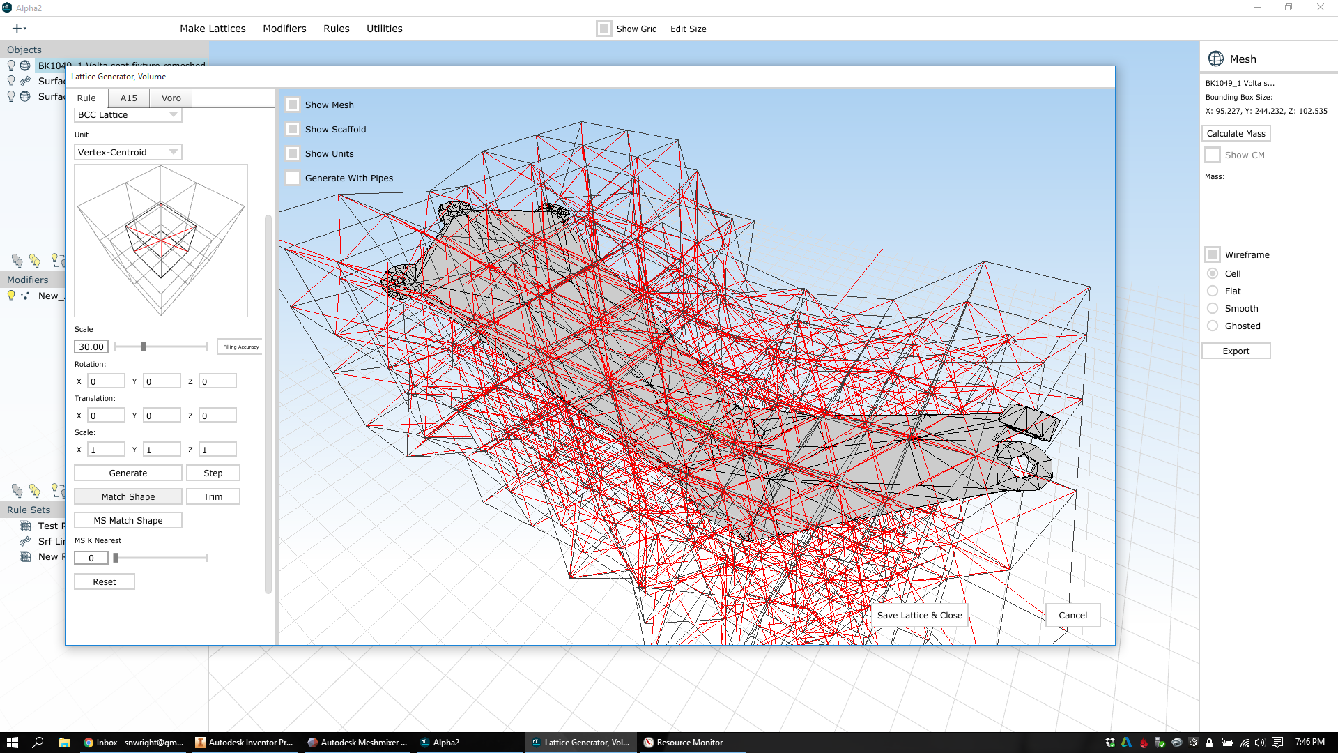
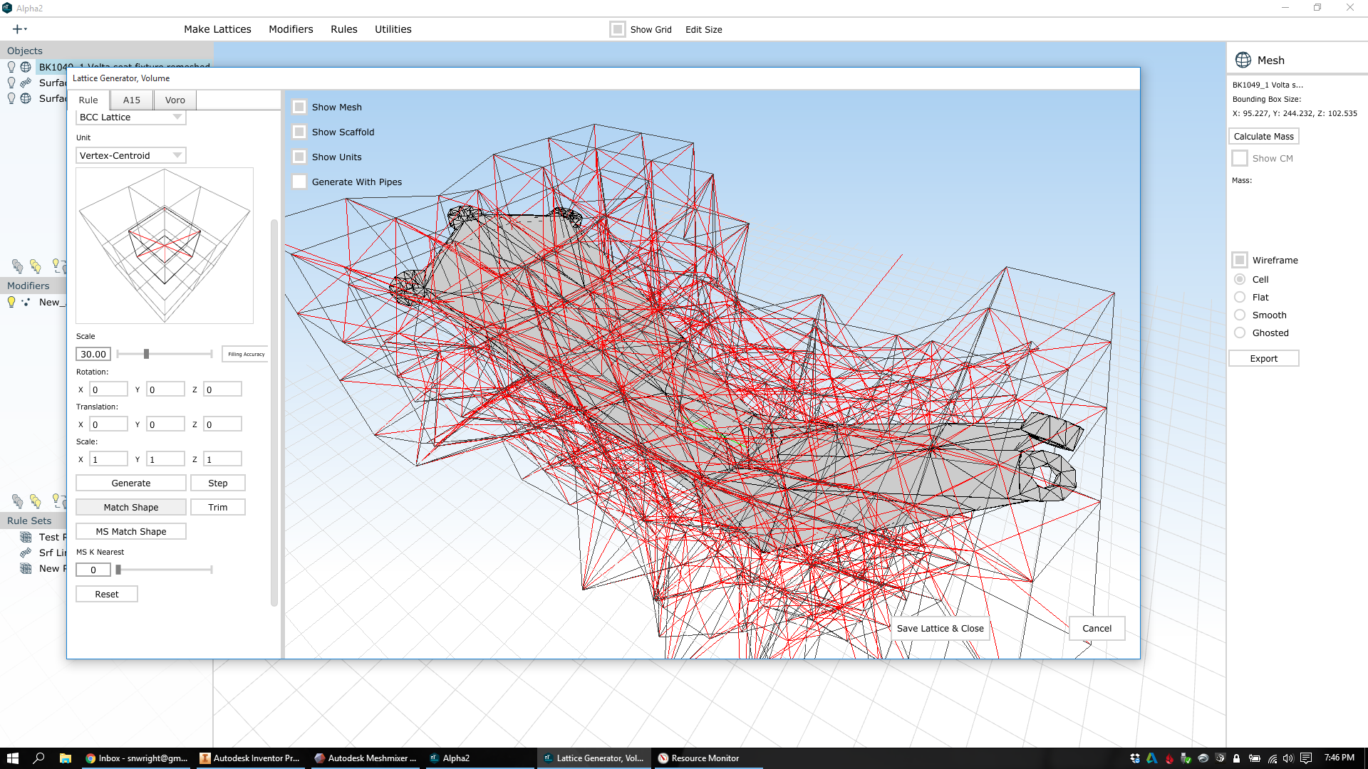
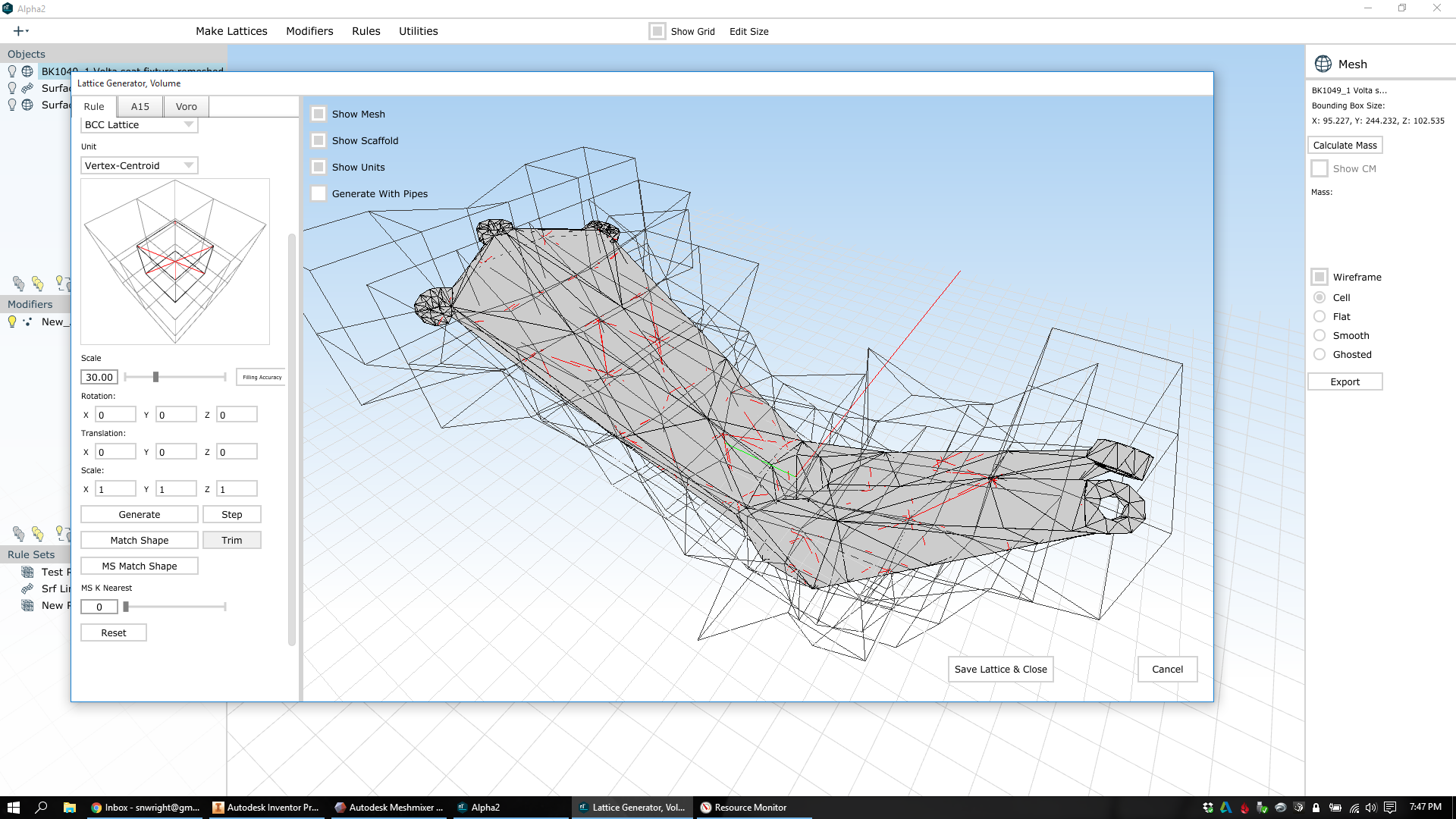
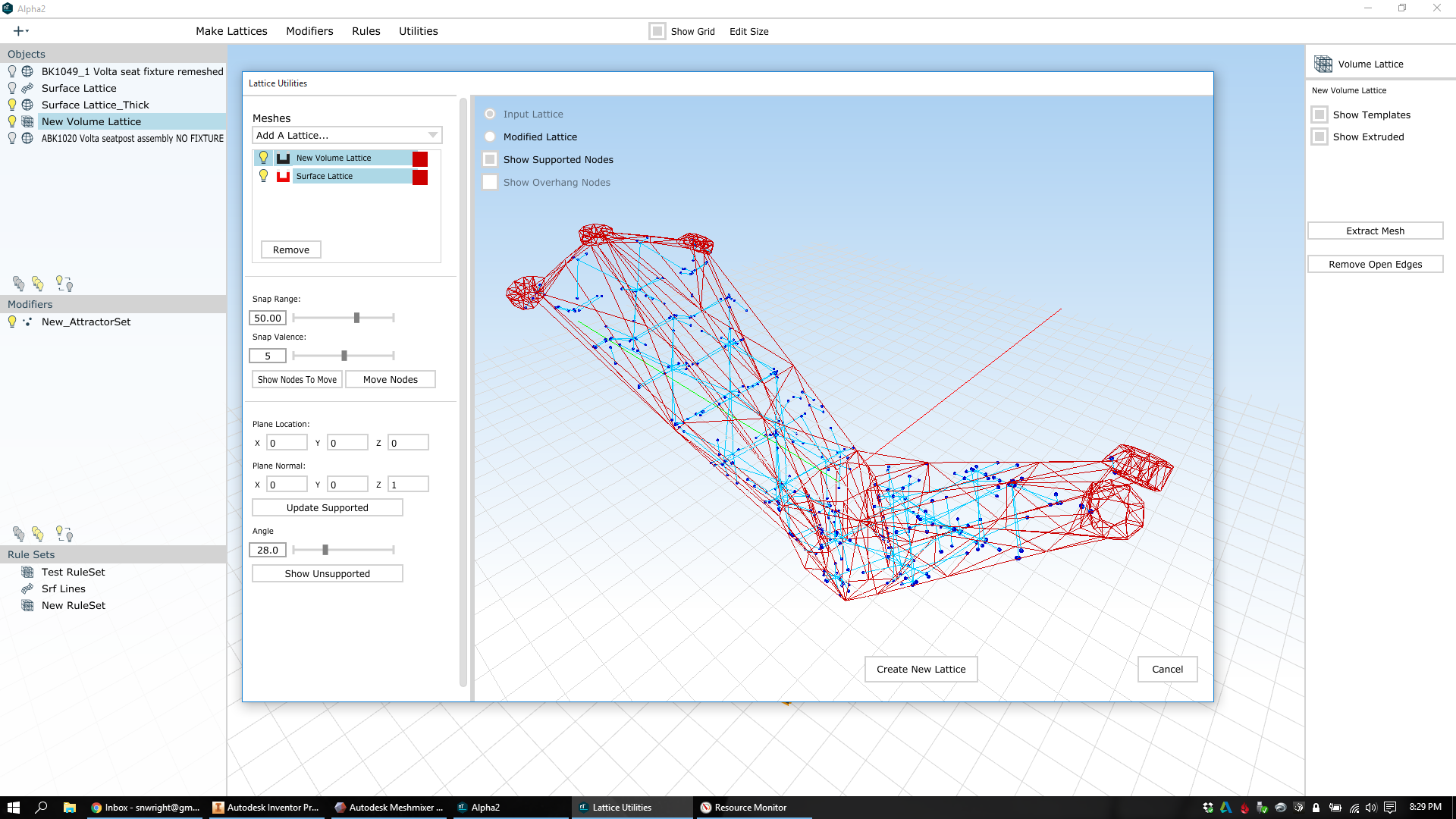
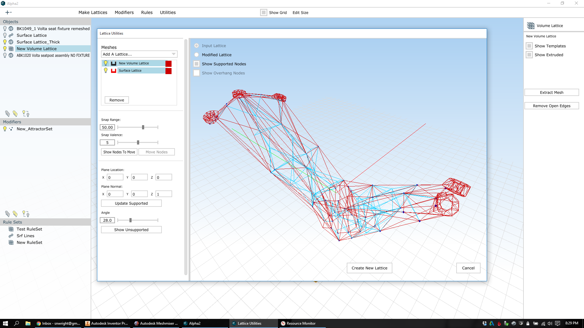
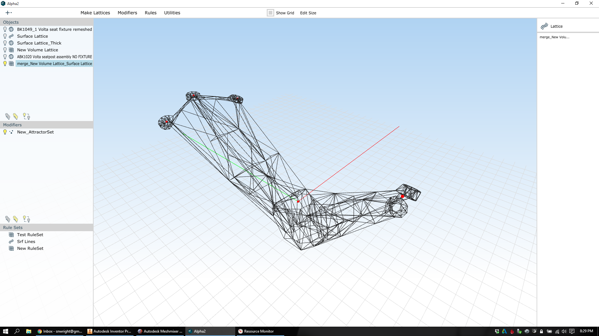
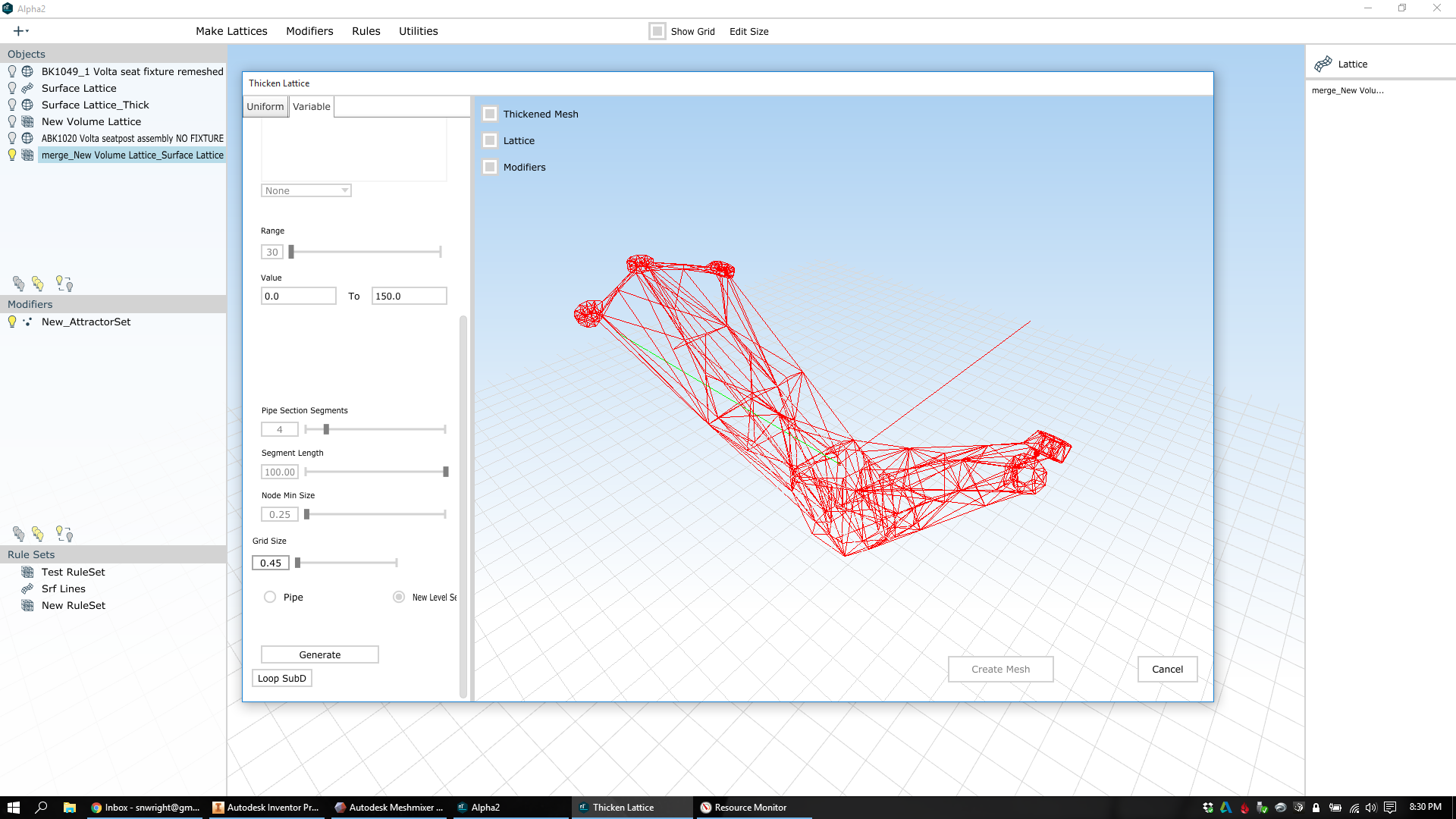
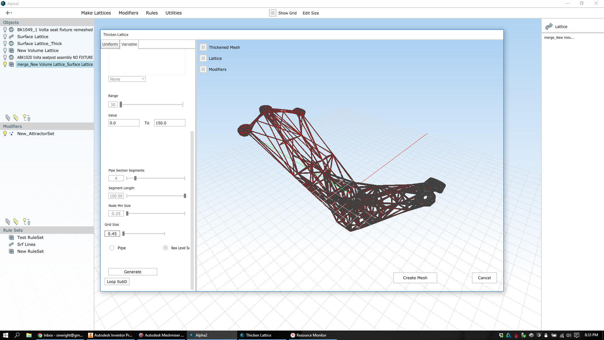
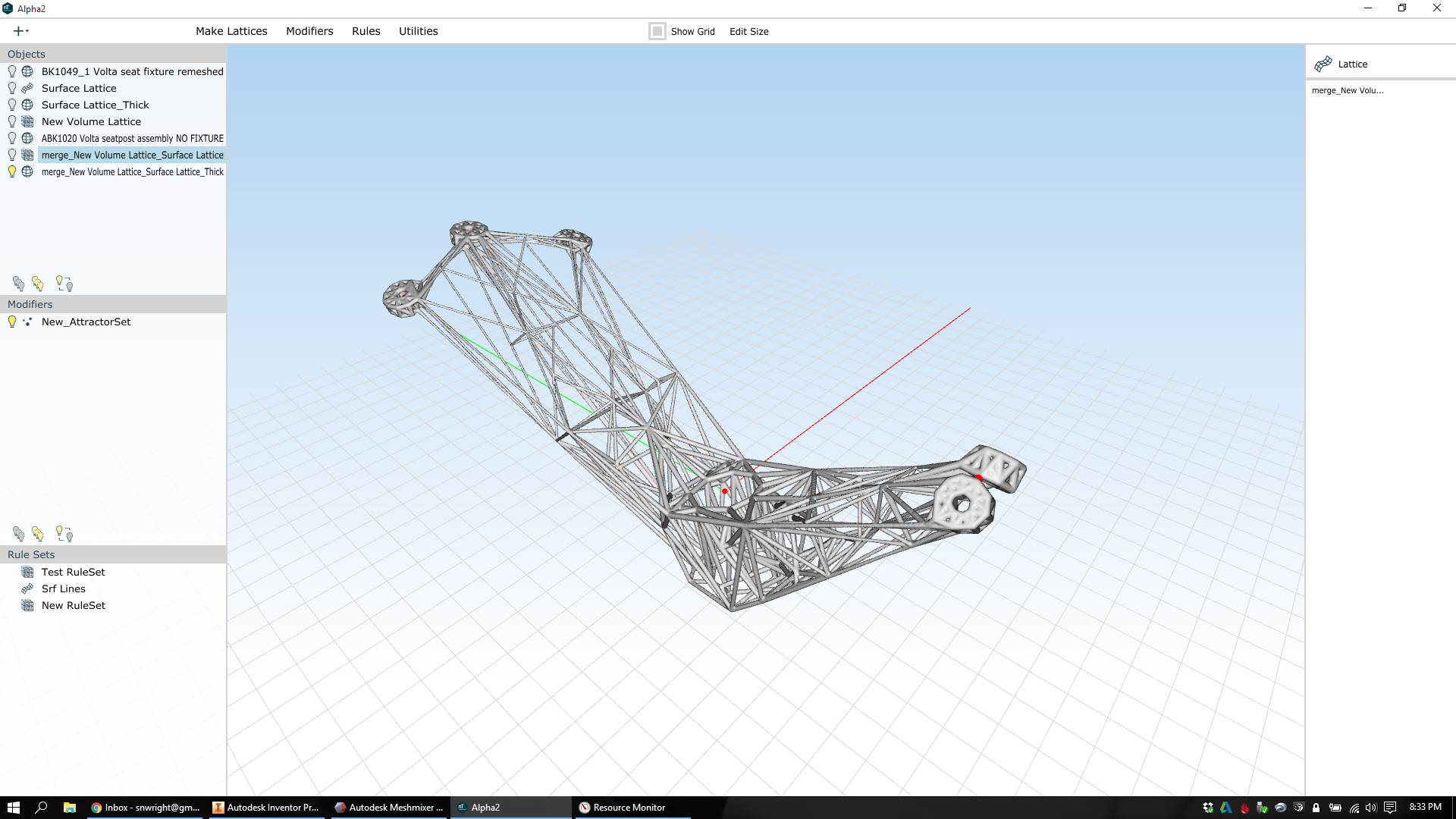
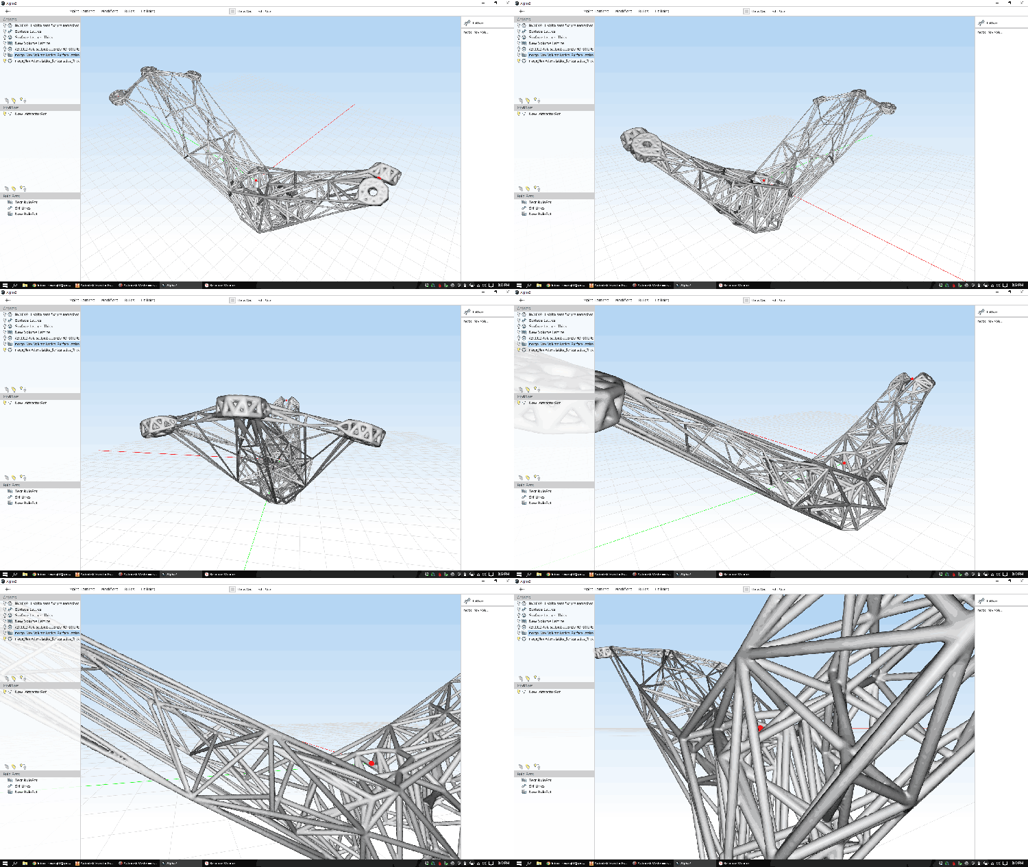
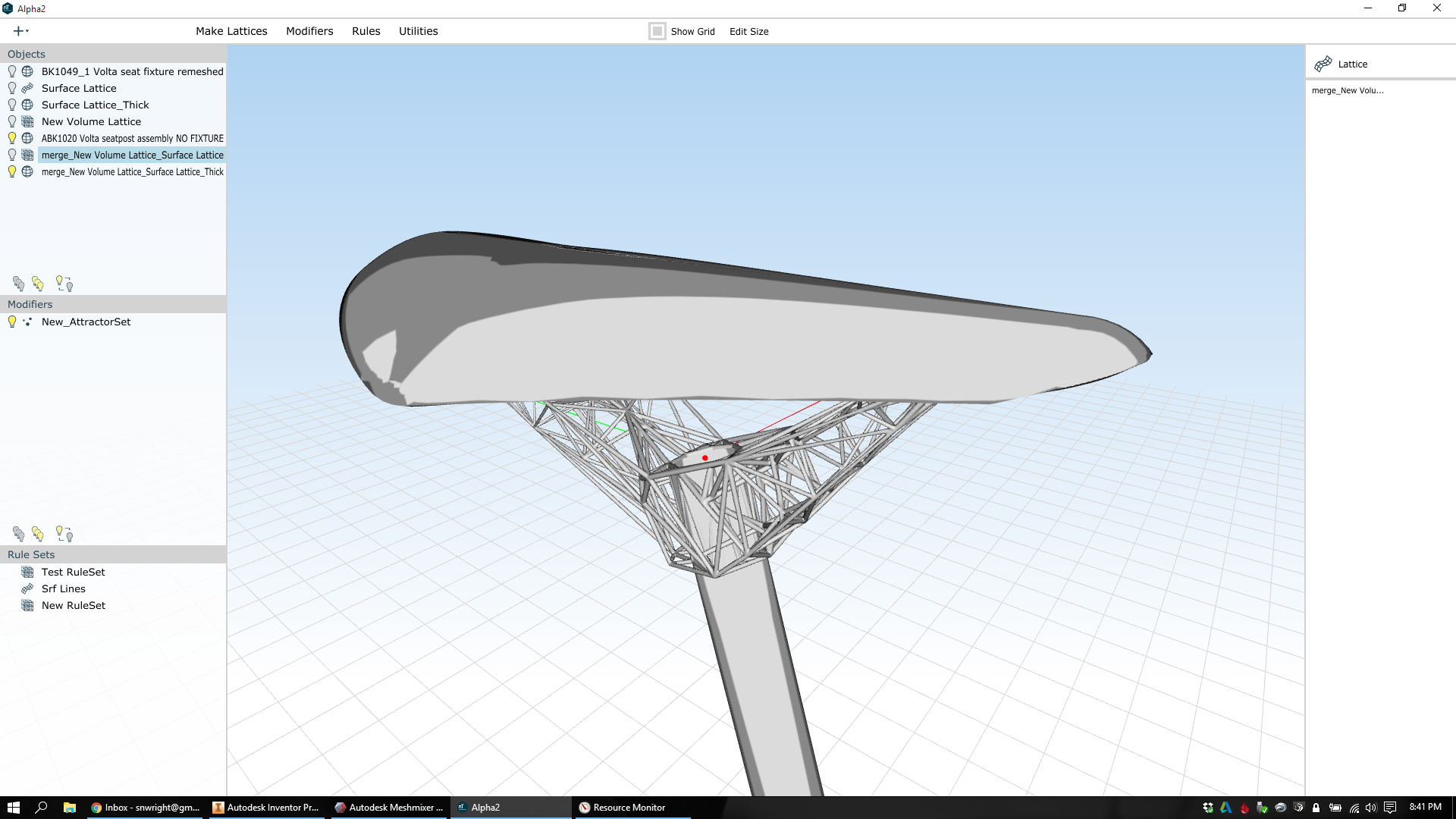
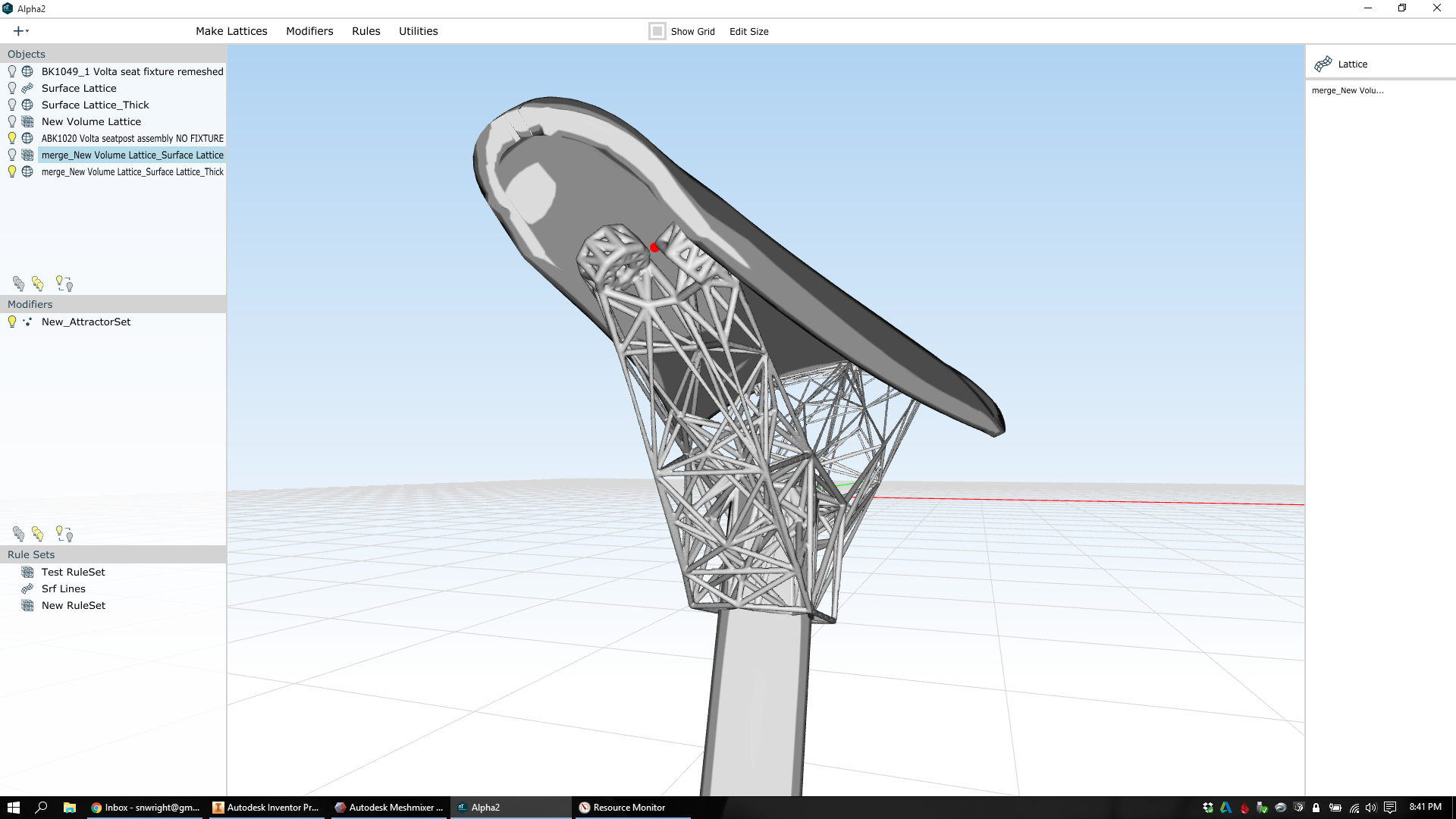
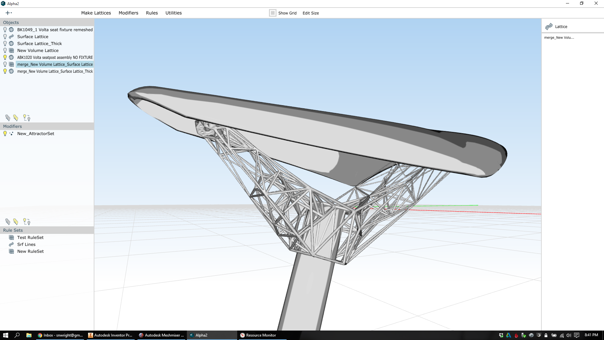
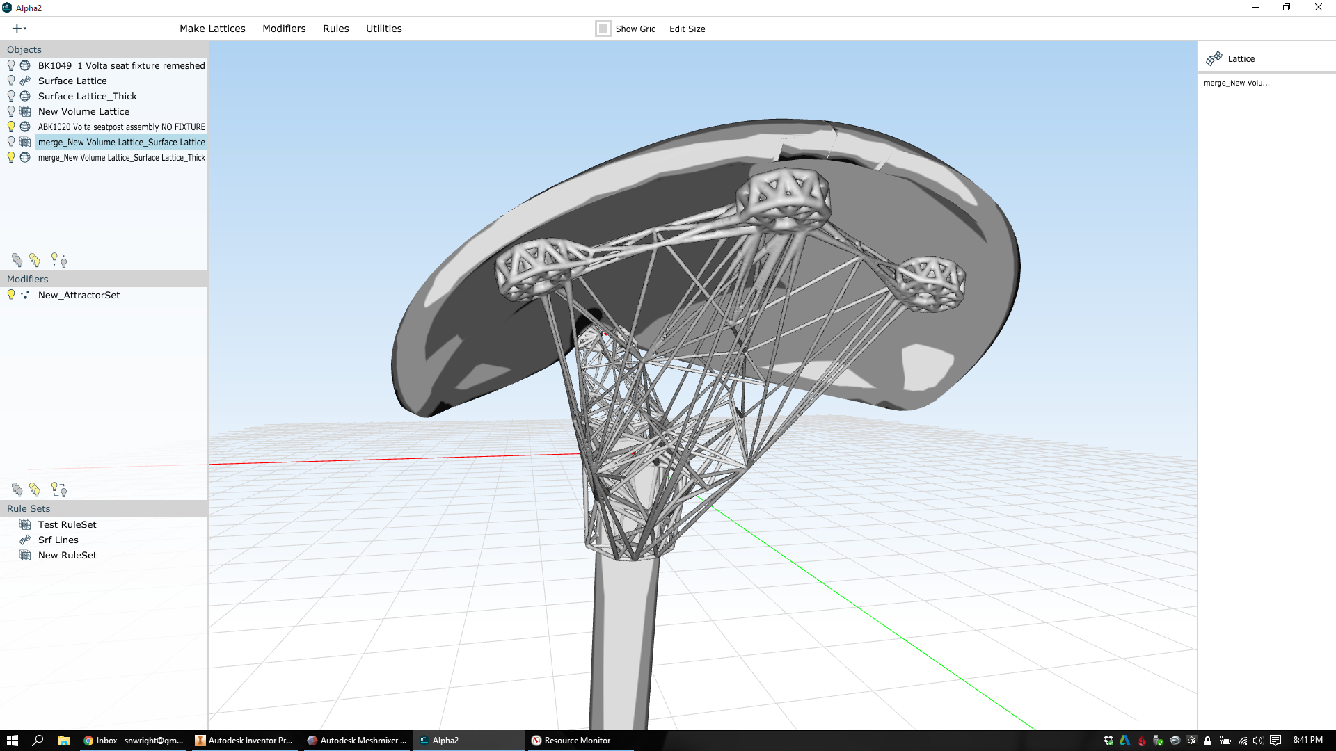
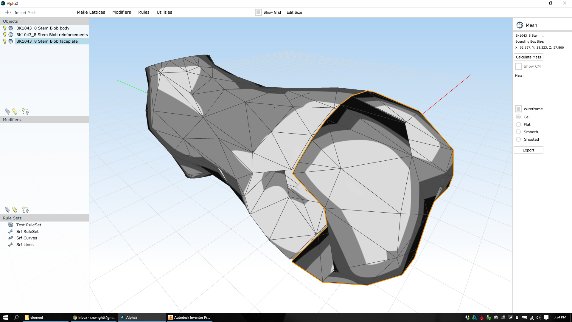
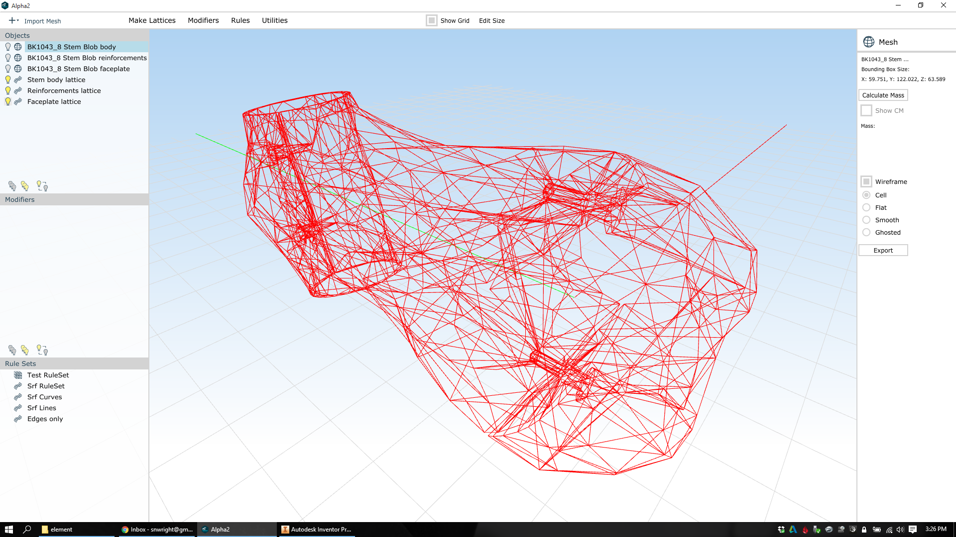
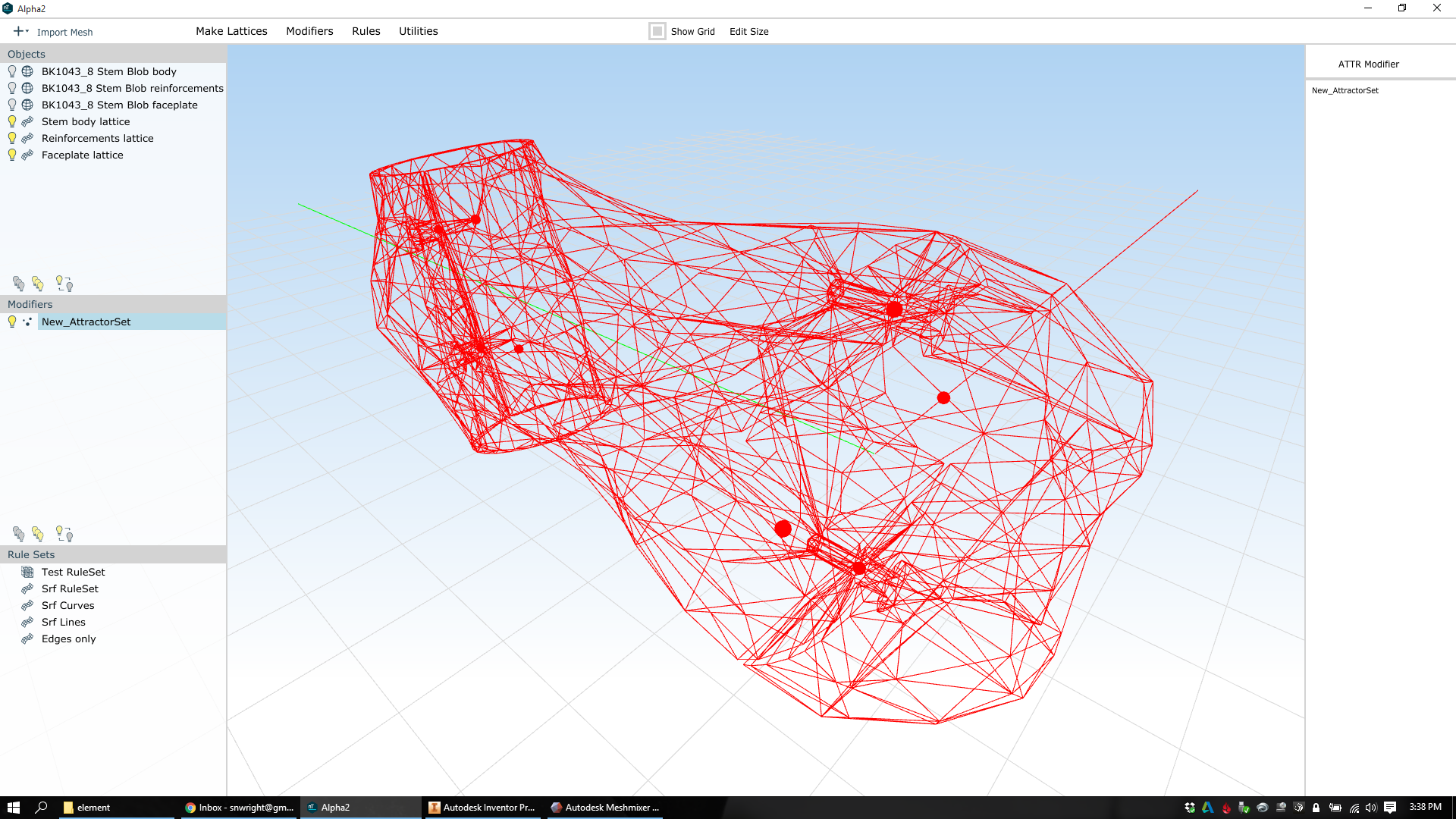
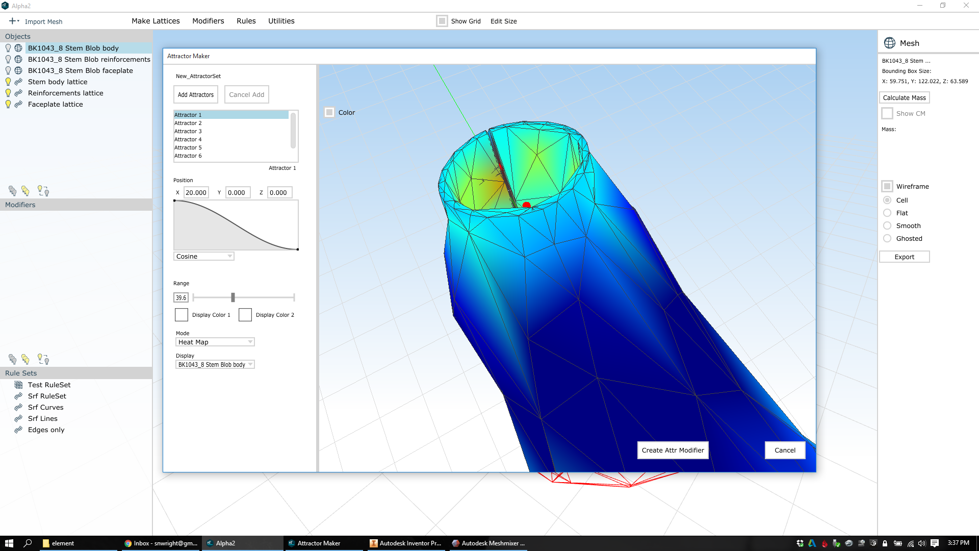
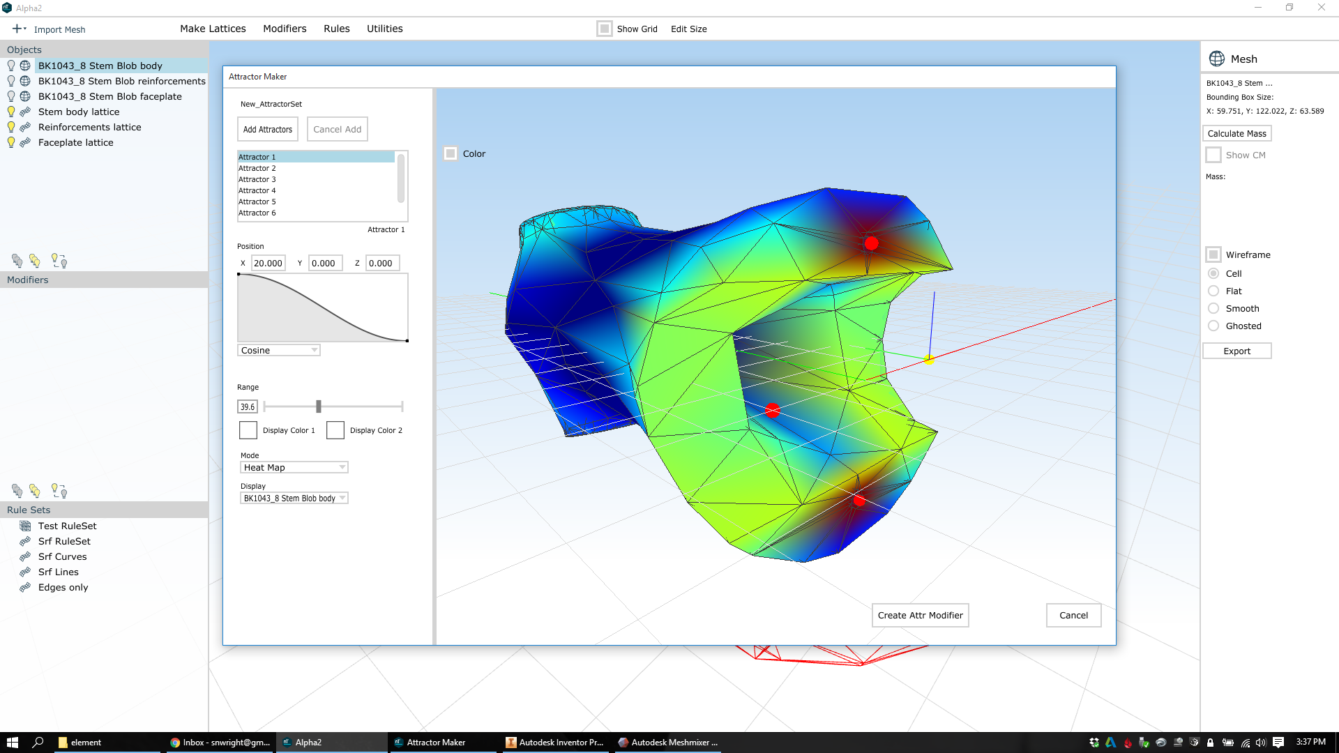
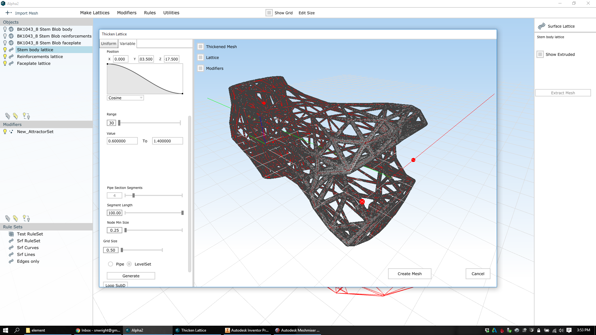
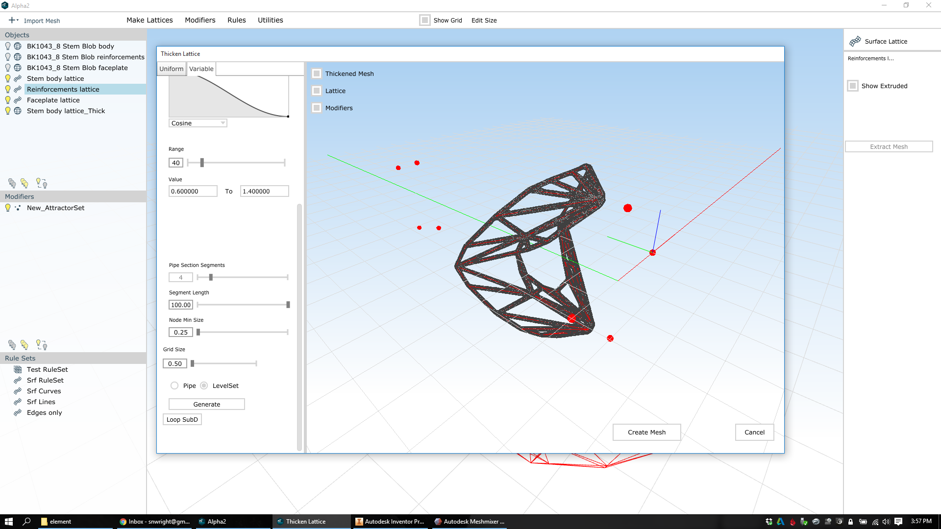
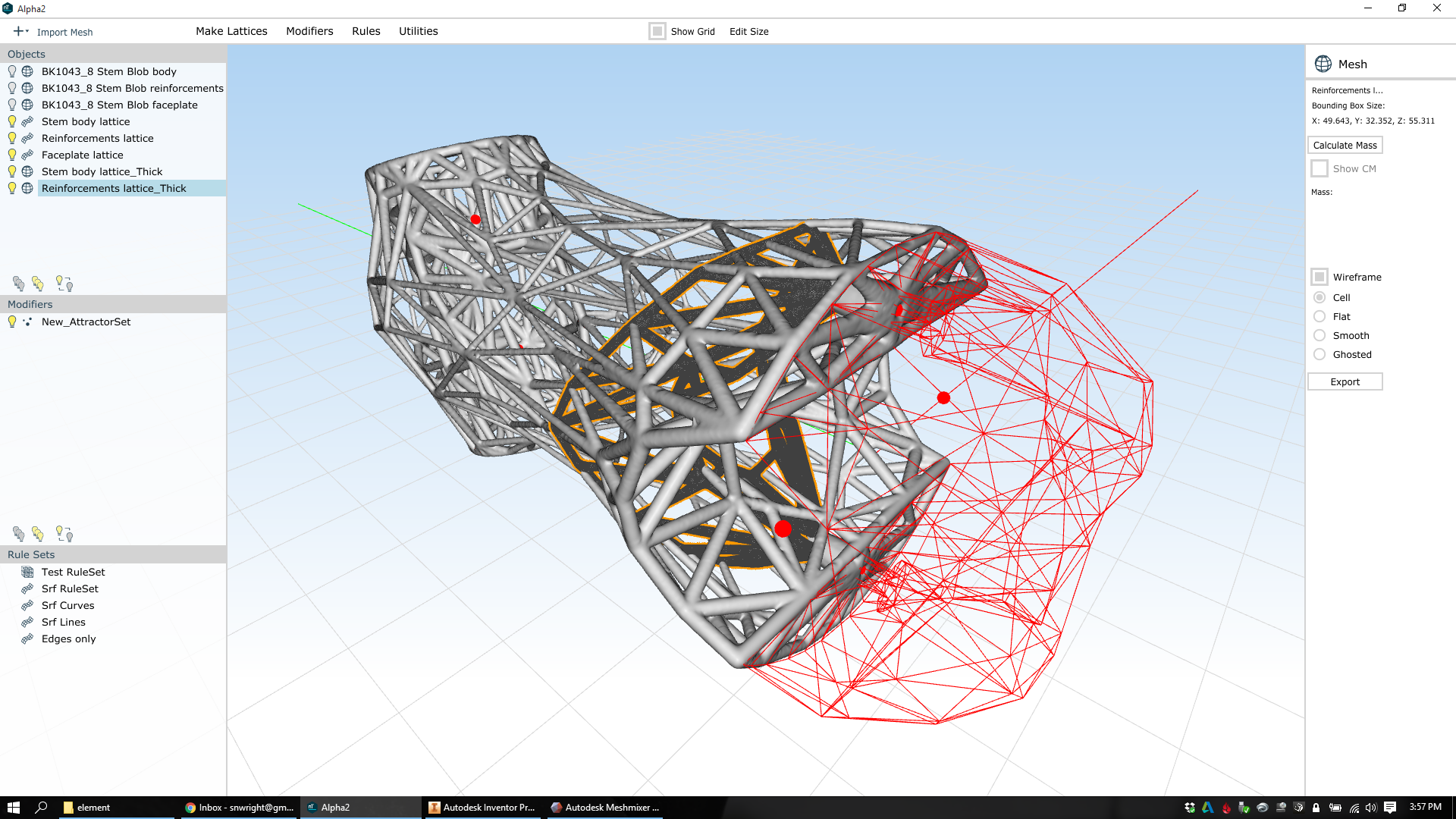
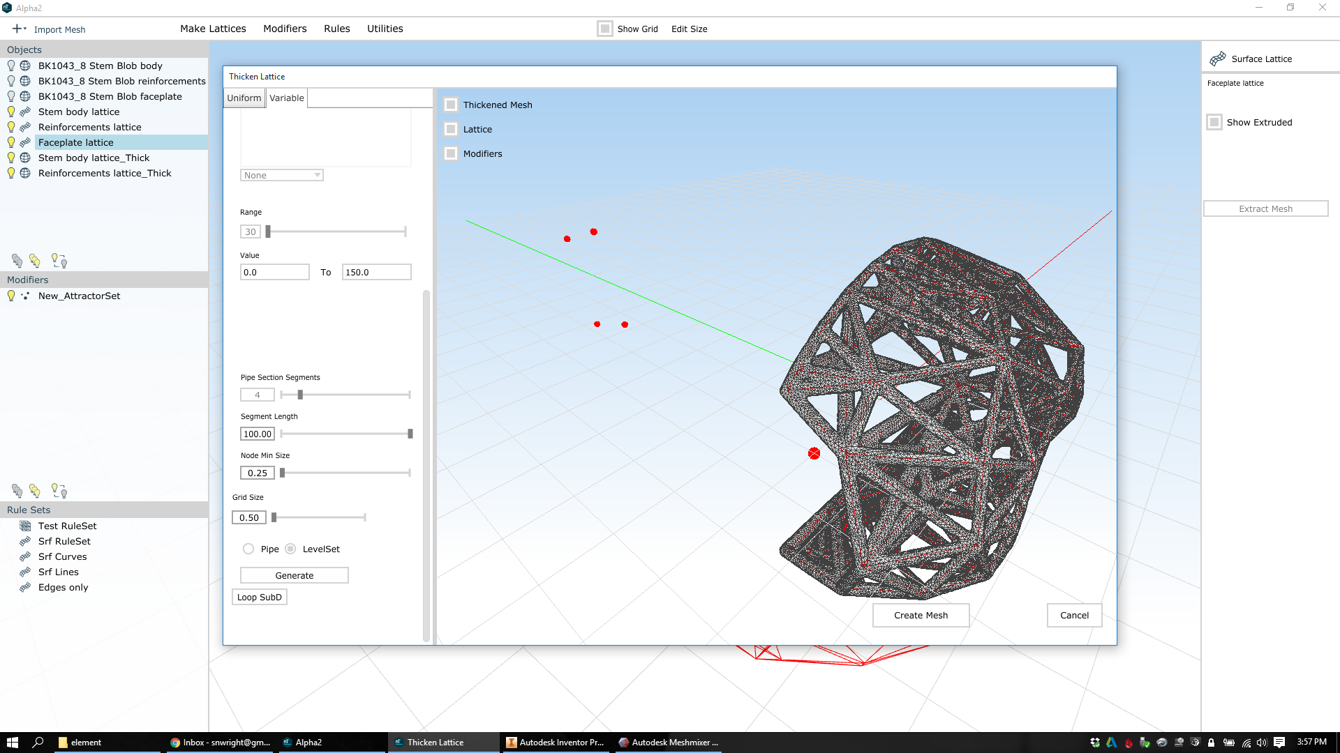
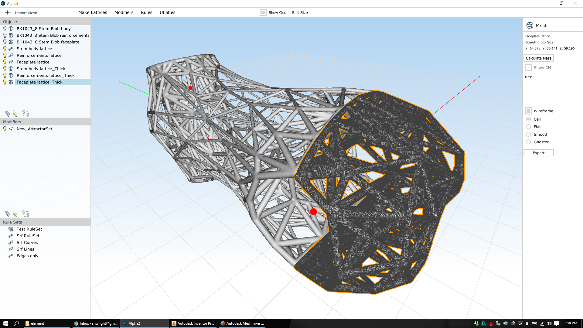
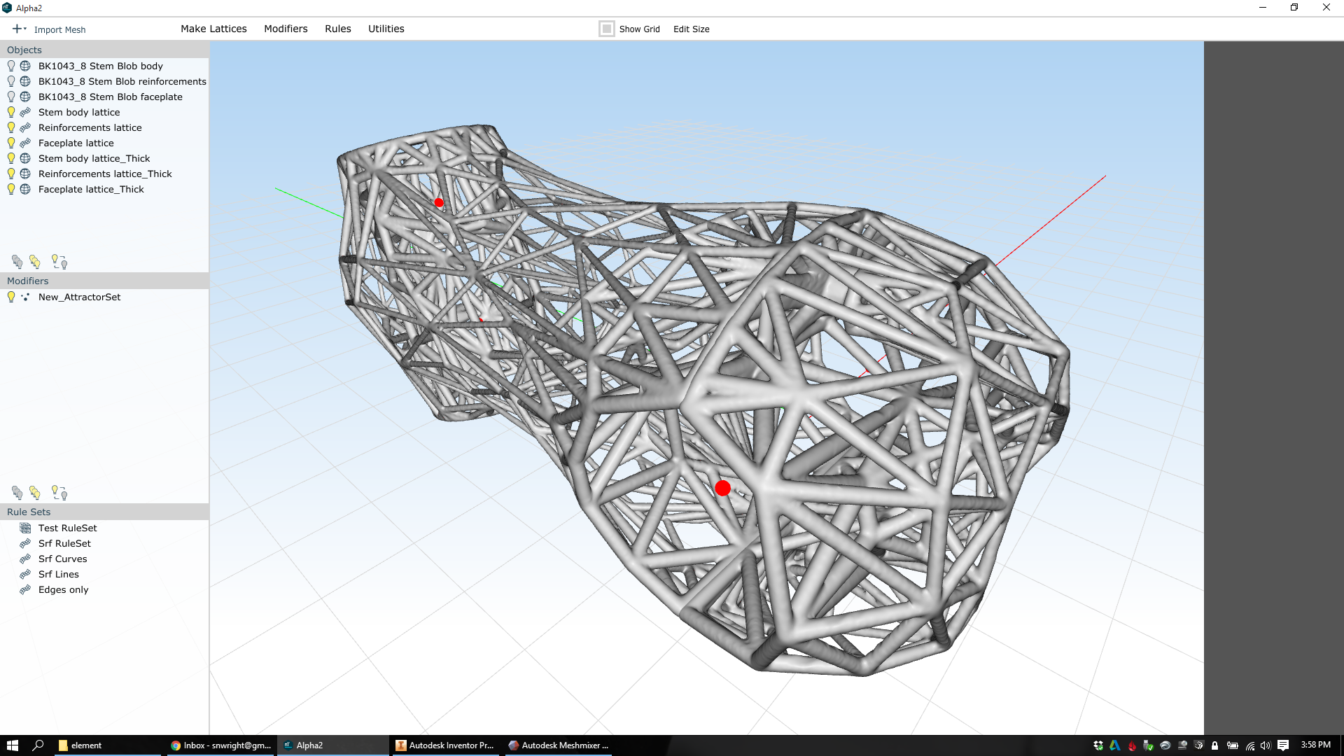
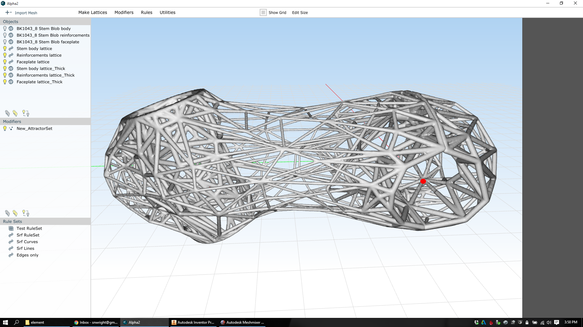
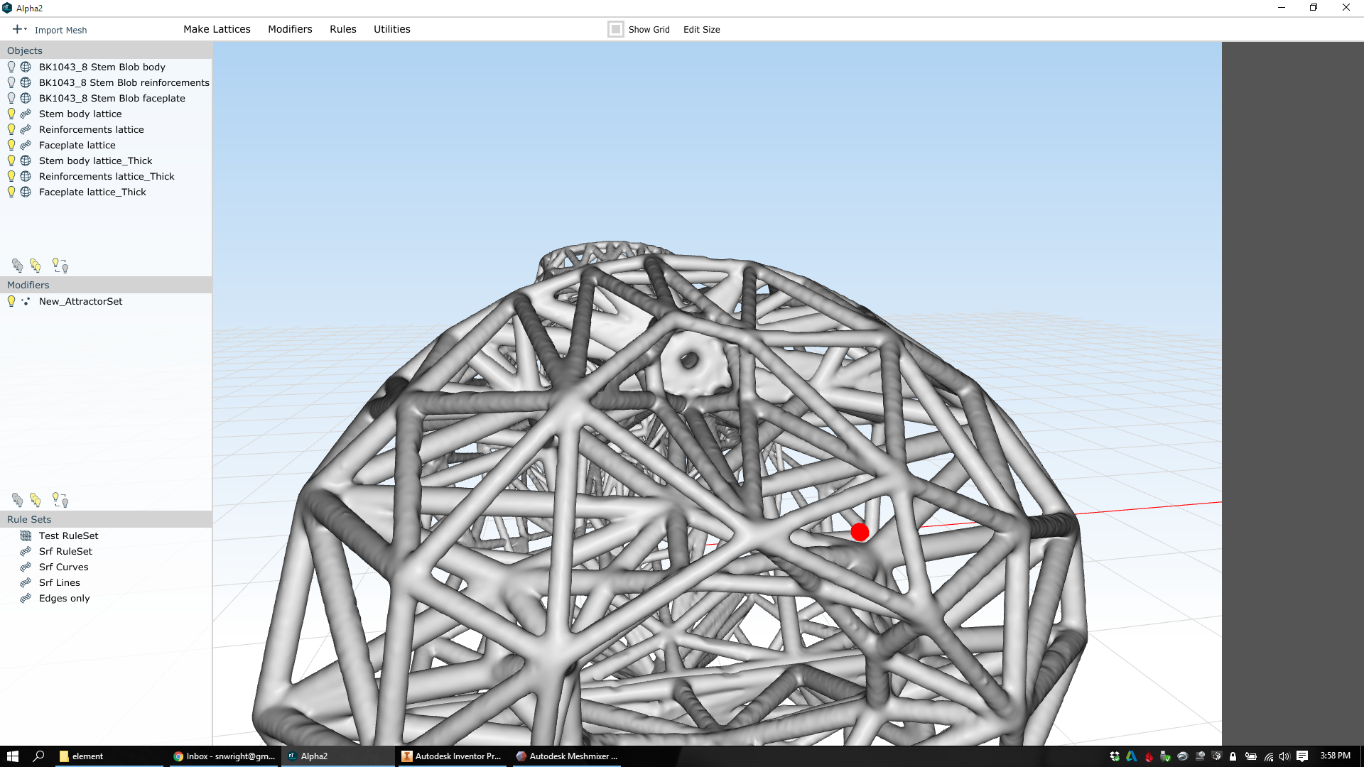
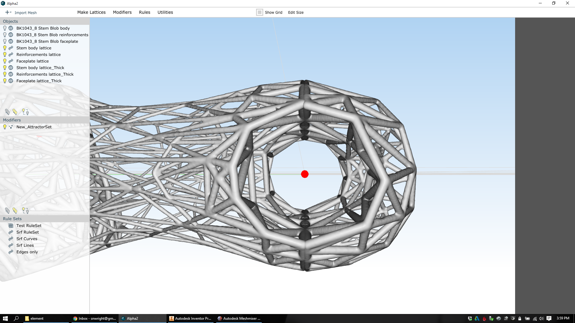
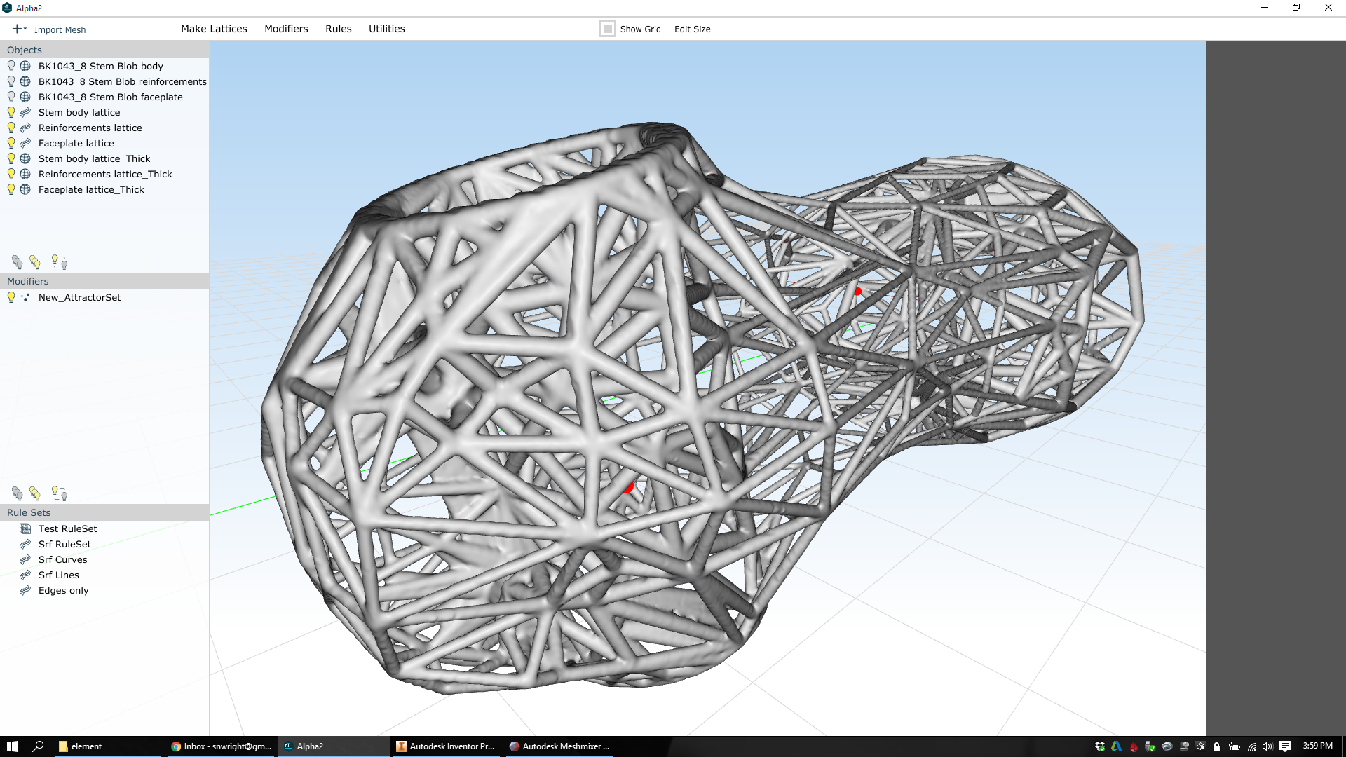
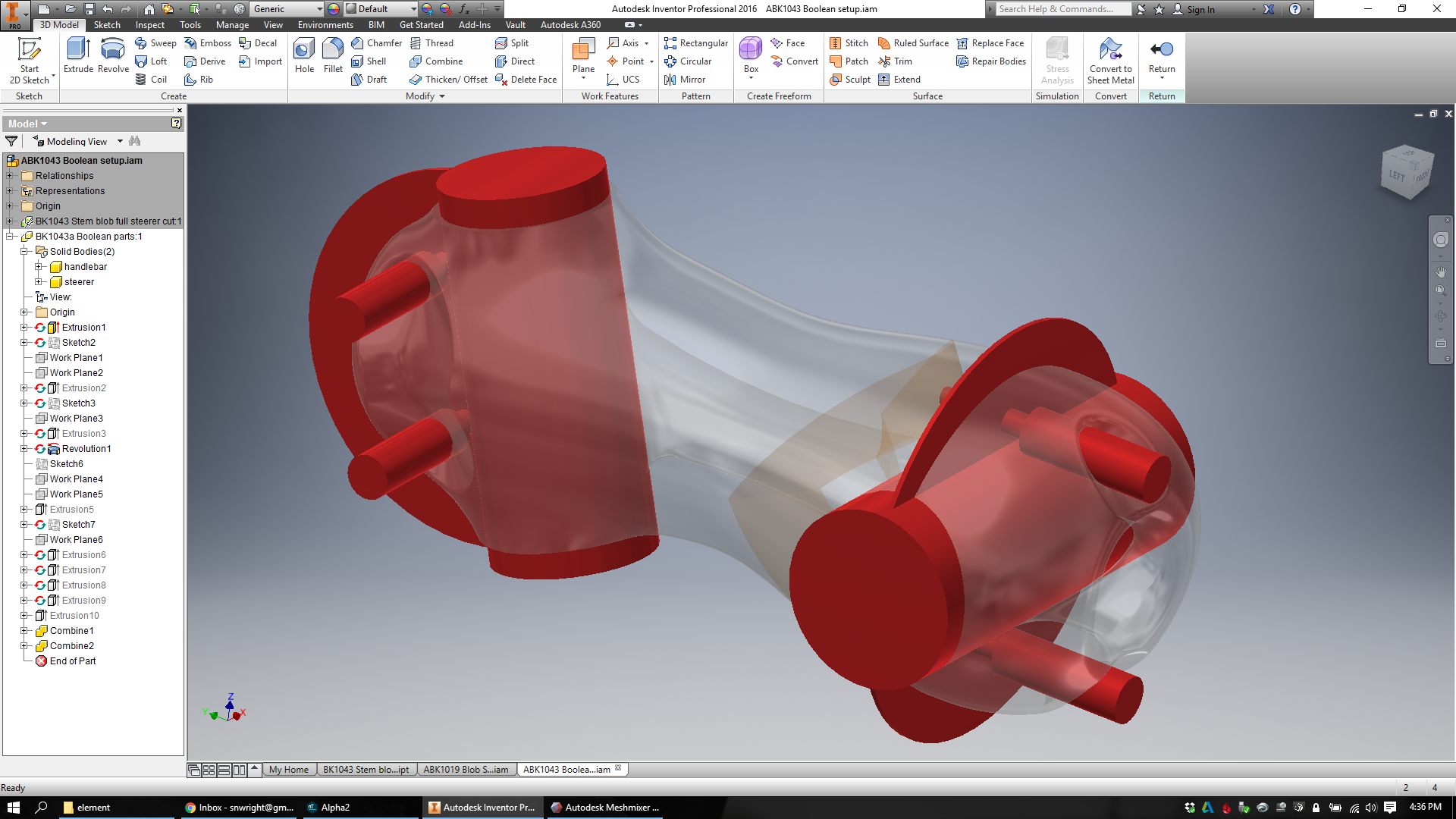
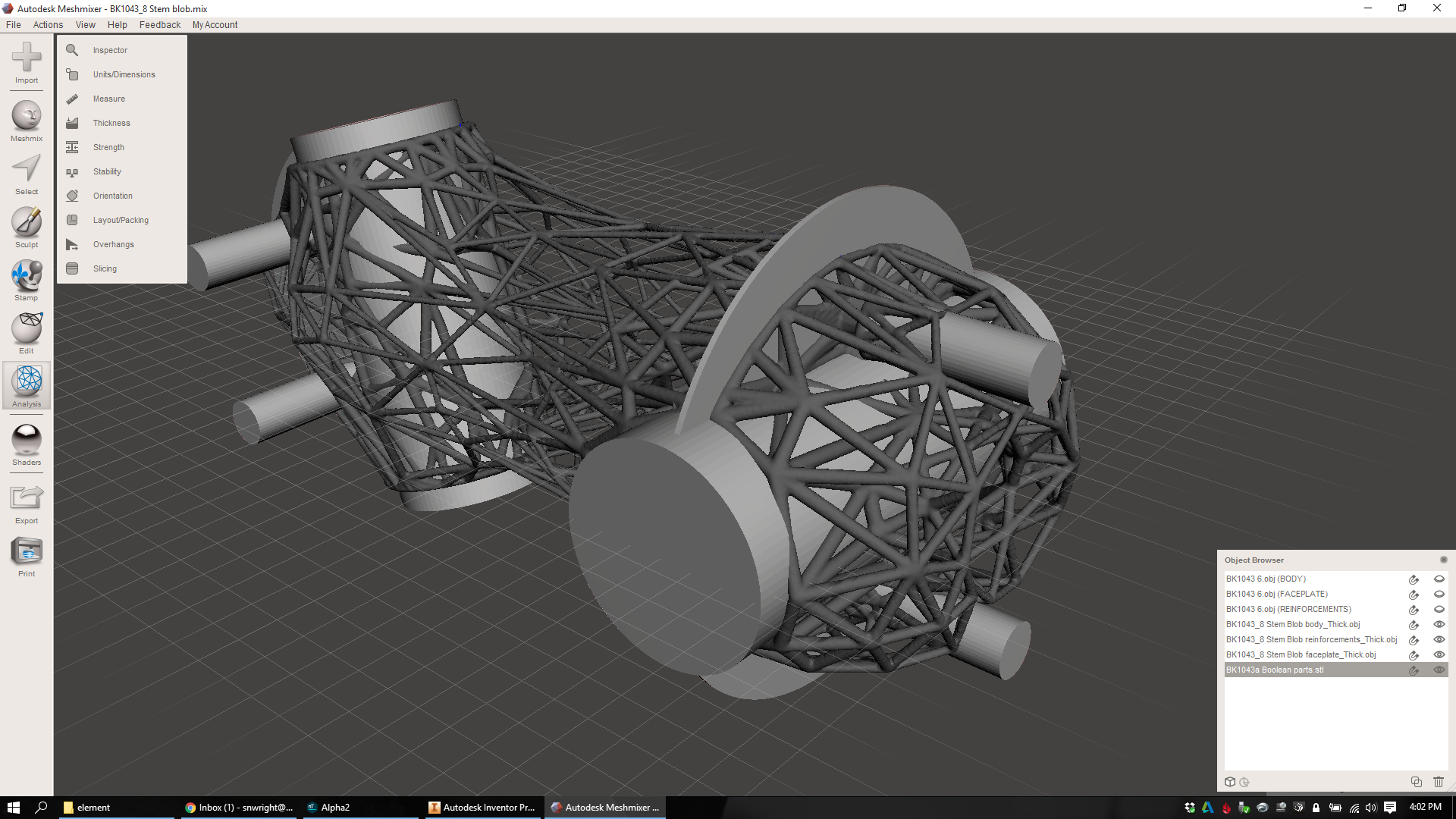
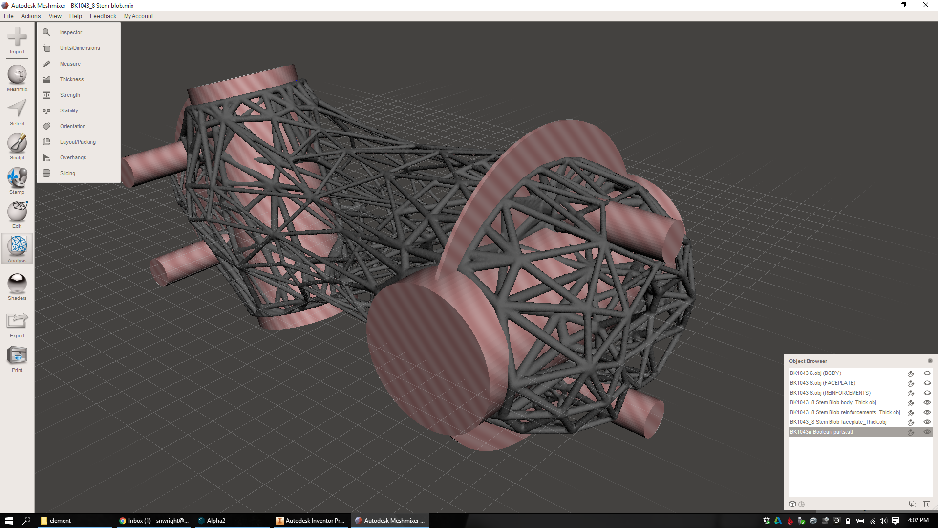
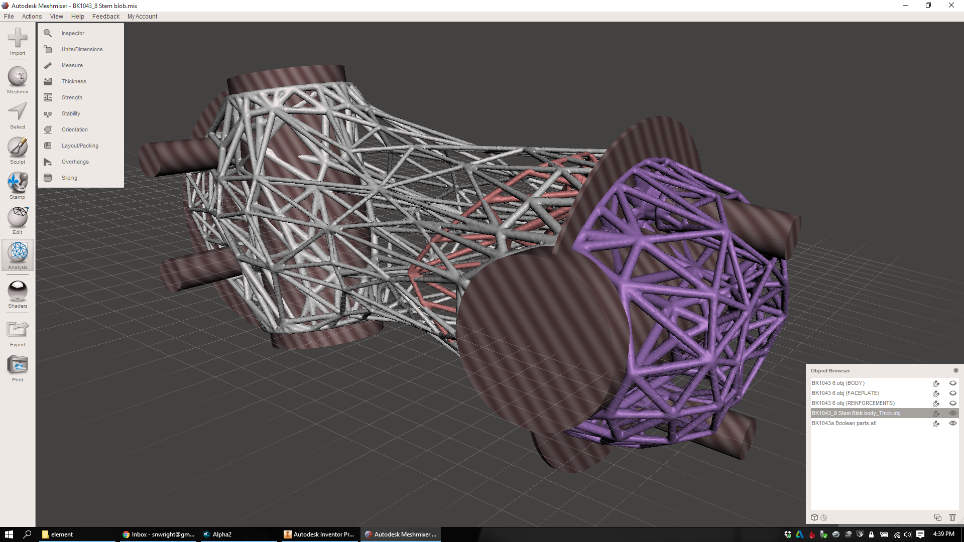
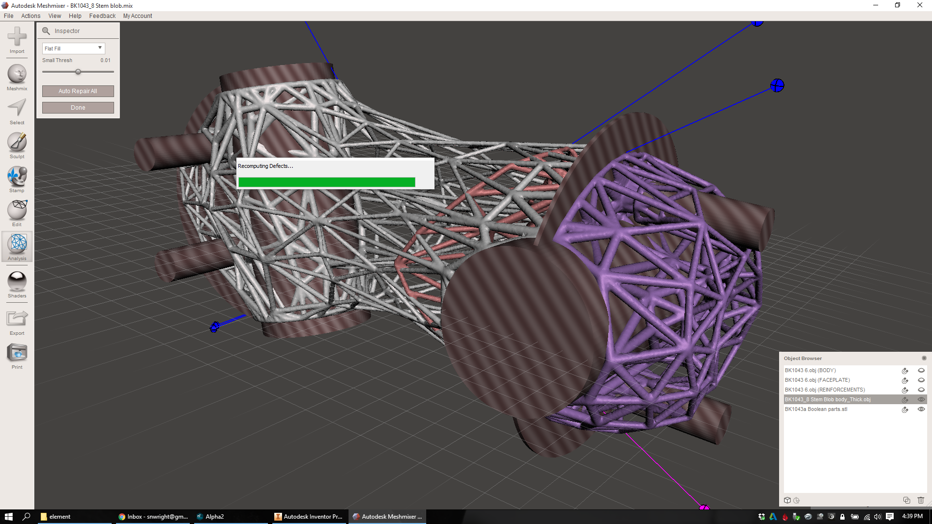
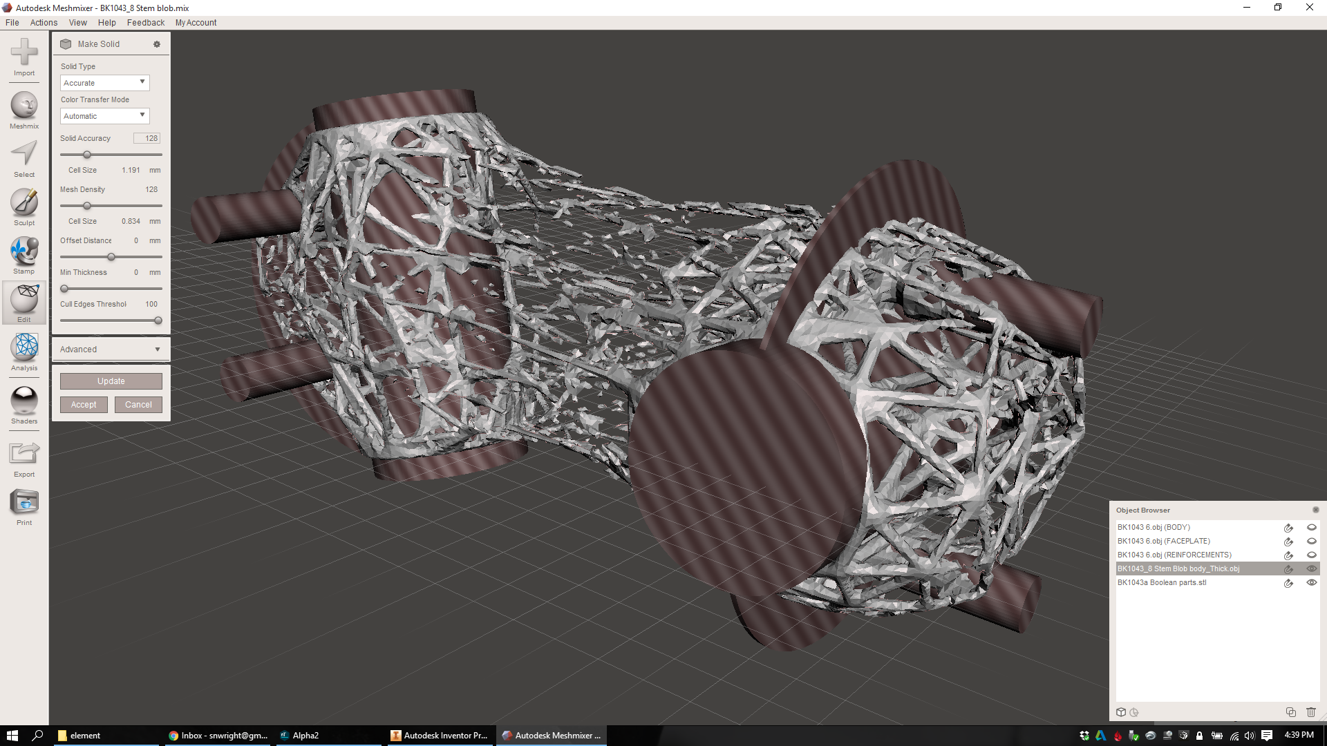
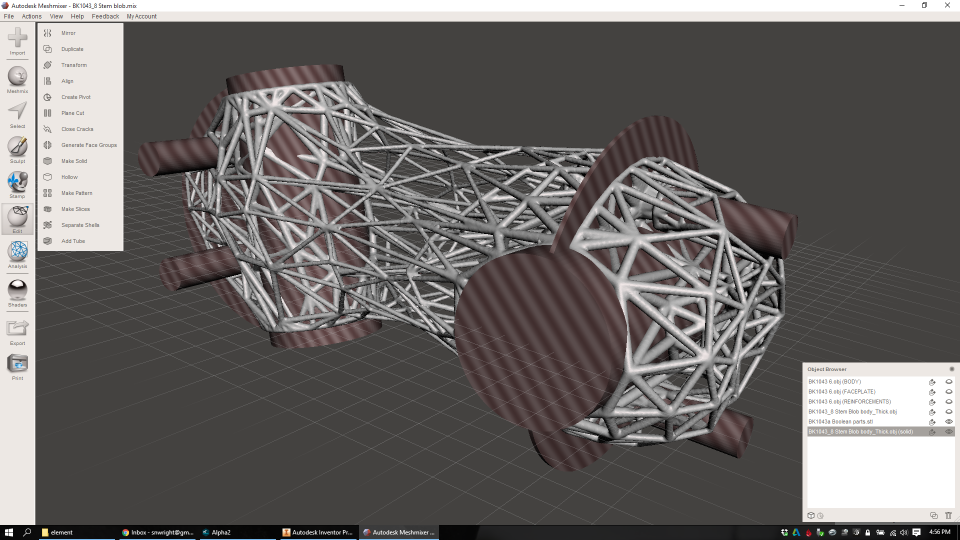
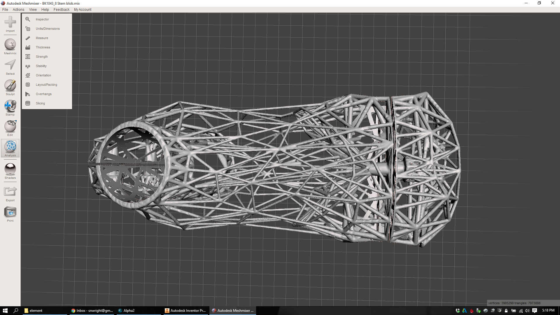
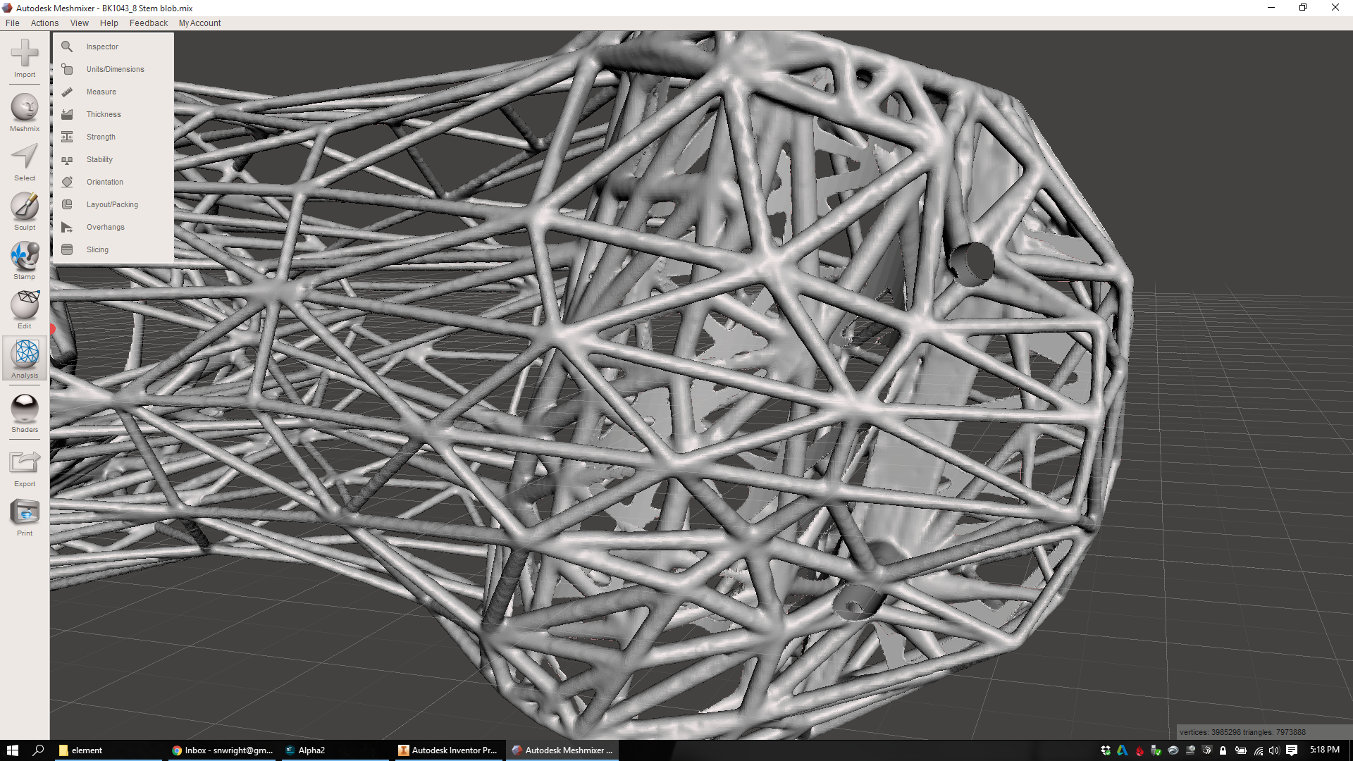
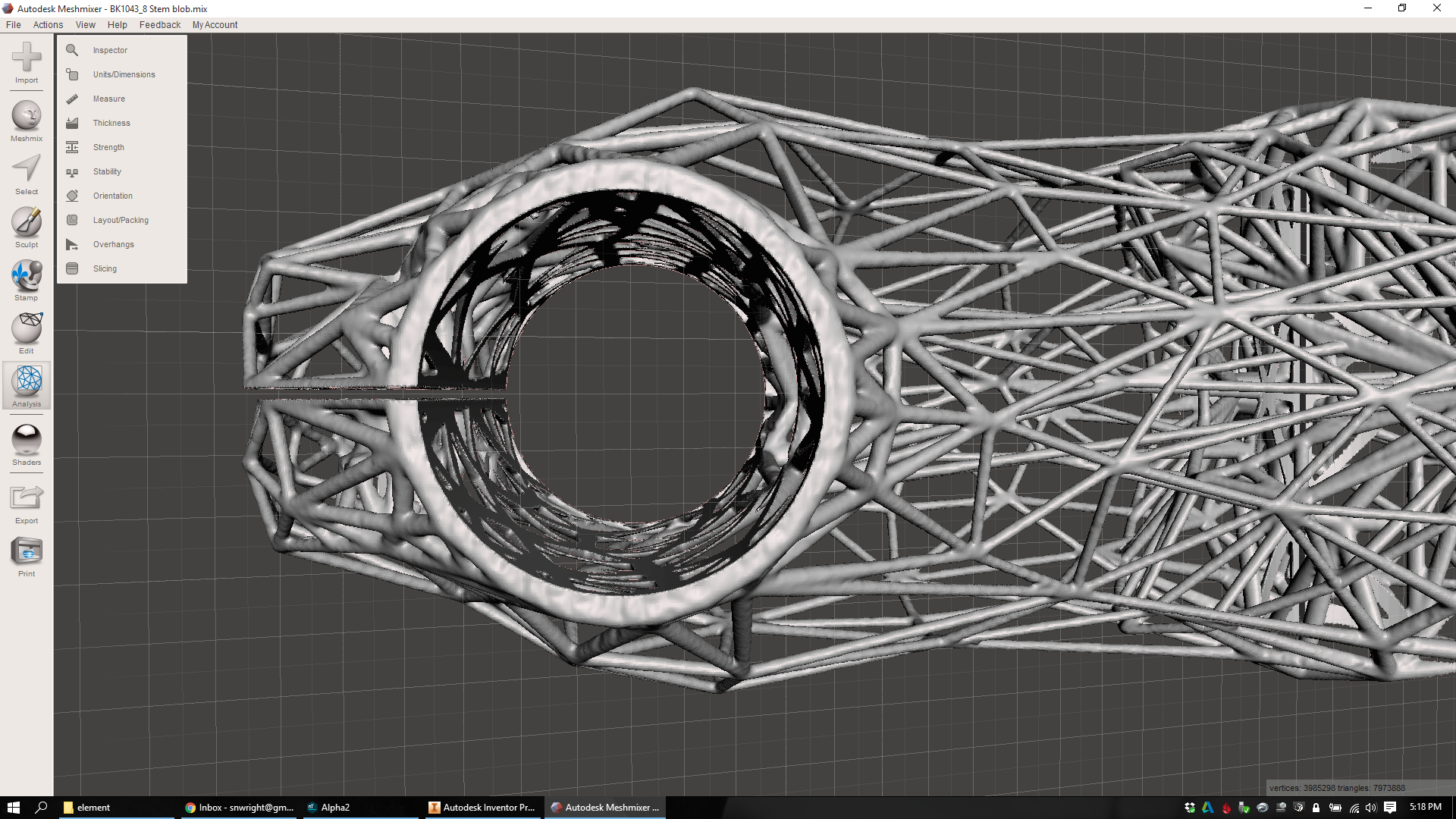
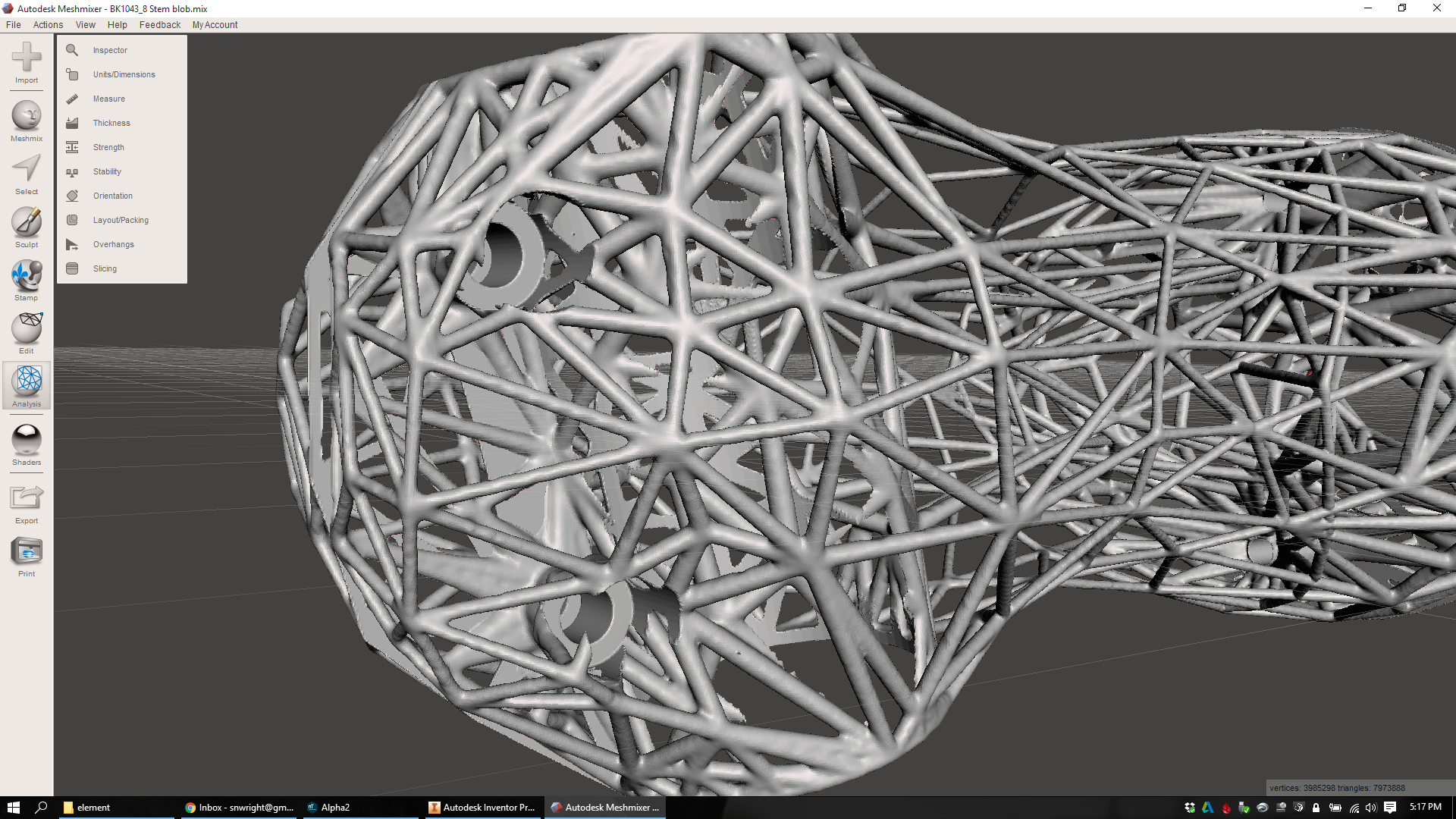
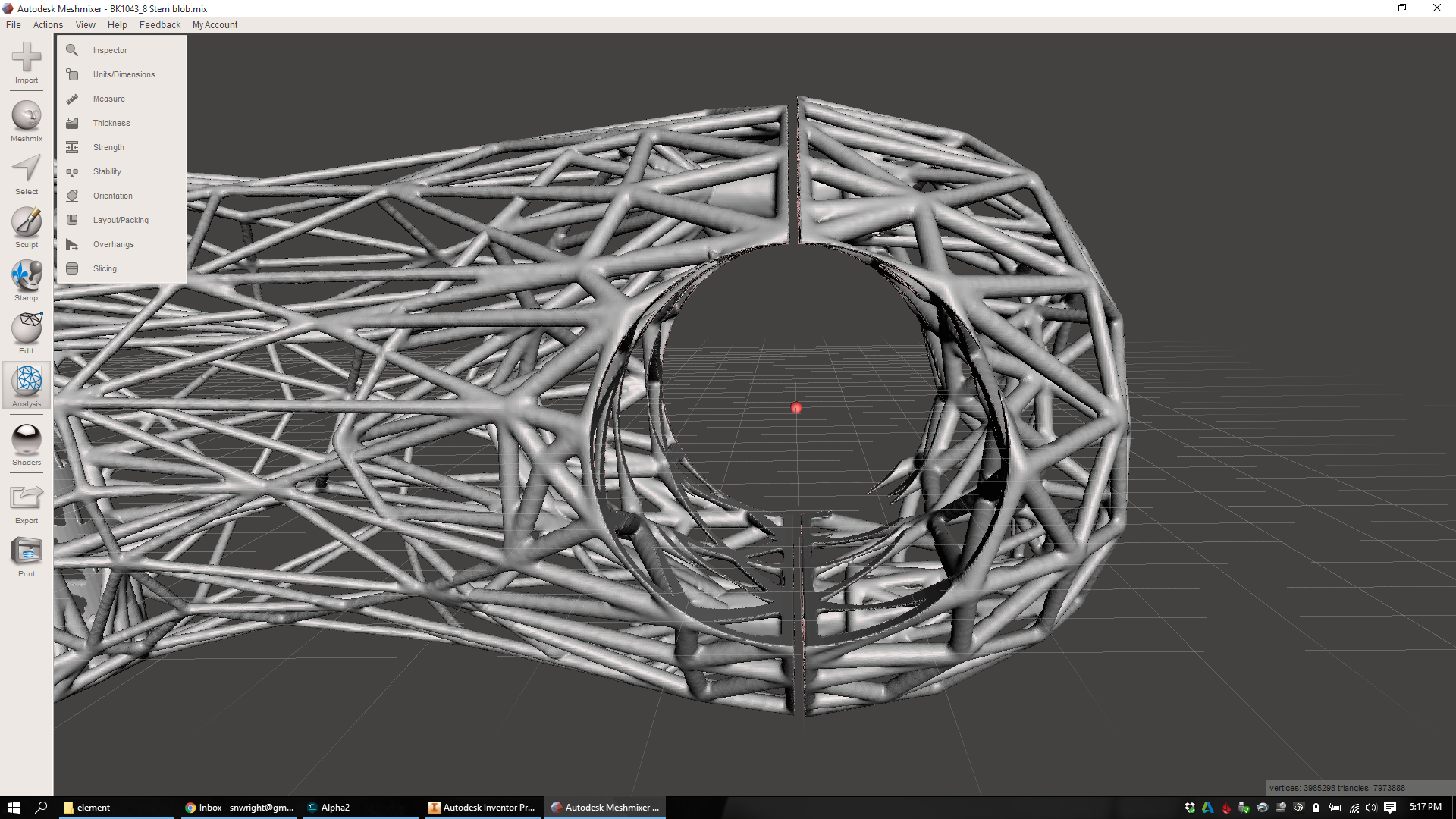
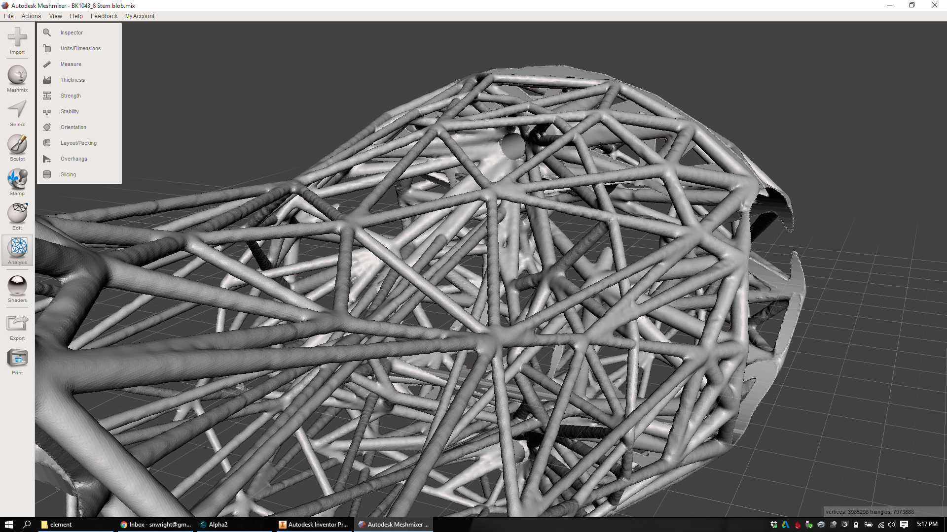
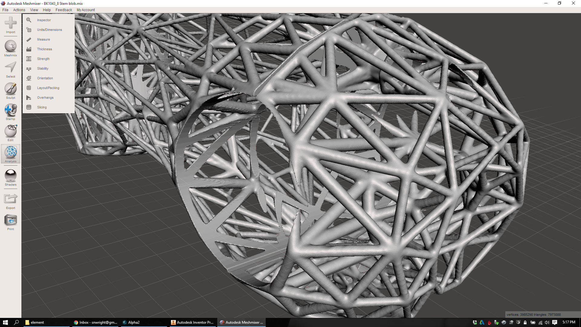
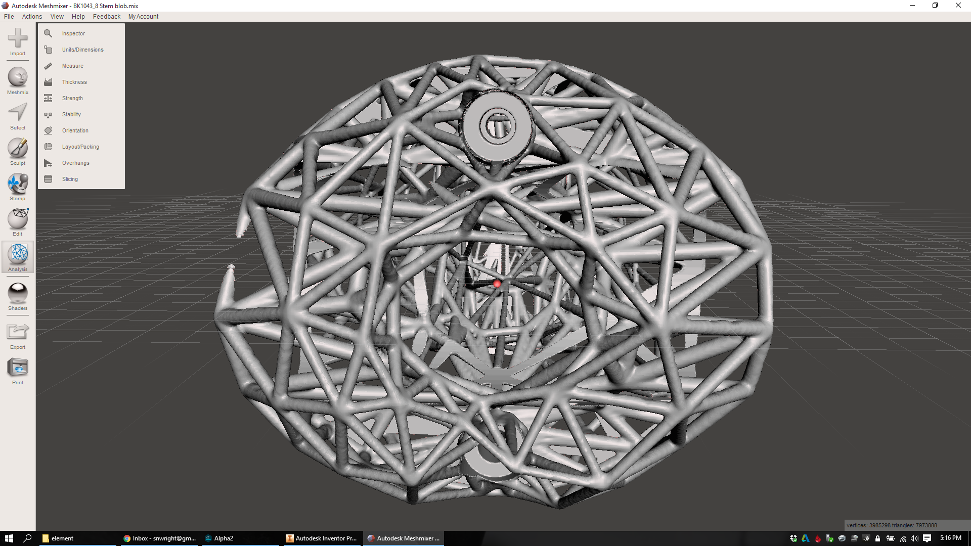
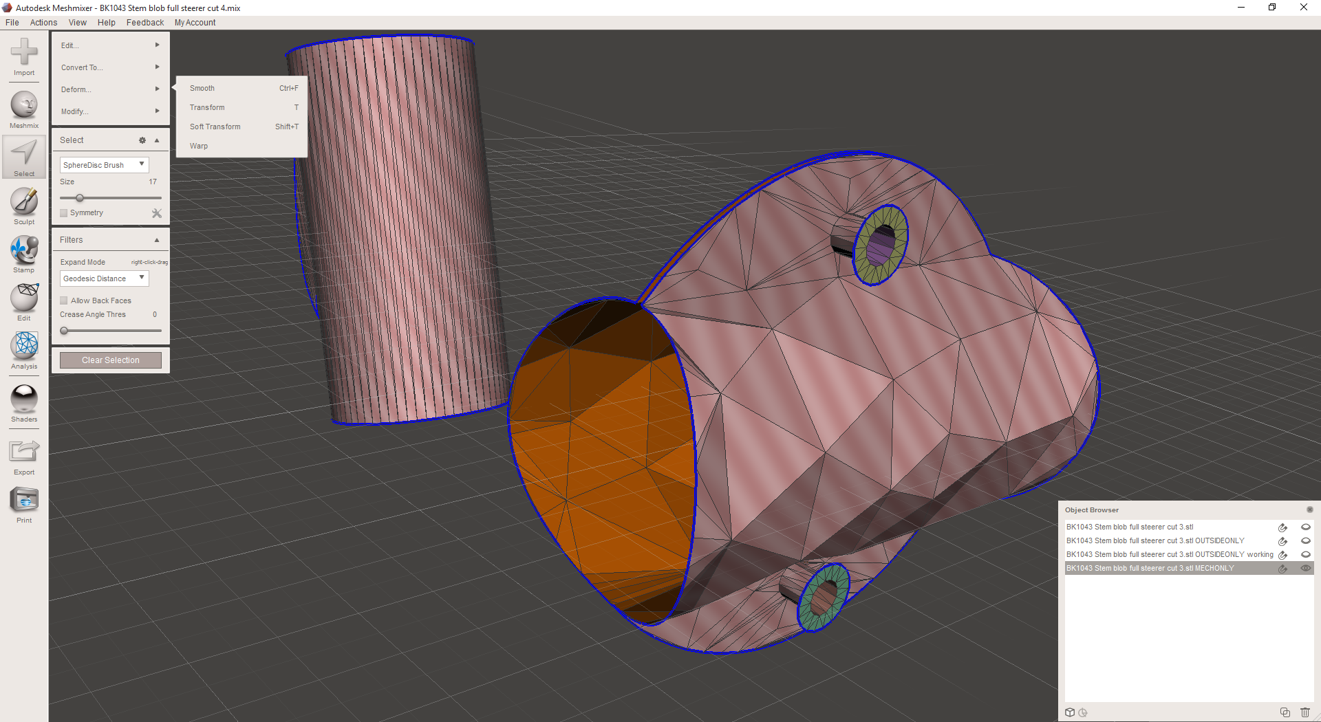
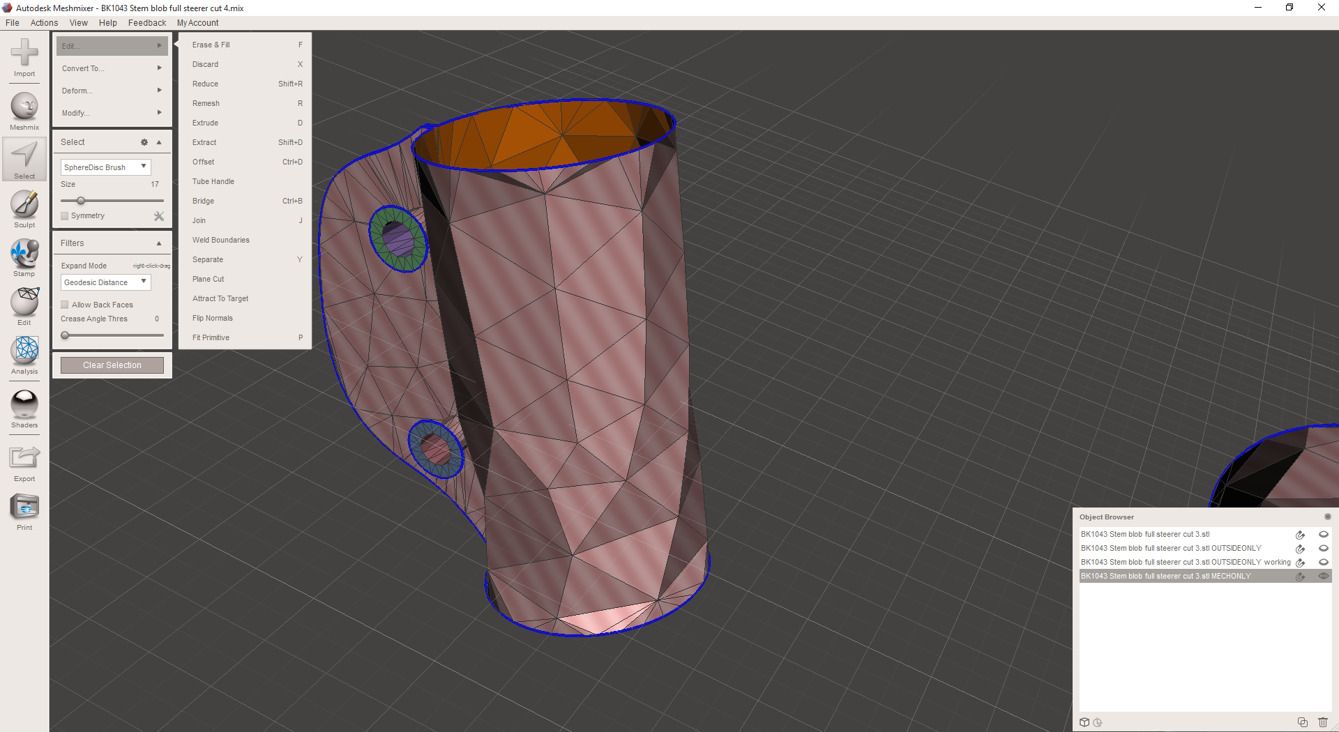
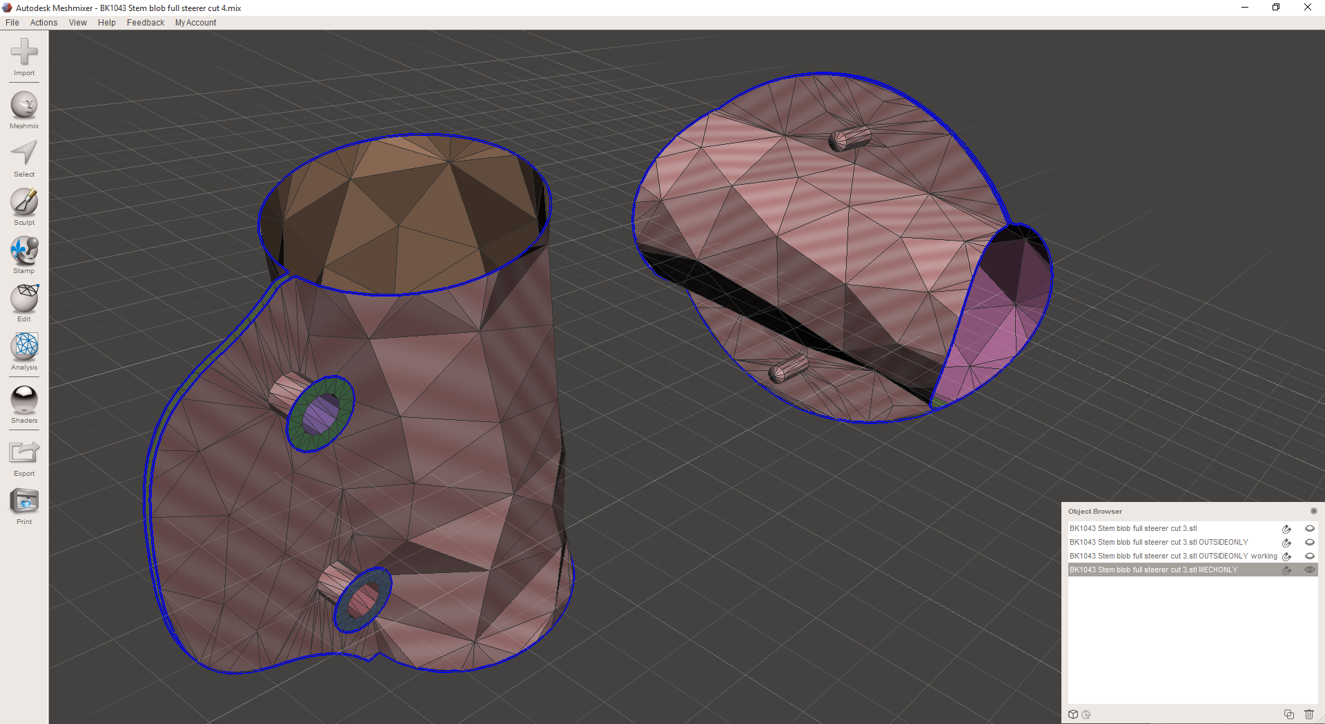
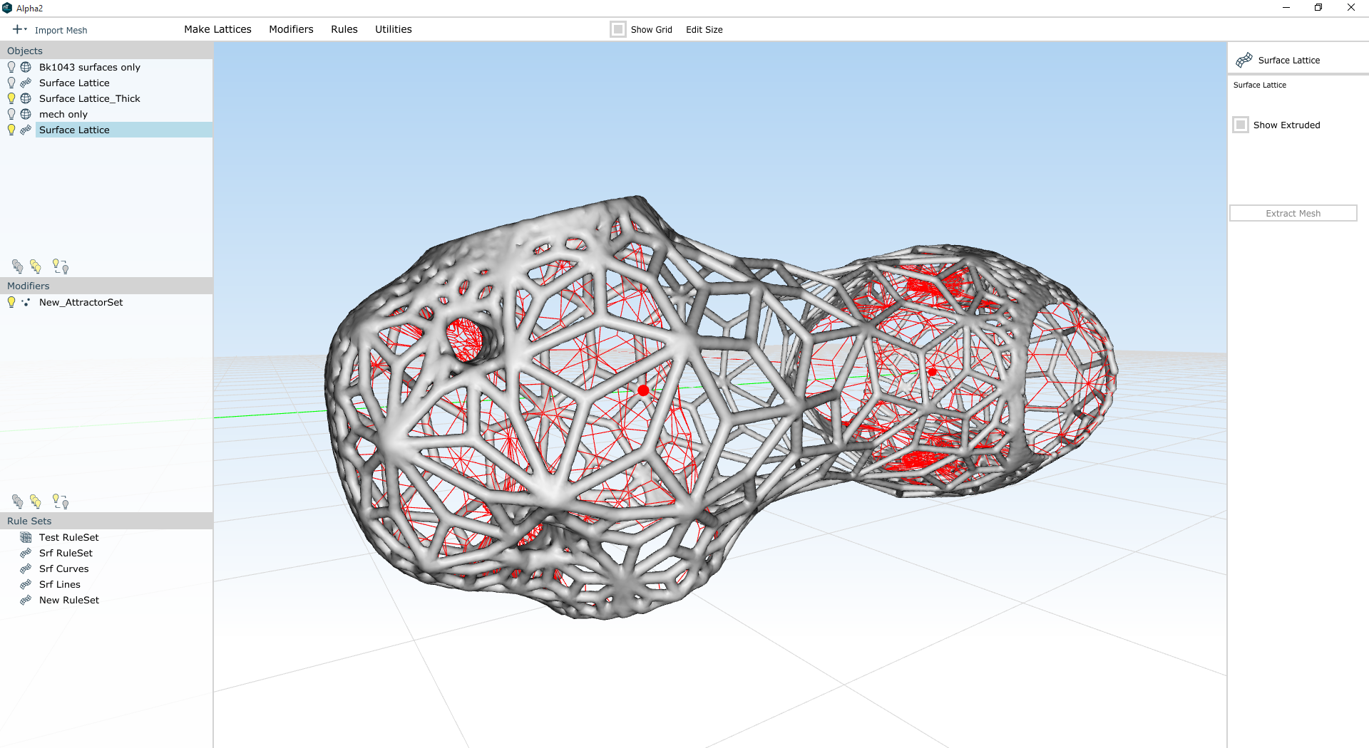
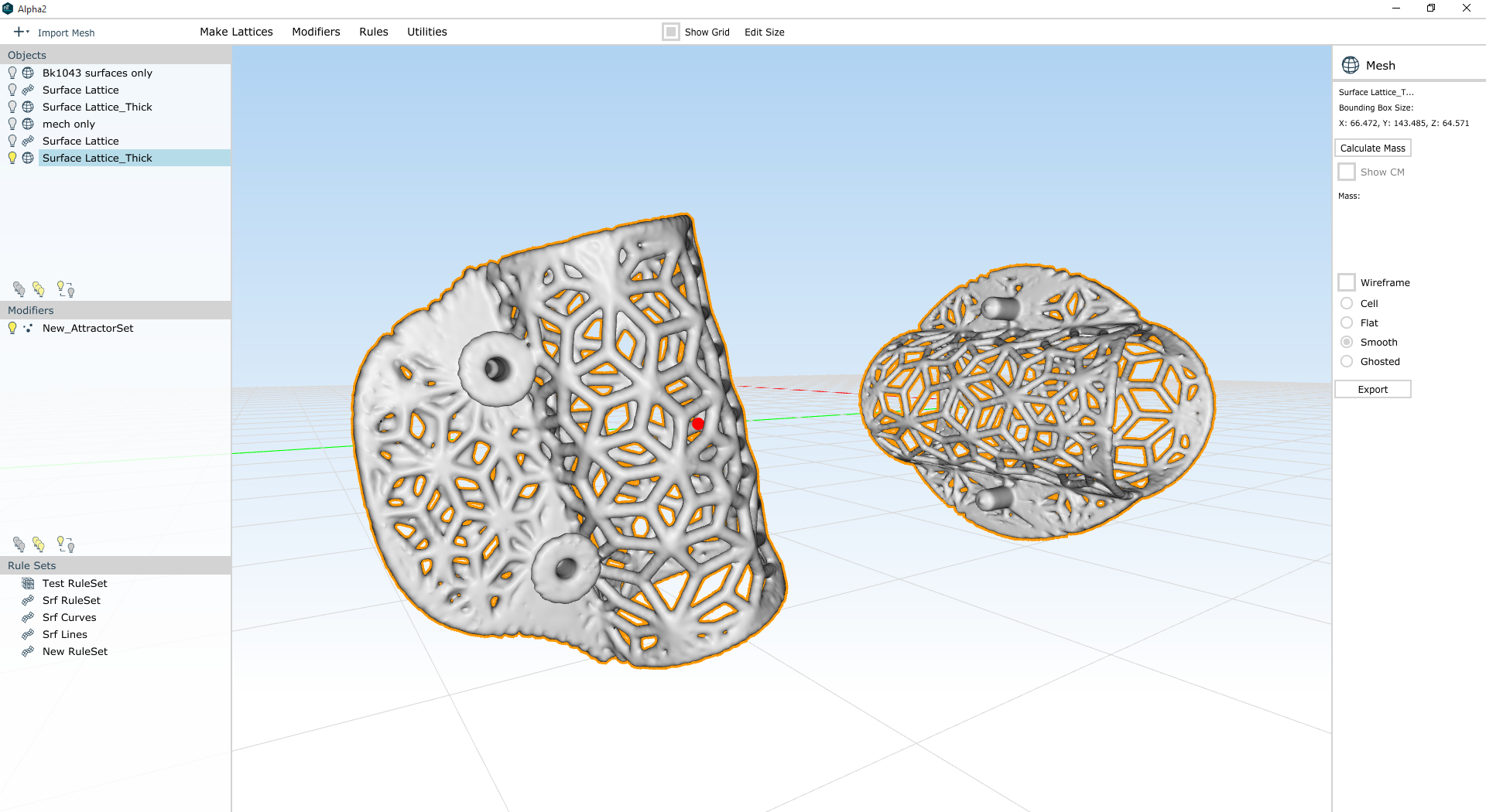
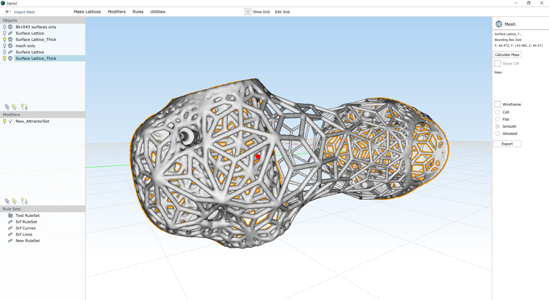
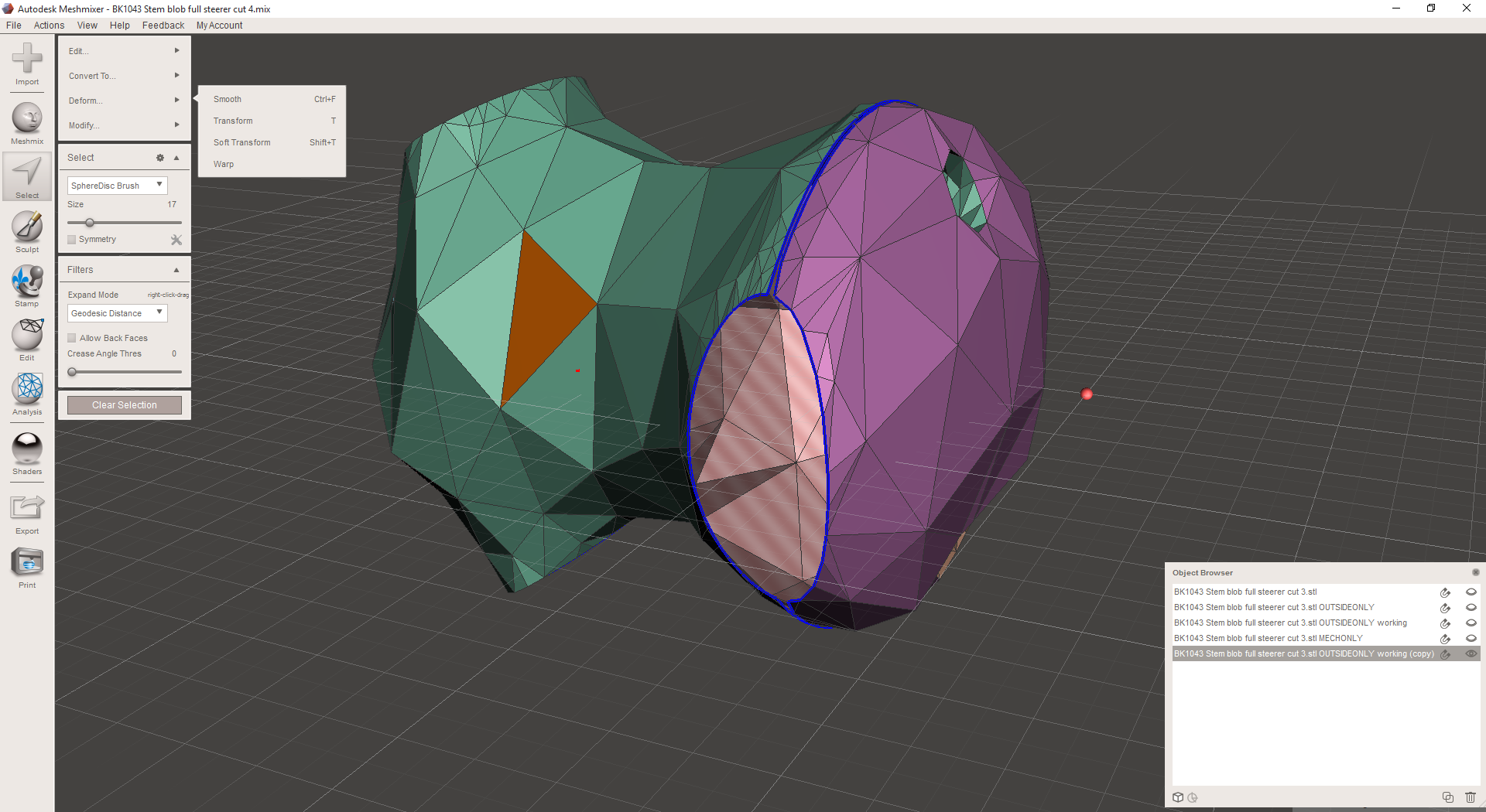
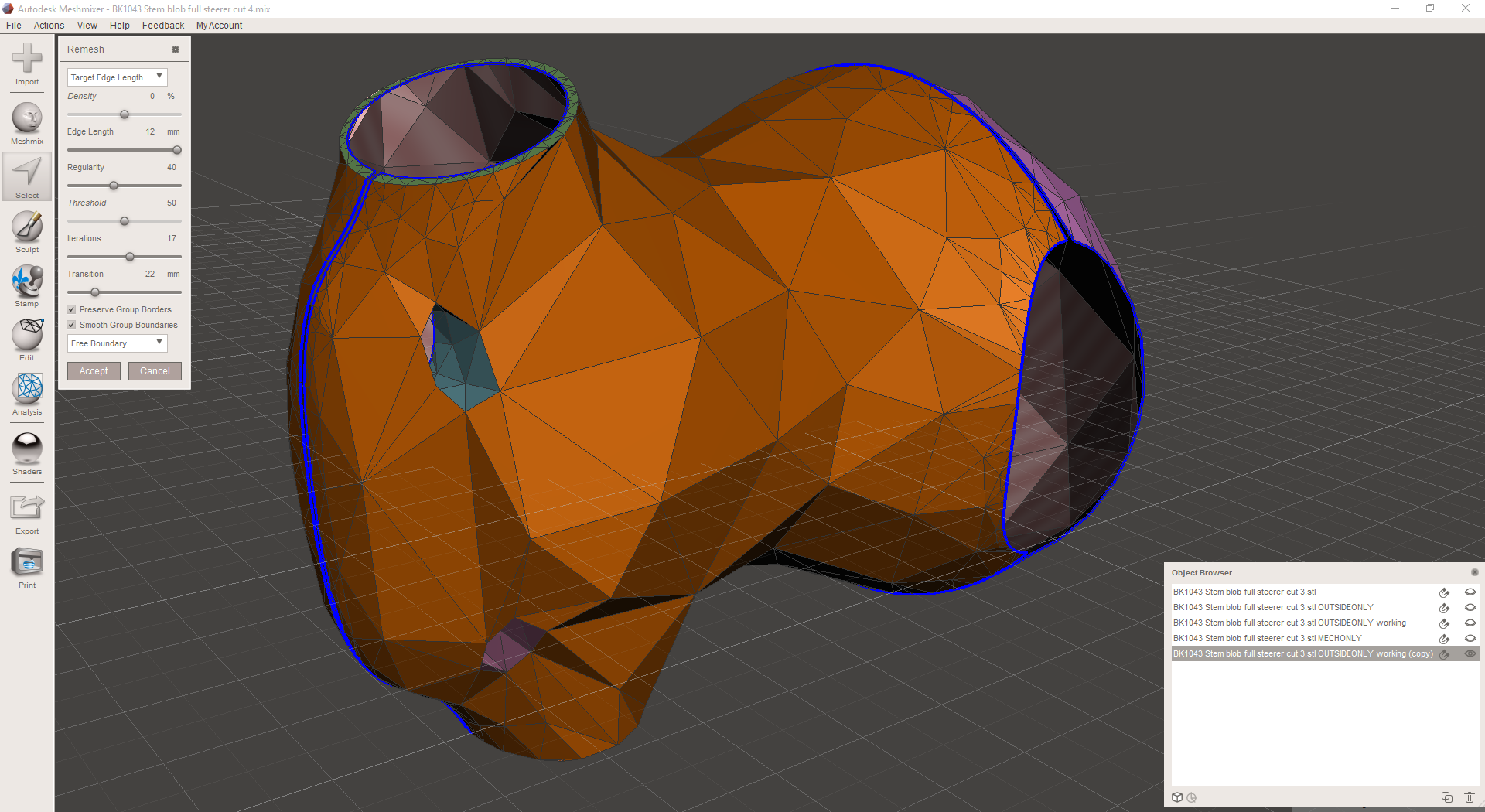
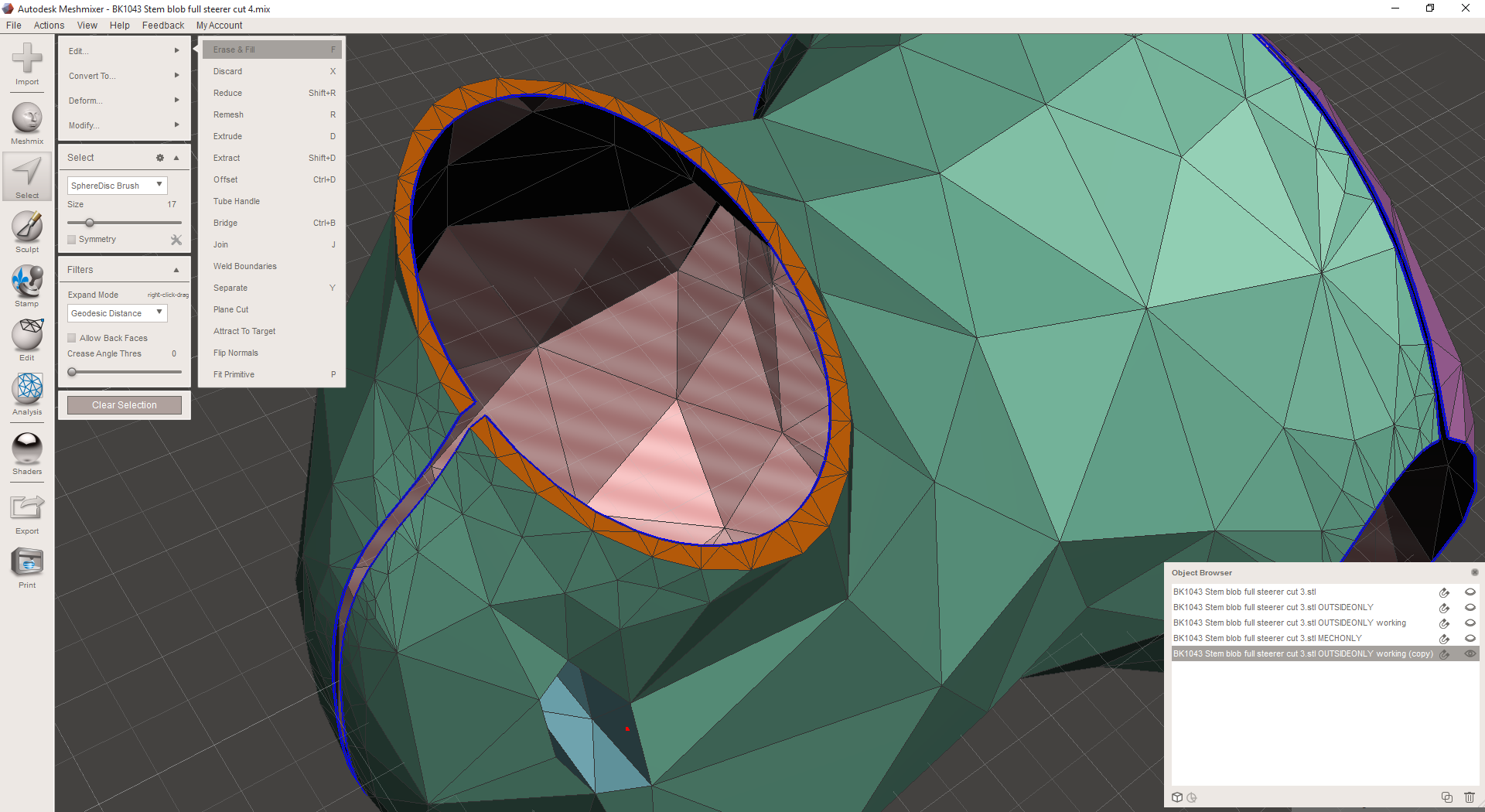
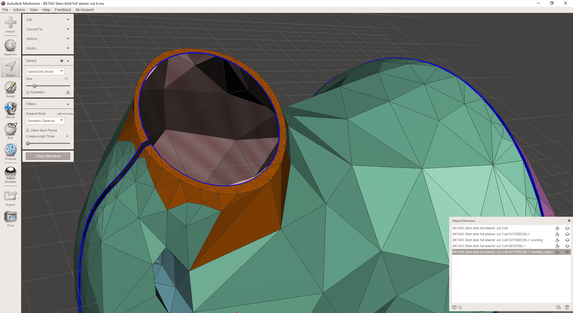
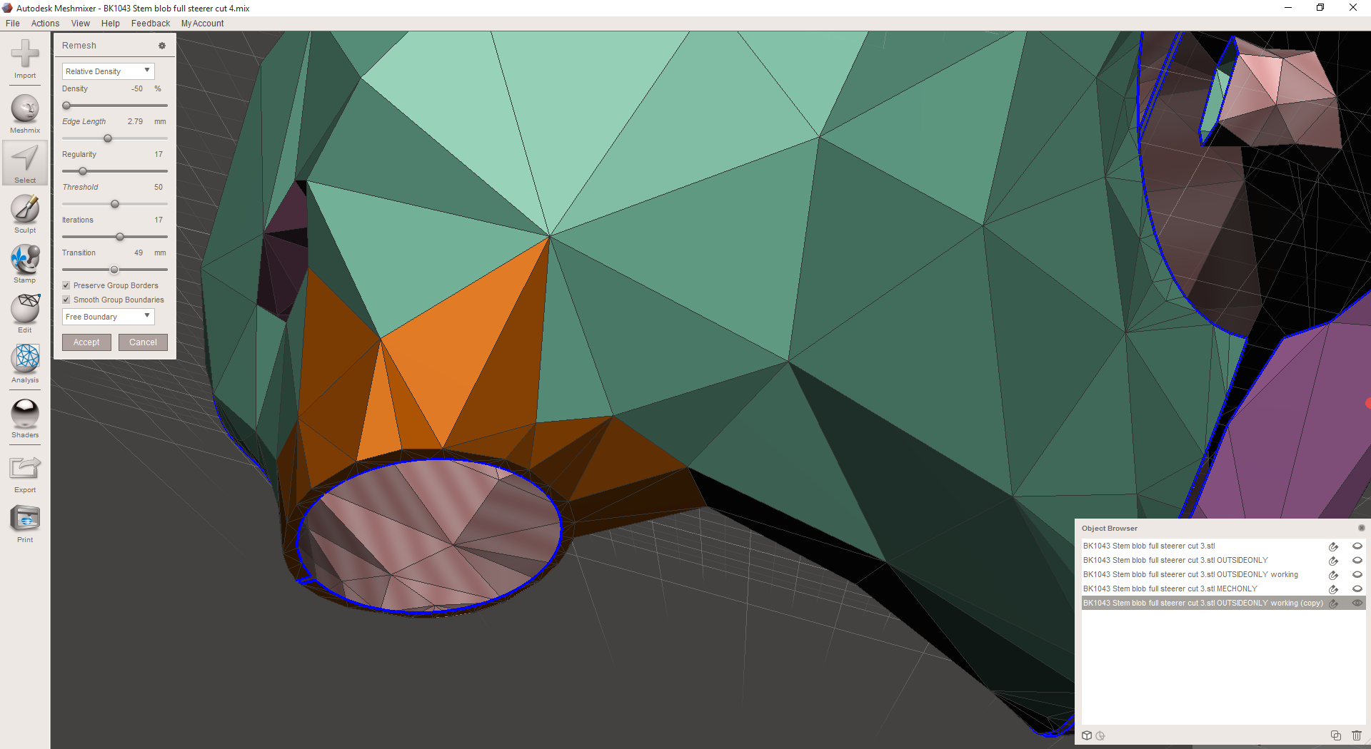
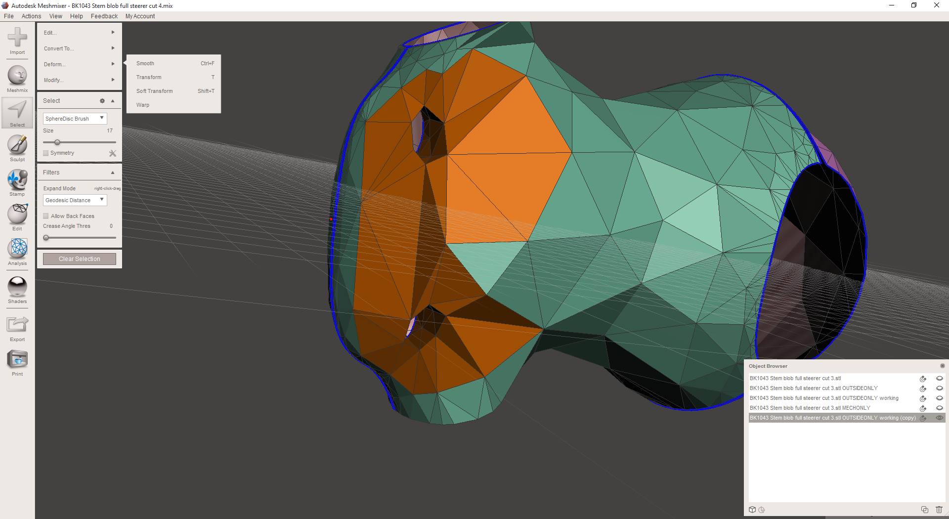
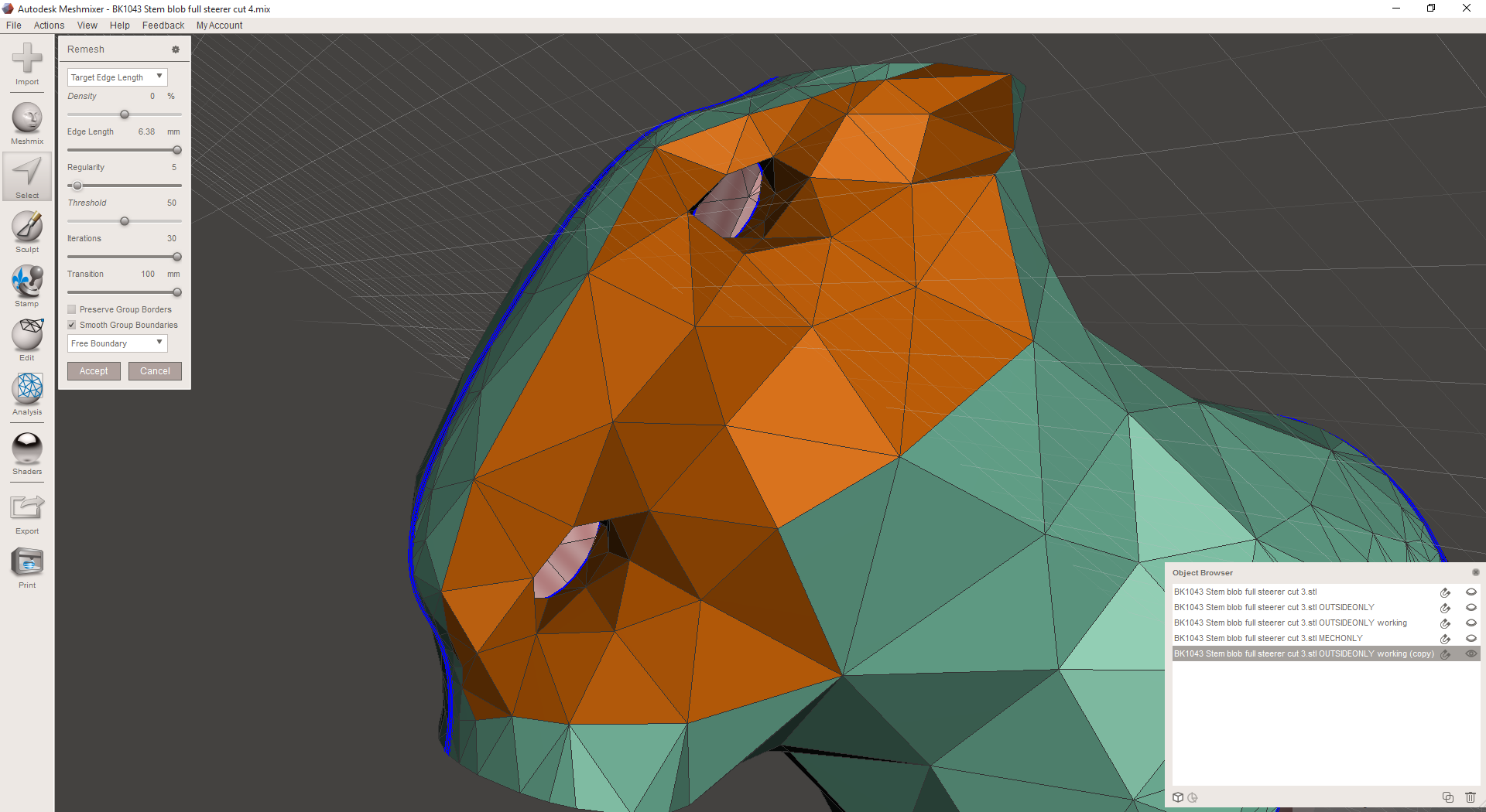
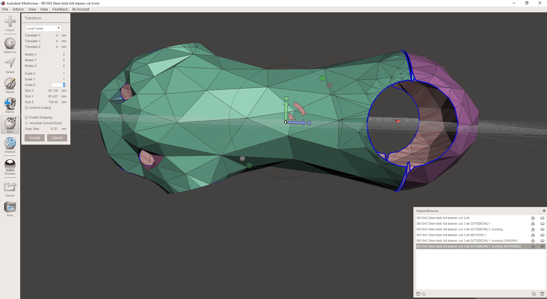
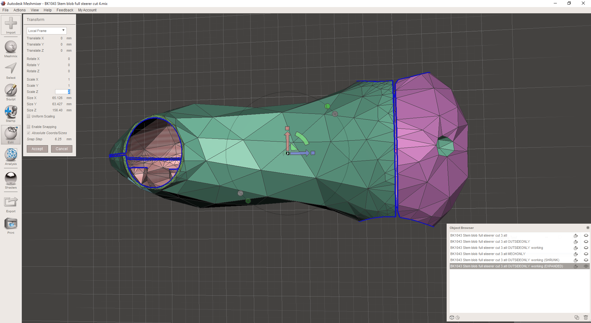
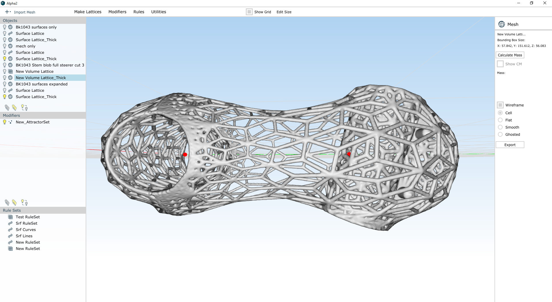
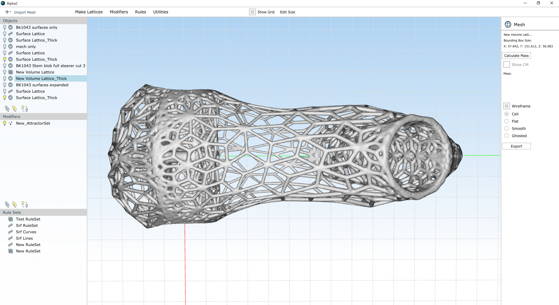
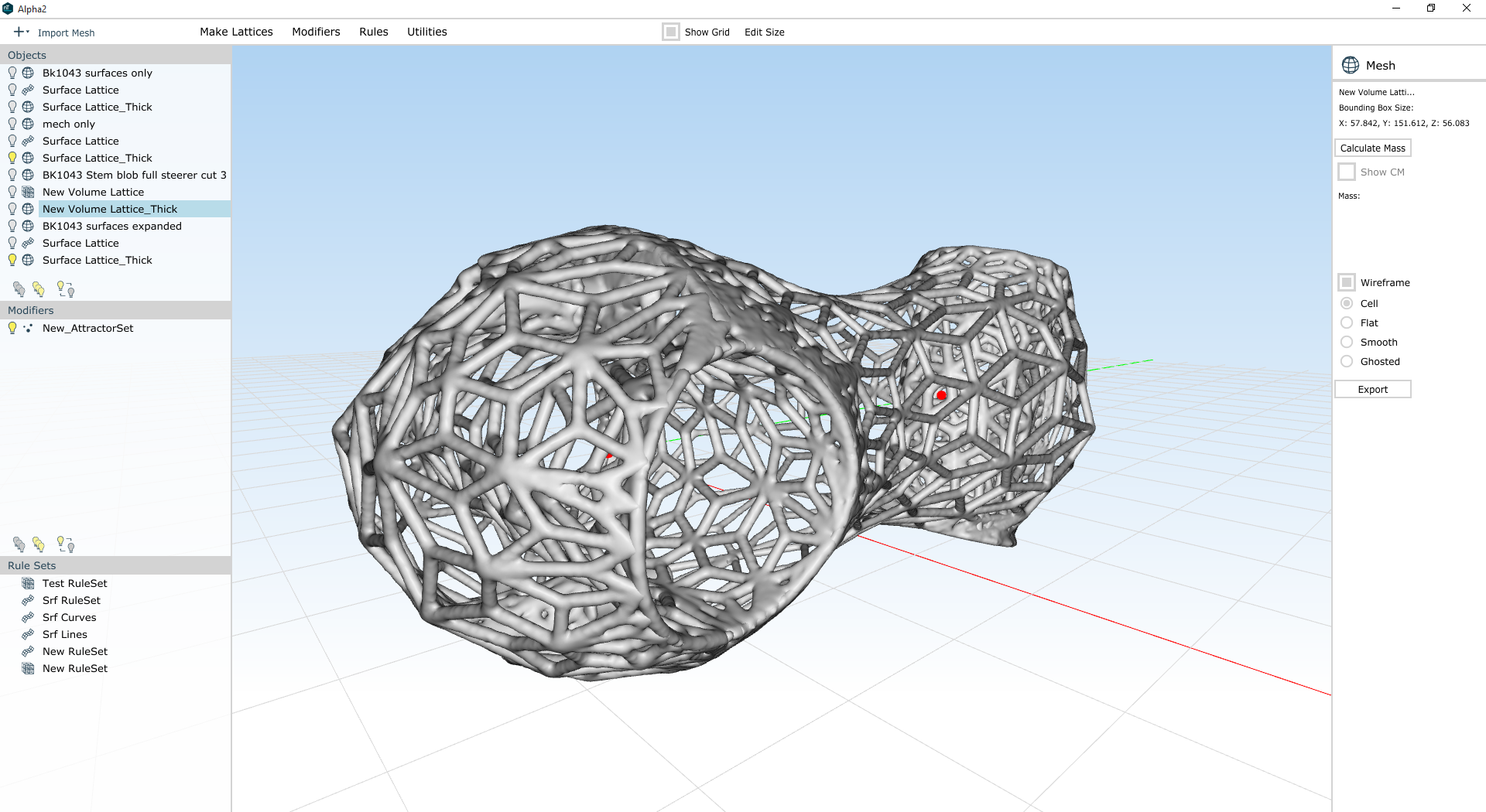
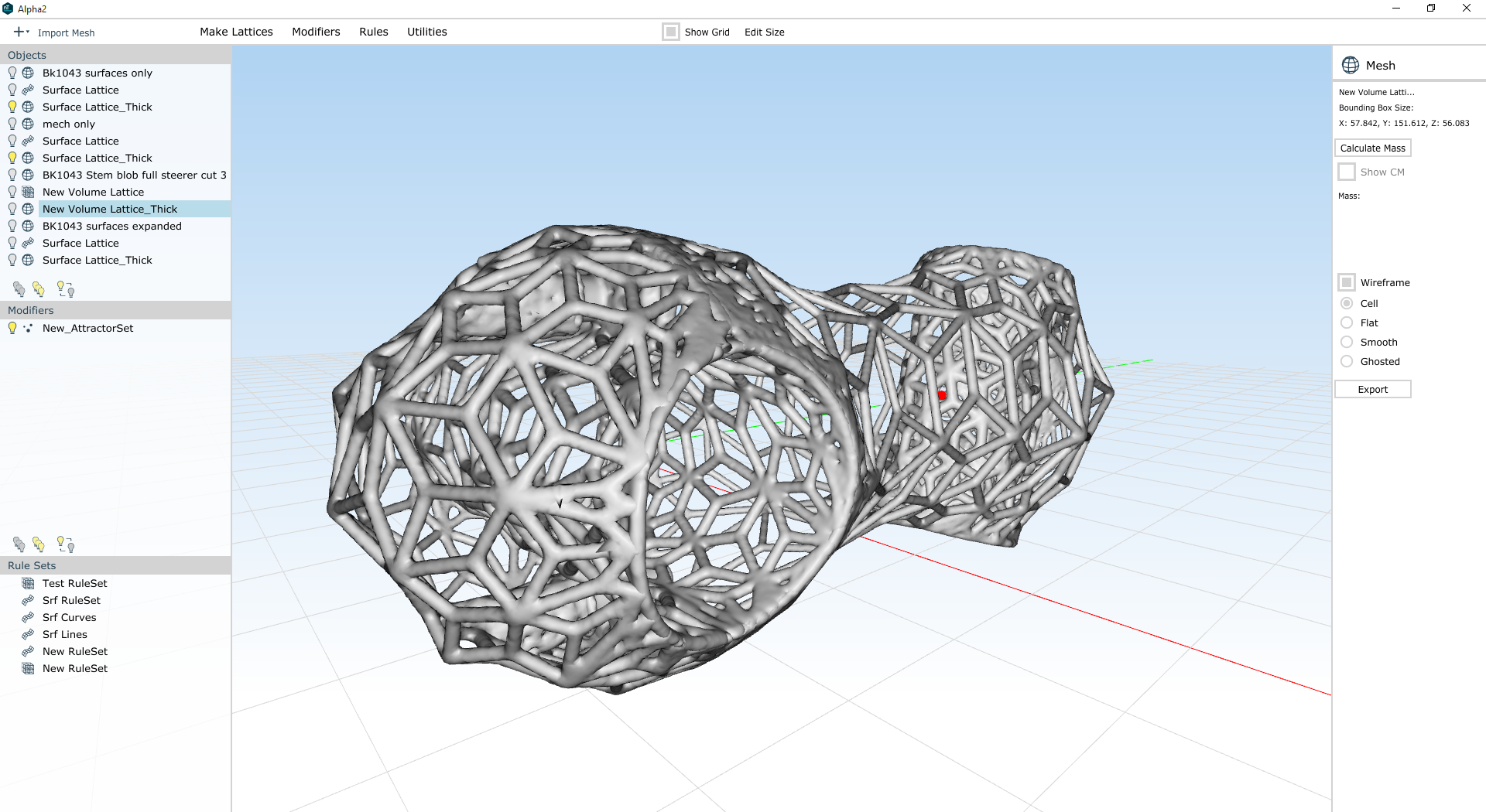
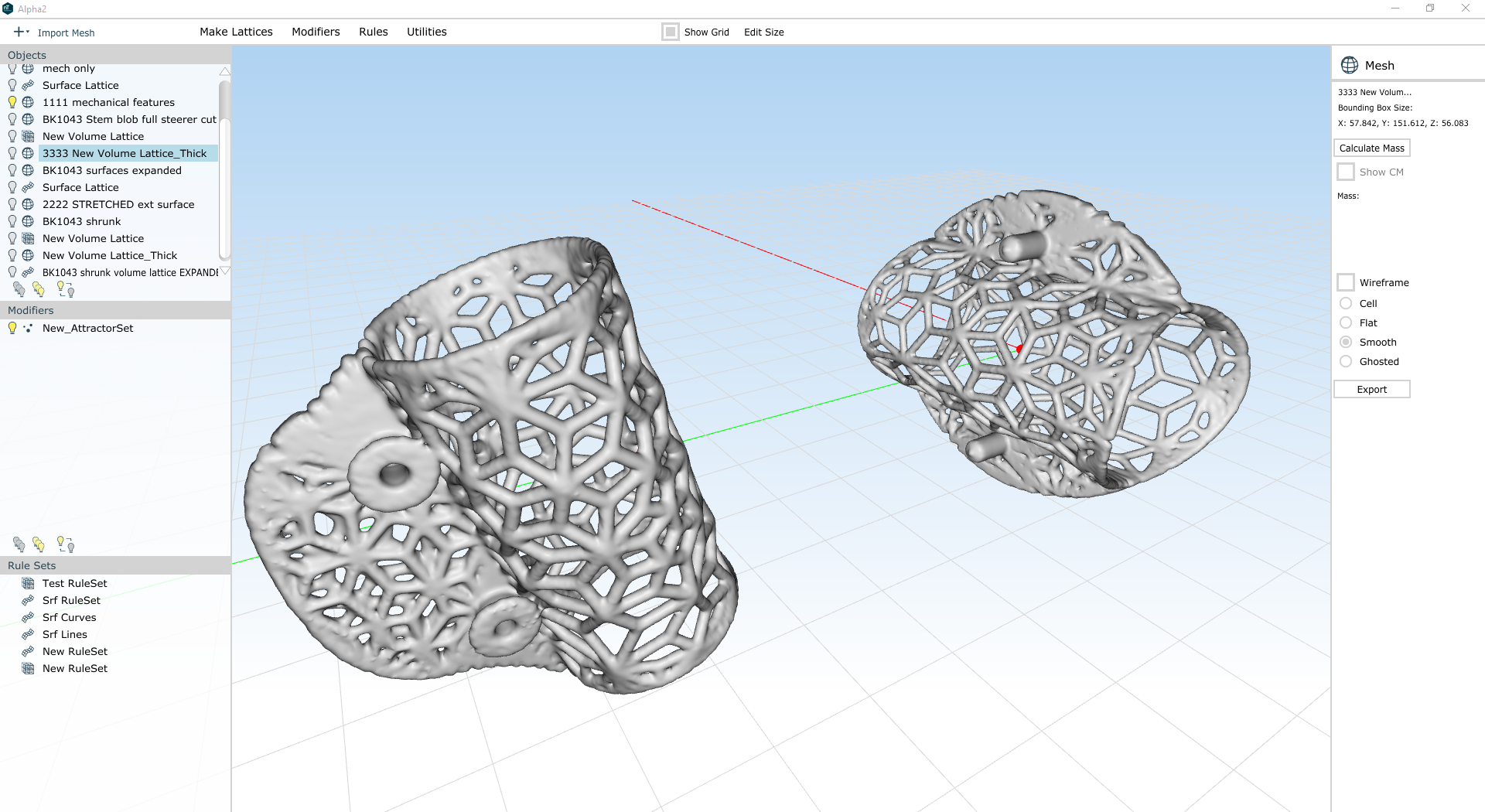
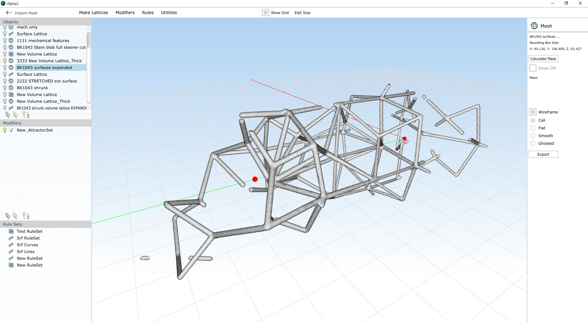
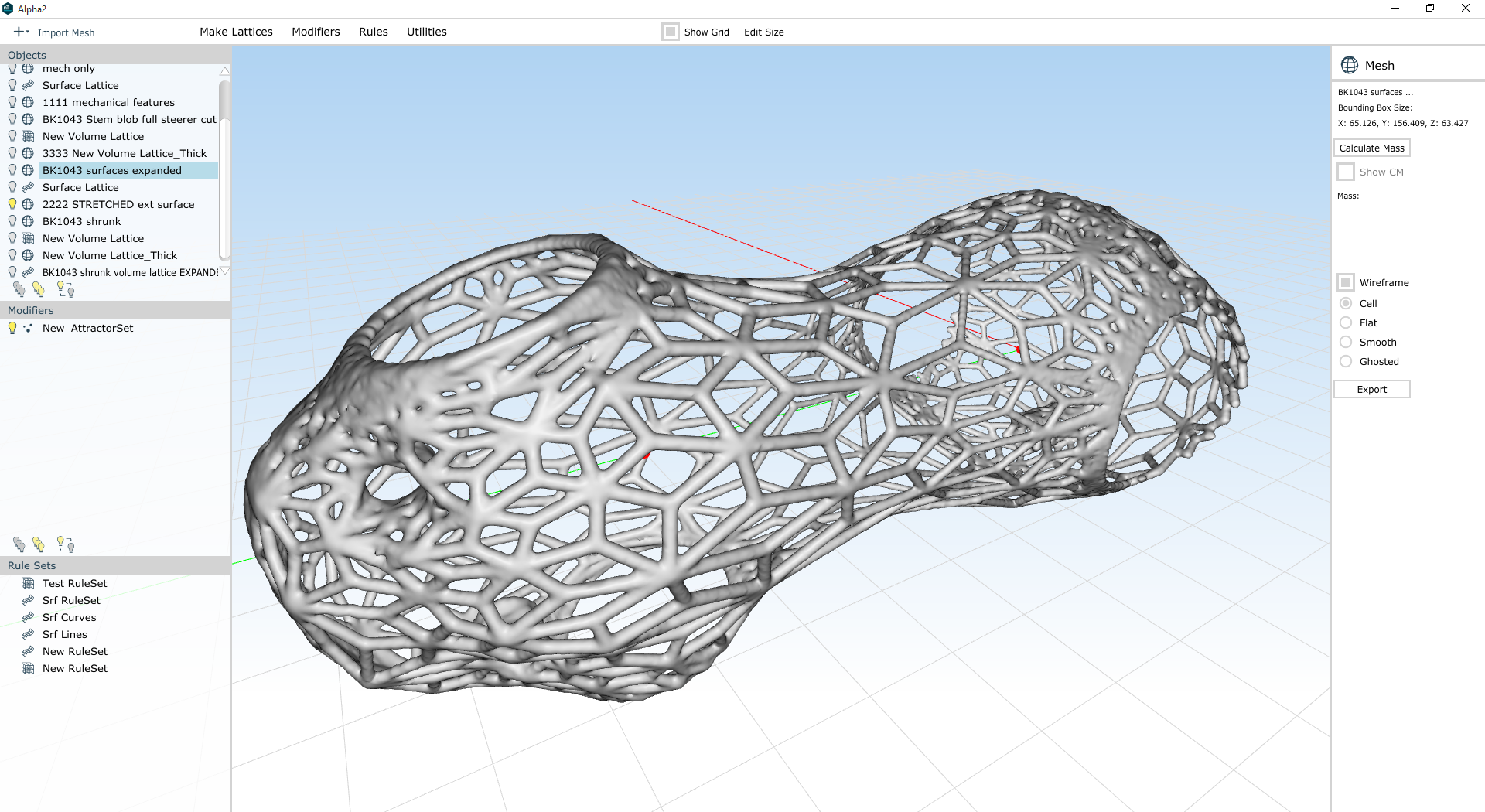
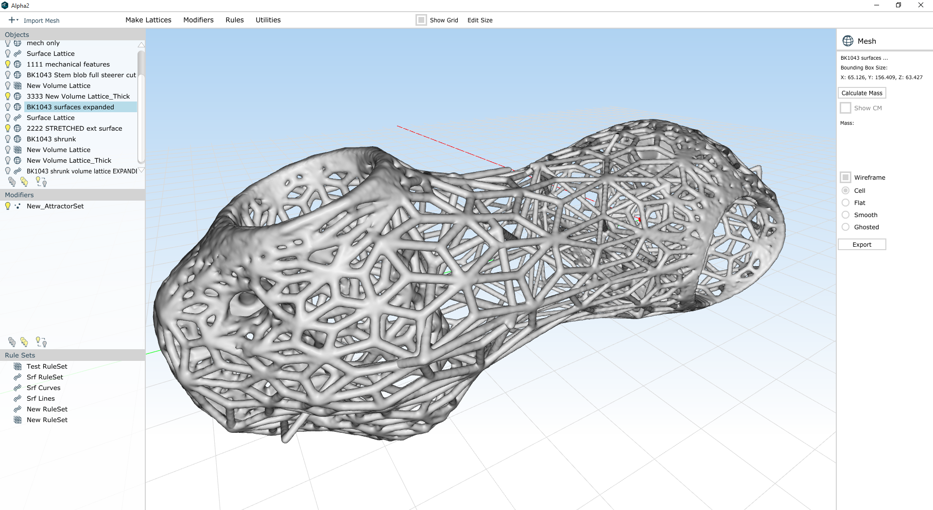
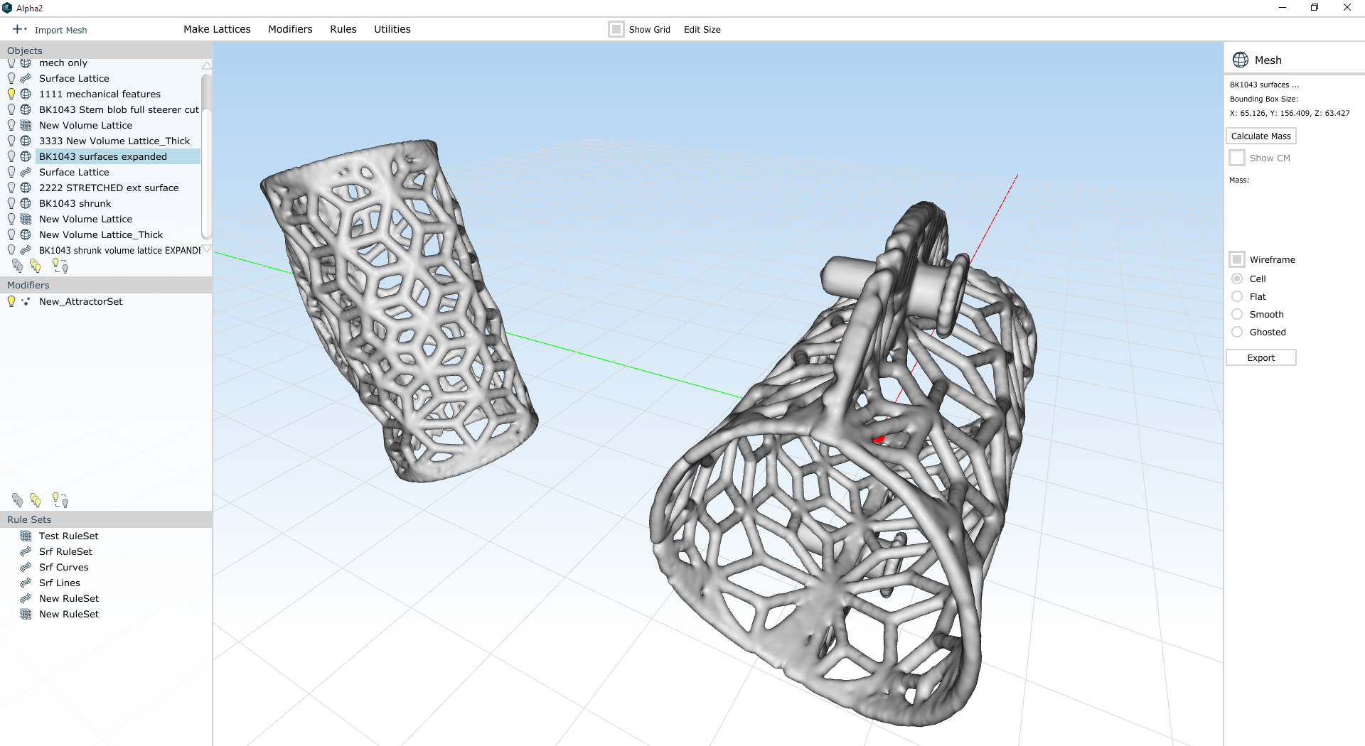
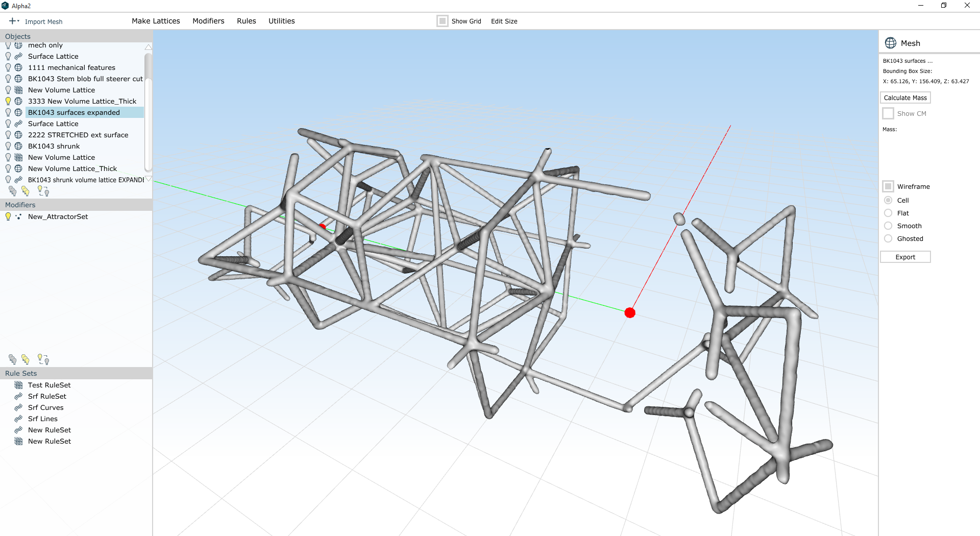
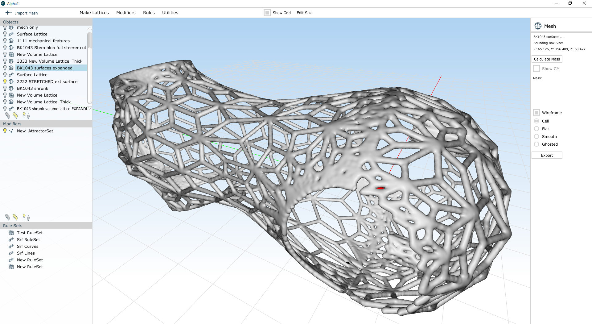
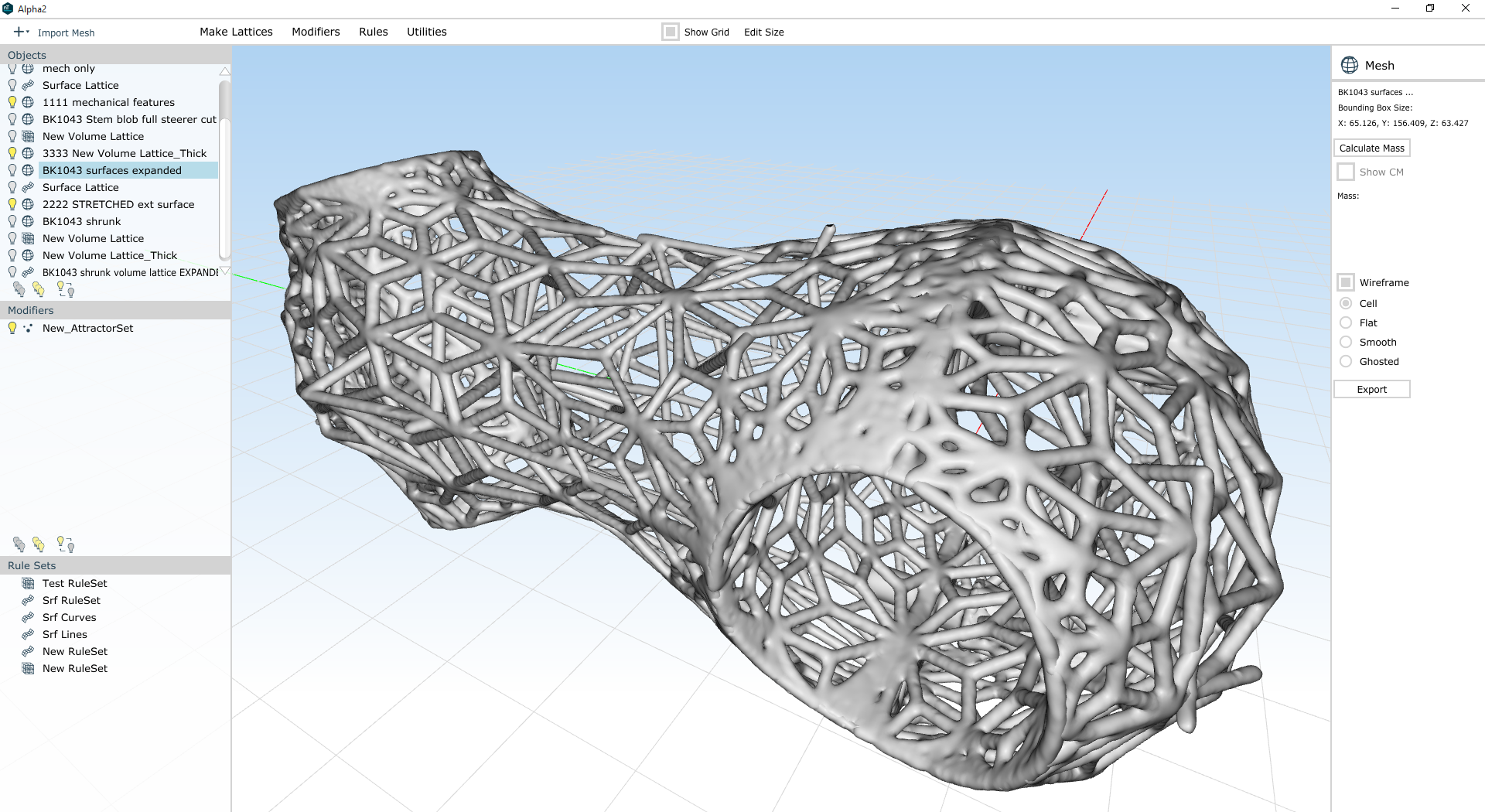
Some semi-random screenshots from a day's worth of lattice design in nTopology Element Pro:

There have been a bunch of big updates to Element recently, and this workflow takes advantage of a few of them. In particular, the new Warp to Shape tool is very helpful; I also used the Extract tool and the Remesher to make some nice selective surface lattices.

The last, and really the biggest, thing here is the conversion into Abaqus for beam analysis & sizing optimization - see the last photo above. I'll be working on & posting more about that in the next few days - stay tuned :)

New desk

Added on by Spencer Wright.

About a year ago, when I refurbished an old Wilton vise for my home office, I noted that I intended to build myself a new desk as well. Like many projects, I ended up moving a bit more slowly on that than I expected - which in this case was convenient, as it allowed me to settle into a new house and think about what my work will look like over the next few years. And so last weekend I opened up Inventor and started putzing with my desk design again:

Like so many of the things I've designed in the past few years, the idea here is to use modern materials & assembly methods, and make something that is highly functional and also aesthetically pleasing. The tabletop will be lab-grade phenolic resin - a material that is strong, seamless, and durable to impact, scratching, and liquids. The legs will be monofilament wound carbon fiber tubing, which I'll probably apply a clear sealer to. And the whole structure will be held together with - you guessed it - 3D printed node connectors.

The exact dimensions and assembly methods are still TBD; I'm also considering a few details for attaching/mounting things (my vise, my monitor stand, lighting, the power strip that I like). I'm also still considering integrating the desk with the 7-drawer tool cabinet that I have, although at this point it's more likely that they just sit side-by-side.

Timeline on this moving forward is... medium? But hoping to show some progress soon :)

(Another iteration of my) Bike stem

Added on by Spencer Wright.

This.

The lattices here were, obviously, designed in nTopology Element Free (which is free!). I happen to have done the mechanical design in Inventor, but the rendering was done in Fusion 360 (effectively free, and totally capable of doing the mechanical design as well). I separated face groups and remeshed surfaces in MeshMixer (free!), and very well could have done the booleans there too (I used netfabb).

^ I just think that's a bit remarkable.

Anyway, it's ready. Printed part (DMLS titanium) soon.
Stem update

Added on by Spencer Wright.

A friend asked me yesterday what was going on with my lattice bike stem design, and after telling him that it's been on the back burner I played with it a bit and made some real (if subtle) improvements. 

First, I should note here that I'm *not* worrying about overhanging faces. That's mostly because I'm working at nTopology to break down manufacturability of lattices into its component parts, and am tabling all of my DFM concerns until I have real data to back them up. In addition, I'm focusing on using variable thickening to maximum effect right now. I've used variable thickening a lot in the past, but the next software update of nTopology Element pushes it even more into the forefront, and I want to dogfood myself a little before we release it into the public :)

I don't have screenshots of the whole process, but this part was designed in much the same method that I was using last fall. I used Inventor to make a design space, and Meshmixer to generate surfaces to grow a lattice on. Then I used Element to:

  1. Create a surface lattice with beams at every edge in the Meshmixer model
  2. Create a volumetric lattice (based on a hex prism cell shape) inside the part
  3. Merge the two lattices by snapping nodes on the volumetric lattice to nearby nodes on the surface lattice
  4. Creating attractor modifiers at locations that I know I'll need more thickness in my lattice, e.g. mechanical features
  5. Applying variable thickness to the lattice based on those modifiers
  6. Refining the resulting mesh & reintroducing mechanical features via Booleans

The trickiest thing by far here is setting the attractor modifiers to the right range & falloff. I've got three things going on here:

  • Bolt holes. These need to be maximum thickness (1.5mm) to accept threads and distribute the load from the bolts.
  • Clamp surfaces. Where the stem clamps to the steer tube and handlebar, the part needs to have relatively high surface area. All lattice beams should lay on the surface itself, and thickness should be high as well.
  • Mechanical stress. I haven't done a full analysis of this part, but in general stress will be concentrated near the clamp surfaces and will be lower in the middle of the part.

Clearly this blog post would be more effective if I ran through every attractor one-by-one and explained how editing them changed the resulting structure, but we'll have to forego that for now. Suffice it to say that the part above weighs 105g and has roughly the mass distribution I was looking for; I'll update with more details soon :)

New TPR designs/drawings

Added on by Spencer Wright.

Made some updates to the models for The Public Radio this weekend. Included:

  • Made a full assembly model of the antenna. I had never done this previously, instead opting to let our suppliers make drawings. No more of that.
  • Fully updated our speaker model to allow for easier mechanical assembly and thru hole mounting to the PCB. This has been in the works for a while, but I needed to remodel the basket fully - and rethink the way that the lid screws work. I also renamed the speaker "Ground up speaker." You know, because of the fact that we're redesigning it from the ground up.
  • Added PEM nuts to the assembly (it was hex nuts before). I also adjusted the full screw stack so that it's fully supported throughout the assembly.
  • Remodeled the knob to be metric. ISO FTW! (Also note that the drawings are all on A4 paper :)
  • Did some basic housekeeping on the model, renaming and reorganizing elements to make maintenance easier.

I also did a bit of work to the EagleCAD - mostly just updating the speaker hole locations & sizes. Zach has done a bunch more work on this over the past few months; I'm mostly just dealing with mechanical interfaces here.

More on this soon, I hope :)

Exploration and explanation

Added on by Spencer Wright.

Apropos of Displaced in space or time, and just generally along the lines of what I spend a *lot* of time thinking about these days, a few thoughts on Michael Nielsen's recent post titled Toward an exploratory medium for mathematics. Note that my comments are largely placed in the field of CAD, while Nielsen is talking about math; hopefully the result isn't overly confusing.

Nielsen begins by separating out exploration from explanation:

Many experimental cognitive media are intended as explanations... By contrast, the prototype medium we'll develop is intended as part of an open-ended environment for exploration and discovery. Of course, exploration and discovery is a very different process to explanation, and so requires a different kind of medium.

I've touched on the explanatory aspects of CAD in the past (see in particular Computer aided design), but I had never really considered the dichotomy between exploration and explanation in such stark terms. This is partly a result of the fact that most CAD software has documentation built right into it. I've spent a *lot* of time using CAD tools to document parts in both 2D (multi-view PDFs) and 3D (STEP, STL, etc), and have had long conversations with engineers who swear up and down that design tools that don't make documentation easy aren't worth the time of day. 

My inclination is to think that the future will be increasingly integrated - in other words, that the divide between exploration and explanation is antiquated. But perhaps it's more useful to consider the many ways that (multifunctional CAD systems notwithstanding) these two aspects of engineering really have very little overlap. After all, my own CAD software has distinctly different interfaces for the two activities, and the way that I interact with the design interface is very different from the way my manufacturing partners will interact with my design explanations. Perhaps these activities could split even further; I see no a priori reason that this would be harmful at all.

Anyway, onward. Again, Nielsen - now talking specifically about the exploratory side of mathematics:

What we'd ideally like is a medium supporting what we will call semi-concrete reasoning. It would simultaneously provide: (1) the ability to compute concretely, to apply constraints, and to make inferences, i.e., all the benefits we expect a digital computer to apply... and (2) the benefits of paper-and-pencil, notably the flexibility to explore and make inferences about impossible worlds. As we've seen, there is tension between these two requirements. Yet is is highly desirable that both be satisfied simultaneously if we are to build a powerful exploratory medium for doing mathematics. That is true not just in the medium I have described, but in any exploratory medium.

I'll just pause here to say that this idea of "semi-concrete reasoning" is fantastic. Humans are quite capable of holding conflicting values at the same time; if computers are to be our partners in design, they'll need to do some analog of the same.

Instead of using our medium's data model to represent mathematical reality, we can instead use the medium's data model to represent the user's current state of mathematical knowledge. This makes sense, since in an exploratory medium we are not trying to describe what is true – by assumption, we don't know that, and are trying to figure it out – but rather what the user currently knows, and how to best support further inference.

Having adopted this point of view, user interface operations correspond to changes in the user's state of mathematical knowledge, and thus also make changes in the medium's model of that state. There is no problem with inconsistency, because the medium's job is only to model the user's current state of knowledge, and that state of knowledge may well be inconsistent. In a sense, we're actually asking the computer to do less, at least in some ways, by ignoring constraints. And that makes for a more powerful medium.

On this point, I agree that inconsistency itself isn't an issue at all - so long as it's made explicit to the user at all times. If a design fails to meet my needs for, say, manufacturability, then I should have some way of knowing that immediately - whether or not I choose to deal with it now or ever. Again, Nielsen:

Ideally, an exploratory medium would help the user make inferences, give the user control over how these inferences are made, and make it easy for the user to understand and track the chain of reasoning.

Yes.

Using the medium to support only a single stage of inference has several benefits. It naturally makes the chain of inference legible, since it mirrors the way we do inference with paper-and-pencil, every step made explicit, while nonetheless reducing tedious computational work, and helping the user understand what inferences are possible. It's also natural psychologically, since the user is already thinking in terms of these relationships, having defined the objects this way. Finally, and perhaps most importantly, it limits the scope of the interface design problem, since we need not design separate interfaces for the unlimited(!) number of possible inferences. Rather, for every interface operation generating a mathematical object, we need to design a corresponding interface to propagate changes. That's a challenging but finite design problem. Indeed, in the worst case, a “completely manual” interface like that presented earlier may in general be used.

With that said, one could imagine media which perform multiple stages of inference in a single step, such as our medium modifying ss in response to changes in the tangent. Designing such a medium would be much more challenging, since potentially many more relationships are involved (meaning more interfaces need to be exposed to the user), and it is also substantially harder to make the chain of reasoning legible to the user.

Even with the simplification of doing single-step inference, there are still many challenging design problems to be solved. Most obviously, we've left open the problem of designing interfaces to support these single stages of inference. In general, solving this interface design problem is an open-ended empirical and psychological question. It's an empirical question insofar as different modes of inference may be useful in different mathematical proofs. And it is a psychological question, insofar as different interfaces may be more or less natural for the user. Every kind of relationship possible in the medium will require its own interface, and thus present a new design challenge. The simplest way to meet that challenge is to use a default-to-manual-editing strategy, mirroring paper-and-pencil.

I recognize that this is a somewhat long quote, but I think it's really critical. To paraphrase: Designing a UI that allows for multidimensional problems is *hard,* and it's hard for human users to glean actionable information from multidimensional data. 

Instead, we should break UIs up into discrete steps, allowing users to visualize and understand relationships piecewise. This means more individual UI modalities need to be designed, but by defaulting to manual editing strategies - which are damn good (viz. paper and pencil) to start with - even that task becomes manageable.

There's a lot here; I recommend reading the original post in its entirety. 

Joining nTopology

Added on by Spencer Wright.

Nine months ago I had one of those random conversations where you walk away feeling thrilled to be working in an industry with such compelling, intelligent people.

I had met Bradley before then (there are only so many people working on additive manufacturing in NYC), but only in passing. In the meantime our paths had diverged somewhat. He was working hard on design software, whereas I had focused on getting industrial AM experience through developing a physical product. But our approaches to the industry had converged, and we had developed a shared enthusiasm for addressing the technological problems in AM head on. We became instant allies, and started swapping emails on a weekly basis. 

In August, when nTopology launched their private beta program, I jumped at the chance to use it in my own designs. The engineering advantages of lattice structures were immediately evident, and nTopology's rule-based approach allowed me to quickly develop designs that met my functional goals. And as I spent more time with nTopology's software - and got to know Greg, Matt, Erik, and Abhi - my enthusiasm about what they were building only grew.

Today I'm thrilled to announce that I'm joining nTopology full time, to run business operations and help direct product strategy. nTopology's team, mission, and product are all precisely what I've been looking for since I began working on additive manufacturing, and I can't wait for the work we've got ahead of us.

For posterity, here are a few thoughts about nTopology's approach towards design for additive manufacturing:

  1. From the very beginning of my work in AM, it was evident that traditional CAD software would never let me design the kinds of parts I wanted. I was looking for variable density parts with targeted, anisotropic mechanical properties - things that feature-based CAD is fundamentally incapable of making. nTopology's lattice design software, on the other hand, can. 
  2. As the number of beams in a lattice structure increases beyond a handful, designing by engineering intuition alone becomes totally impractical. It's important, then, to run mechanical simulations early on, and use the results to drive the design directly. nTopology let me do just that.
  3. nTopology's approach towards optimization lets me, the engineer, set my own balance between manual and algorithmic design. This is key: when I intuitively know what the design should look like, I can take the reins. When I'd rather let simulation data drive, that's fine too. The engineering process is collaborative - the software is there to help, but gets out of the way when I need it to.
  4. Best of all, nTopology doesn't limit me to design optimization - it lets me design new structures and forms as well. That means far more flexibility for me. No longer am I locked into design decisions artificially early in my workflow, when a lot of the effects of those decisions are unknown. nTopology gives a fluid transition from mechanical CAD to DFM, and lets me truly consider - and adjust - my design's effectiveness and efficiency throughout the process.

The nTopology team has shown incredible progress in a tiny amount of time. They've built a powerful, valuable, and intuitive engineering tool in less than a year - and have set a trajectory that points towards a paradigm shift in additive manufacturing design.

In the coming months, I'll be writing more about our company, our mission, and our design workflow. If you're an engineer, developer, or UI designer interested in working on the future of CAD, send me a note or see our job postings on AngelList. To learn more about purchasing a license of nTopology Element, get in touch with me directly here.

Computer aided design

Added on by Spencer Wright.

Over the past week, one particular tweet has showed up in my timeline over and over:


The photos in this tweet have been public for over a year now. I've been aware of the project since last June; it was created by Arup, the fascinating global design firm (whose ownership structure is similarly fascinating). They needed a more efficient way to design and manufacture a whole series of nodes for a tensile structure, and for a variety of reasons (including, if I recall correctly, the fact that each node was both unique and difficult to manufacture conventionally) they decided to try out additive manufacturing. As it happens, I was lucky enough to speak to the designer (Salomé Galjaard) by phone a few months ago, and enjoyed hearing about the way they're thinking of applying AM to large construction projects.

In short: I'm a fan of the project, and love to see it get more exposure. There's something about the particular wording of Jo Liss's tweet, though, that is strange to me. Specifically, I find myself asking whether a computer did, indeed, design the new nodes.

(Note: I don't know Jo Liss and don't mean to be overly critical of her choice of wording; it's simply a jumping off point for some things I've been mulling over. I also don't believe that I have any proprietary or particularly insightful information about how Arup went about designing or manufacturing the nodes in question.)

As far as I can tell, Arup's process worked like so: Engineers modeled a design space, defined boundary conditions at the attachment points (which were predefined), and applied a number of loading conditions to the part. Here the story gets less clear; some reports mention topology optimization, and others say that Arup worked with Within (which is *not* topology optimization). My suspicion is that they used something like solidThinking Inspire to create a design concept, and then modeled the final part manually in SolidWorks or similar. Regardless, we can be nearly sure that the model that was printed was indeed designed by a human; that is, the actual shapes and curves we see in the part on the right were explicitly defined by an actual engineer, NOT by a piece of software. This is because nearly every engineered component in AEC needs to be documented using traditional CAD techniques, and neither Within nor solidThinking (nor most of the design optimization industry) supports CAD export. As a result, most parts that could be said to be "designed by a computer" are really merely sketched by a computer, while the actual design & documentation is done by a human.

This may seem like a small quibble, but it's far from trivial. Optimization (whether shape, topology, or parametric) software is expensive, and as a result most of the applications where it's being adopted involve expensive end products: airplanes, bridges, hip implants, and the like. Not coincidentally, those products tend to have stringent performance requirements - which themselves are often highly regulated. Regulation means documentation, and regulating bodies tend not to be (for totally legitimate reasons which are a bit beyond the scope of this blog post) particularly impressed with some computer generated concept model in STL or OBJ format. They want real CAD data, annotated by the designer and signed off by a string of his or her colleagues. And we simply haven't even started to figure out how to get a computer to do any of that stuff.

I'm reminded here also of something that I've spent a bunch of time considering over the past six months. The name "CAD" (for Computer Aided Design) implies that SolidWorks and Inventor and Siemens NX are actively helping humans design stuff. To me, this means making actual design decisions, like where to put a particular feature or what size and shape an object should be. But the vast majority of the time that isn't the case at all. Instead, traditional CAD packages are concerned primarily with helping engineers to document the decisions that they've already made.

The implications of this are huge. Traditional CAD never had to find ways for the user to communicate design intent; they only needed to make it easy for me to, for instance, create a form that transitions seamlessly from one size and shape to another. For decades, that's been totally fine: the manufacturing methods that we had were primarily feature based, and the range of features that we've been good at making (by milling, turning, grinding, welding, etc) are very similar to the range of features that CAD packages were capable of documenting.

But additive manufacturing doesn't operate in terms of features. It deals with mass, and that mass is deposited layer by layer (with the exception of technologies like directed energy deposition, which is different in some ways but still not at all feature based). As a result, it becomes increasingly advantageous to work directly from design intent, and to optimize the design not feature by feature but instead holistically. 

One major philosophical underpinning of most optimization software (like both Within and solidThinking Inspire) is that the process of optimizing mass distribution to meet some set of design intentions (namely mechanical strength and mass, though longtime readers of this blog will know that I feel that manufacturability, aesthetics, and supply chain complexity must be considered in this calculation as well) is a task better suited to software than to humans. To that effect, they are squarely opposed to the history of Computer Aided Documentation. They want CAD software to be making actual design decisions, presumably with the input and guidance of the engineer.

If it's not clear, I agree with the movement towards true computer aided design. But CAD vendors will need to overcome a number of roadblocks before I'd be comfortable saying that my computer designs anything in particular:

First, we need user interfaces that allow engineers to effectively communicate design intent. Traditional CAD packages never needed this, and optimization software has only just begun the task of rethinking how engineers tell their computers what kind of decisions they need them to make. 

Second, we need to expand the number of variables we're optimizing for. Ultimately I believe this means iteratively focusing on one or two variables at a time, as the curse of dimensionality will make high dimensional optimization impractical for the foreseeable future. It's because of this that I'm bullish on parametric lattice optimization (and nTopology), which optimizes strength and weight on lattice structures that are (given input from the engineer) inherently manufacturable and structurally efficient.

Third, we need a new paradigm for documentation. This is for a few reasons. To start, the kinds of freeform & lattice structures that additive manufacturing can produce don't lend themselves to traditional three view 2D drawings. But in addition, there's a growing desire [citation needed] within engineering organizations to unify the design and documentation processes in some way - to make the model itself into a repository for its own design documentation.

These are big, difficult problems. But they're incredibly important to the advancement of functionally driven design, and to the integration of additive manufacturing's advantages (which are significant) into high value industries. And with some dedicated work by people across advanced design and manufacturing, I hope to see substantive progress soon :)


Thanks to Steve Taub and MH McQuiston for helping to crystalize some of the ideas in this post.

After publishing this post, I got into two interesting twitter conversations about it - one with Ryan Schmidt, and the other with Kevin Quigley. Both of them know a lot about these subjects; I recommend checking the threads out.

On Optimization

Added on by Spencer Wright.

As I've explored further into the obscure regions of design for additive manufacturing, I've been thinking a lot about the philosophical underpinnings of optimization, and the role that design optimization can play in product development. Optimization is in the air today; the major CAD vendors all seem to have an offering which purports to create "the ideal part" with "optimum relation between weight, stiffness and dynamic behavior" and "the aesthetics you want." These promises are attractive for seemingly obvious reasons, but it's less clear how design optimization (at least as it exists today) actually affects the product development process.

Product development inherently involves a three-way compromise between quality, cost, and speed. The most critical trait of a product manager is the ability to establish a balance between these three variables, and then find ways to maintain it.

Understanding the strengths and limitations of manufacturing processes is, then, invaluable to me as a product manager. Given infinite resources, people are pretty good at making just about anything that can be designed; there are designers out there who make very successful careers just by pushing the boundaries of what is possible, and employing talented manufacturing engineers to figure out how to bring their designs into existence. But in my own experience, the more I understand and plan for the manufacturing process, the easier it has been to maintain a balance between quality and cost - and hence to create an optimal end product.

All of which makes me feel a strange disconnect when I encounter today's design optimization software, which always seems to focus specifically on creating Platonically perfect parts - with no regard for manufacturability or cost.

To be fair, traditional CAD programs don't usually have a strong manufacturability feedback loop either. Inventor, SolidWorks, and NX are all perfectly happy with me designing a fillet with a radius of .24999995" - when a 1/4" radius would work just fine and cost much less to manufacture. In this way, traditional CAD requires the user to have an understanding of the manufacturability of the features that she designs - a requirement which, given the maturity and nature of conventional manufacturing methods, is not unreasonable.

But the combination of additive manufacturing on one hand, and generative design on the other, produces vastly different effects. No longer does a designer work on features per se. There's no fillet to design in the first place, only material to move around in 3D space. Moreover, the complex interaction between a part's geometry and its orientation on the build platform produce manufacturability problems (overhanging faces and thermal stresses, to name two) that are difficult to predict - and much harder to keep in mind than things like "when you design fillets, make their radii round numbers."

The remarkable thing about AM design optimization software, then, isn't that it allows me to create expensive designs - it's that these kinds of manufacturing factors (orientation to the build platform, and the structural and thermal effects that it produces) aren't treated as things which need to be optimized for at all.

The purpose of optimization should be to help me, as a product manager, design optimal *products* - not to chase some Platonic ideal.

So: Give me a way to incorporate build orientation, overhanging faces, and slicing data into my designs. Those variables are critical to the balance between cost, quality, and speed; without them, the products I design will never be optimal. 

3D reverse engineering process chain

Added on by Spencer Wright.

Big thanks to Michael Raphael and Peter Kennedy, of Direct Dimensions, for their help with the 3D scanning - the key part of this process. Thanks also to Ryan Schmidt (of MeshMixer) and Bradley Rothenberg (of nTopology) for their ongoing support in designing 3D lattice structures.


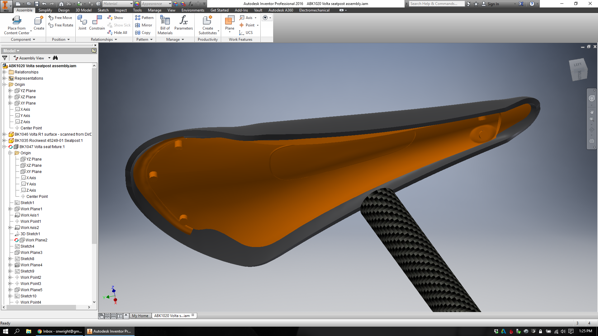
As I hinted to a few months back, I've been scheming for a while to create an integrated design for a seatpost/saddle support to be printed in titanium. As a first step along this path, I decided that it'd be easiest to use an existing saddle shell, and design a part that would adapt the shell to fit a piece of carbon fiber tubing.

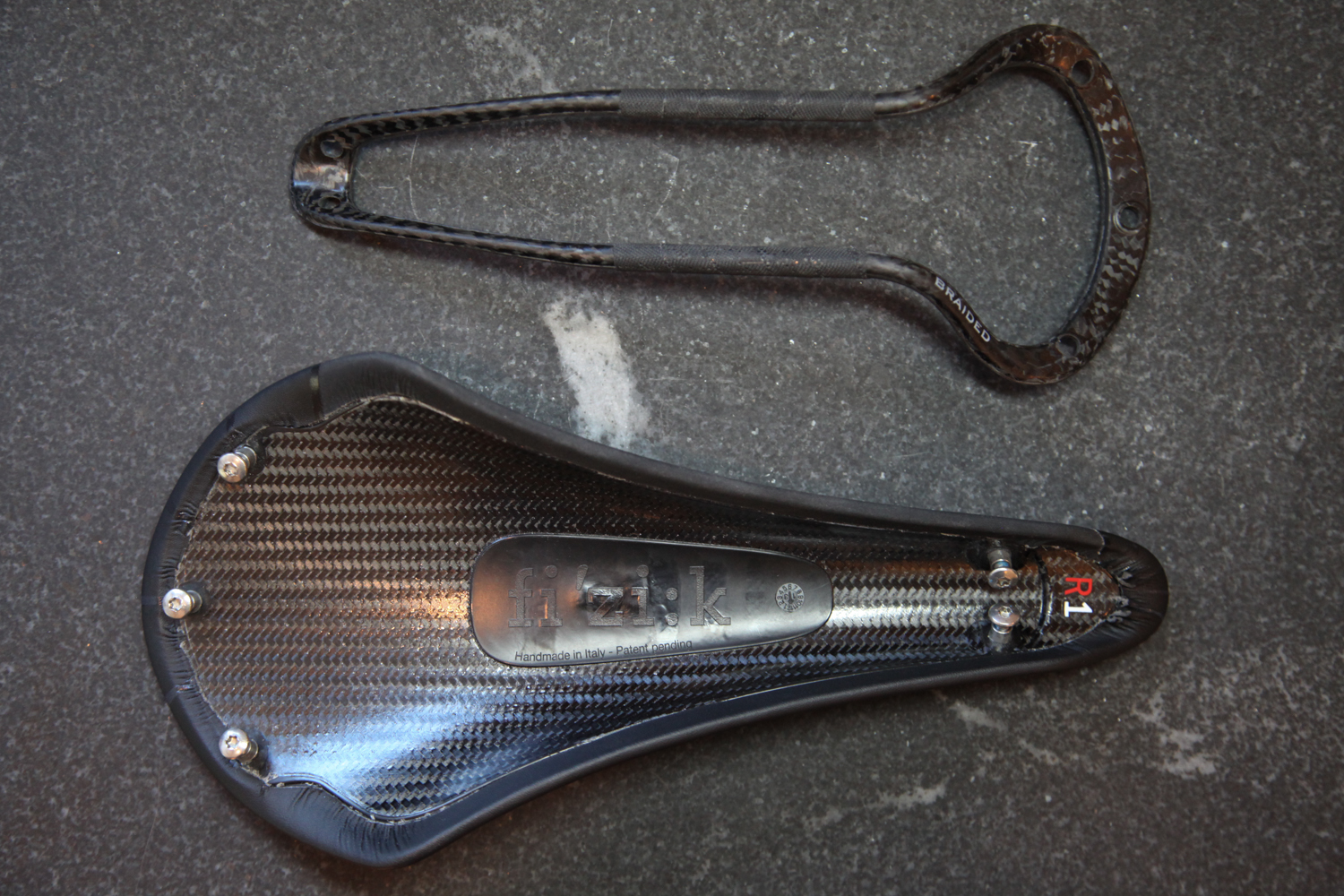
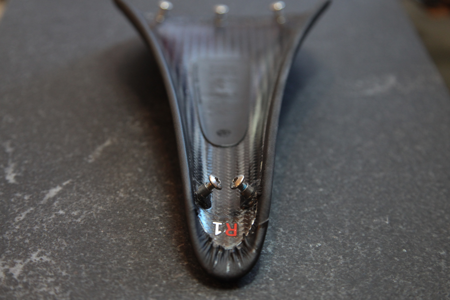
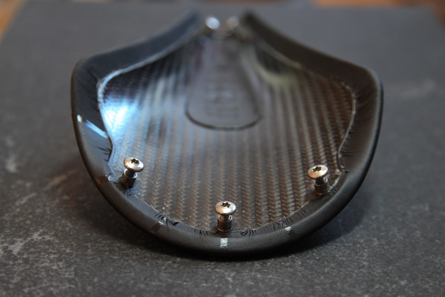
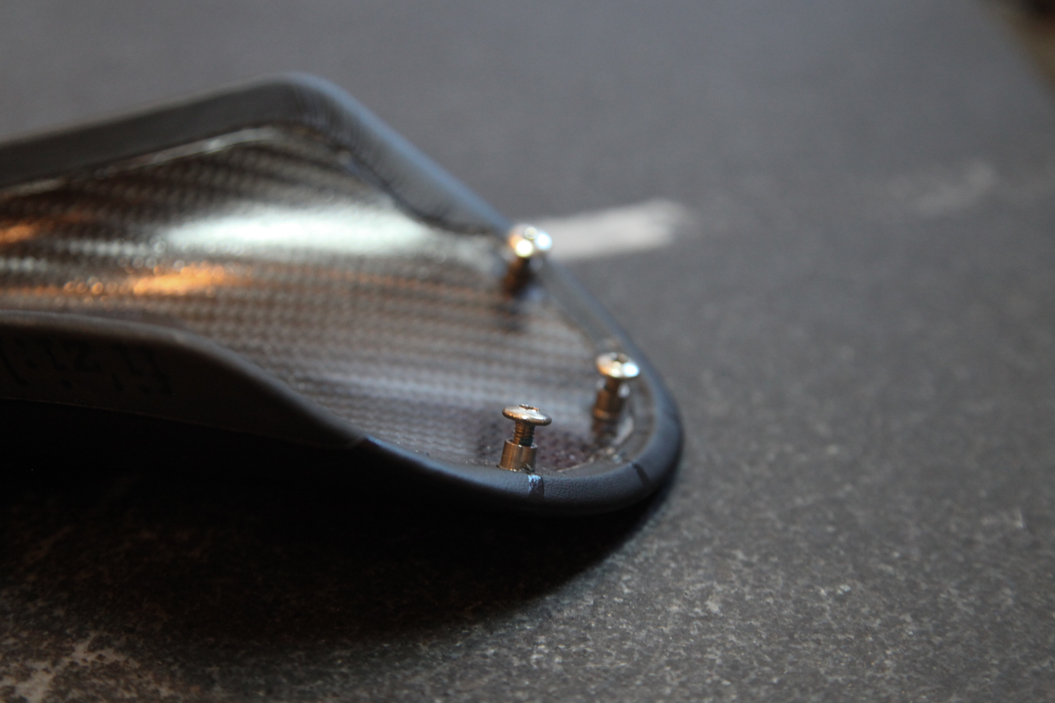
The saddle I chose consists of a carbon fiber shell, some minimal padding, and five female threaded bosses: three in back, two in the front. The bosses fit through the shell, so that they protrude through the underside; they will be my part's connection points. As you can see below, the saddle comes with (and isn't meant to be separated from; this is a decidedly off-label use of this part) a loop shaped rail part; I'll be discarding that and building my own 3D printed titanium part instead.

The first step in my design process is pure reverse engineering. I need to understand where each of those bosses is in 3D space, so that I can design a part that fastens to them securely. In order to do this, I worked with Direct Dimensions to scan - and then reconstruct - the part to a point where I could design around it.

Reverse engineering via 3D scanning is a process of interpolating, smoothing, and in the end often guessing the design intent behind an observed feature. The same is the case with basically any form of reverse engineering, of course; if you measure (via calipers, for instance) a feature to be 100.005mm, you'll generally assume that it was intended to be 100mm. With simple rectilinear parts this process is relatively straightforward, but with more complicated ones - especially ones that include a combination of complex curvature and manual fabrication methods - it can look a lot like art.

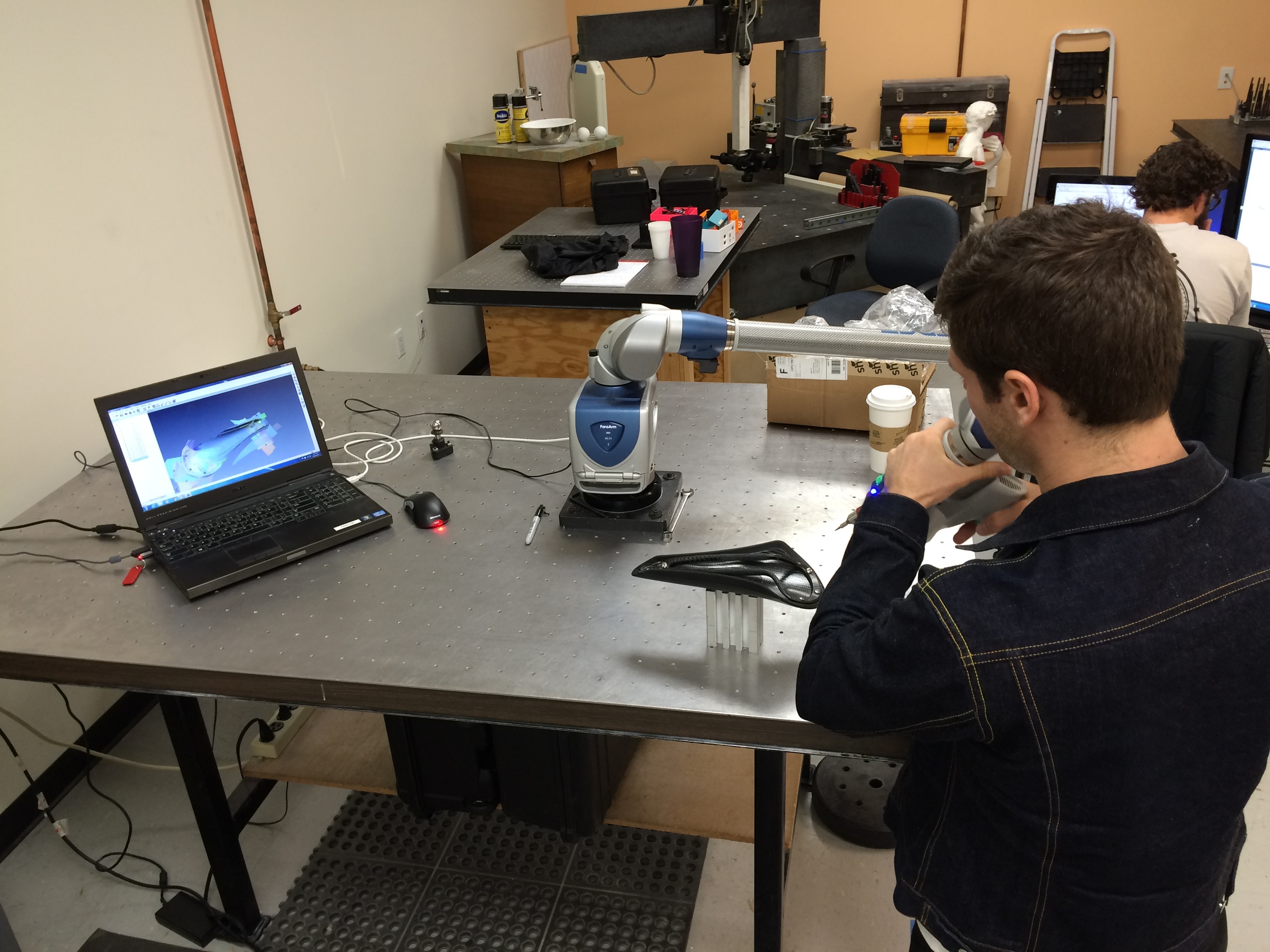
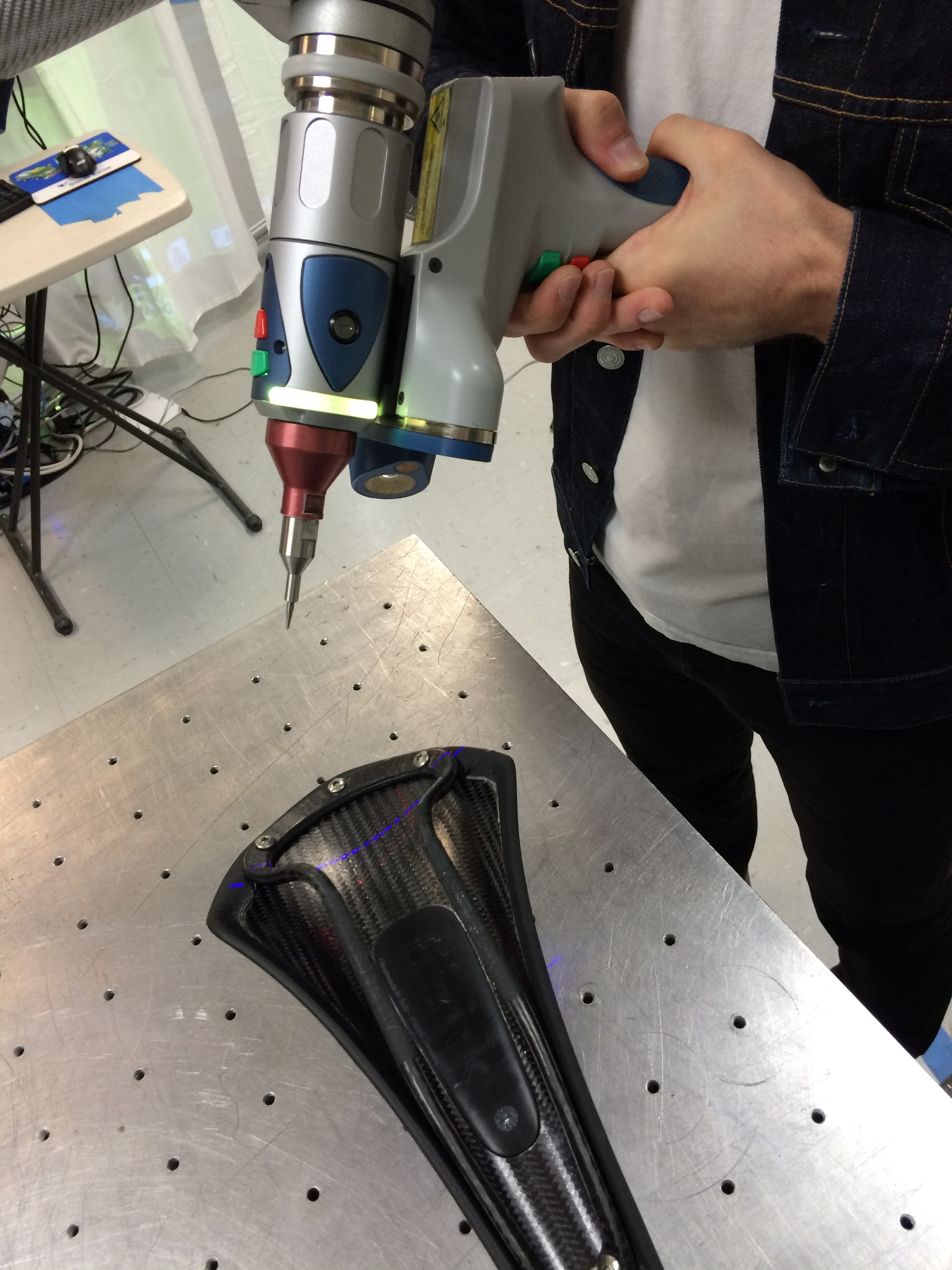
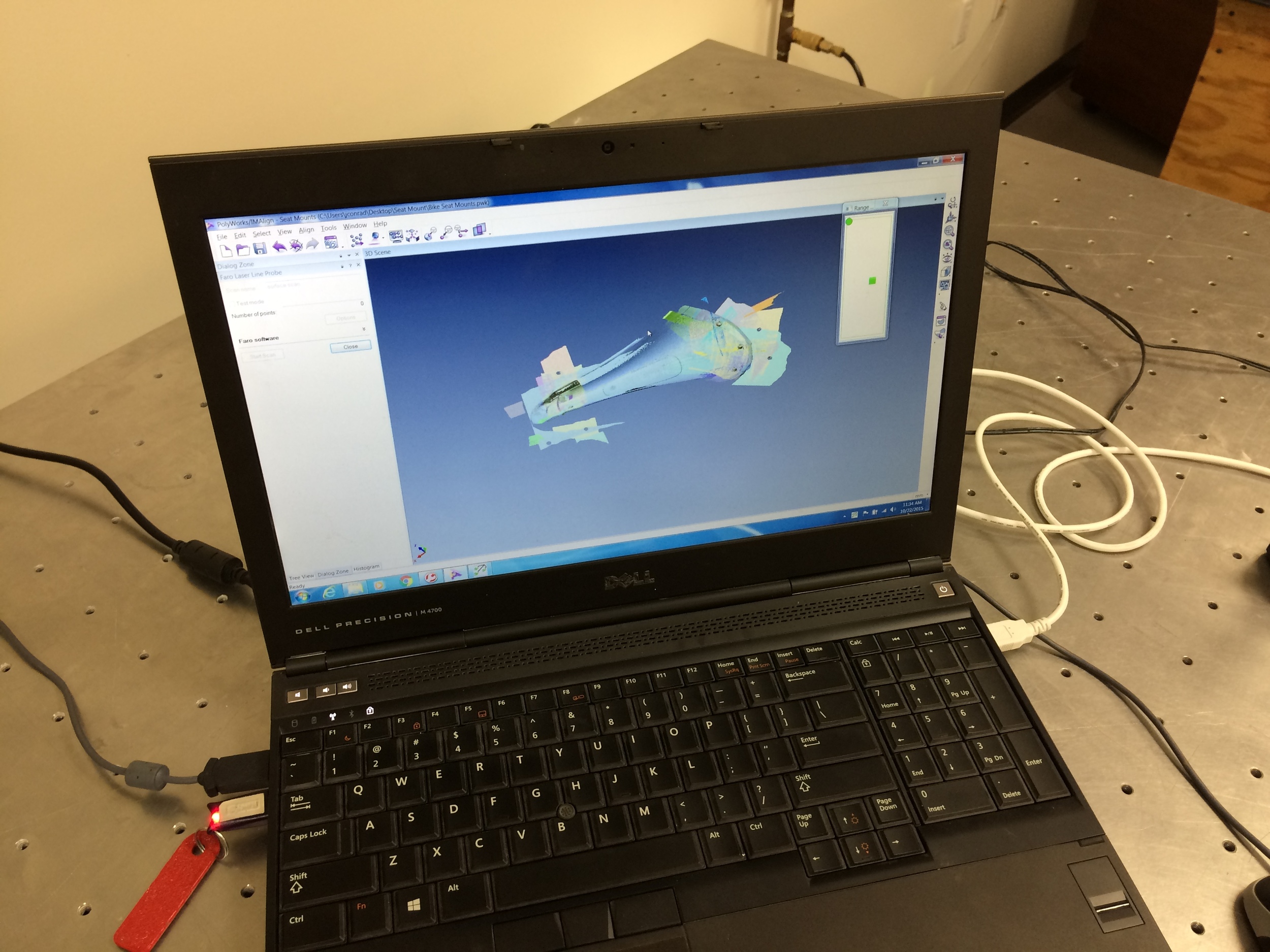
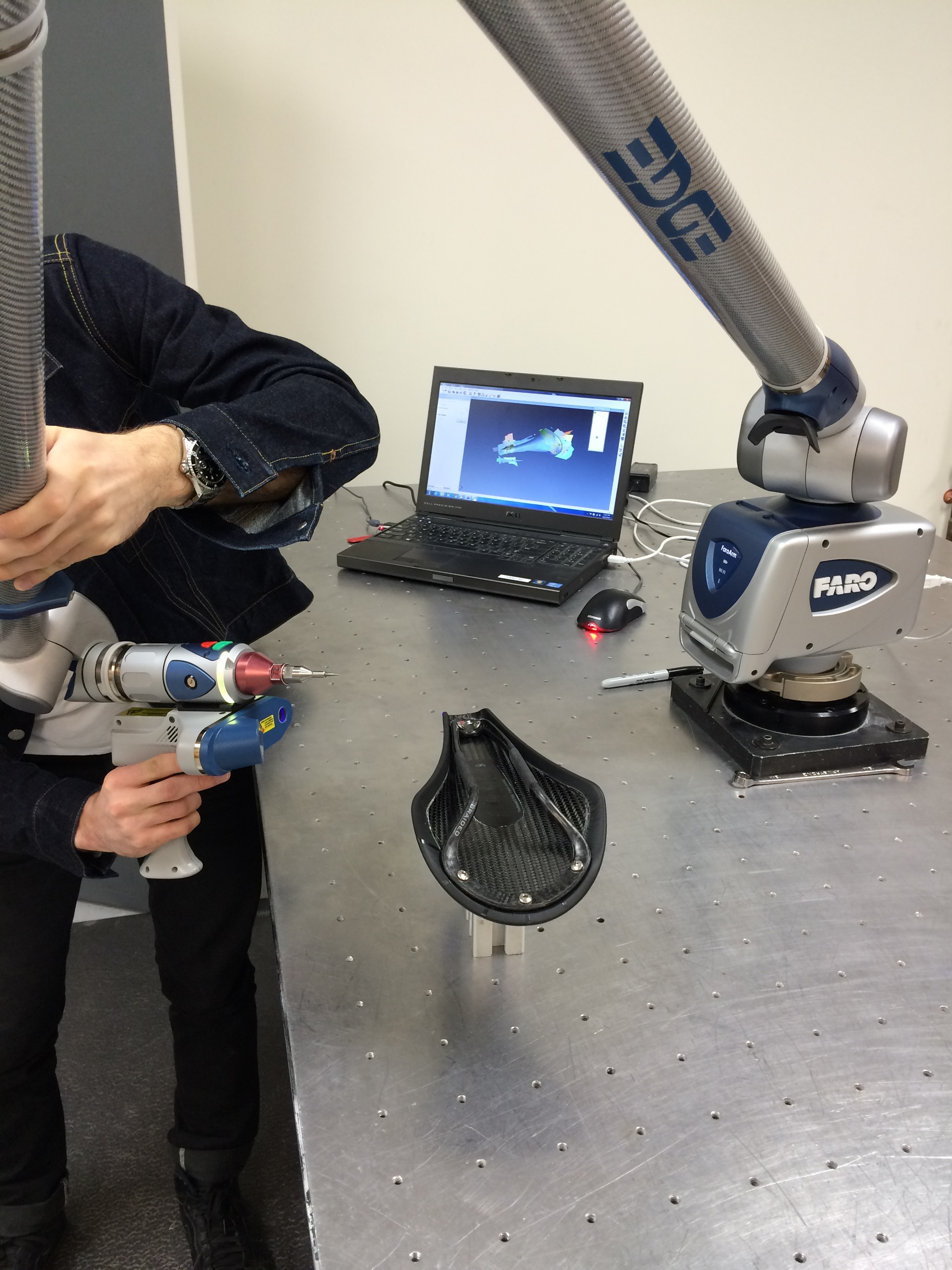
Regardless, the first step is to acquire some data on where exactly the part in question *is.* Direct Dimensions started by laser scanning my part with a Faro Edge arm and an HD probe:

This is an interesting hybrid system: the arm itself knows where it is, and the non-contact laser scanning probe knows how far away (and in what direction) the thing it's pointing at is. When combined, the single-point repeatability of the system is below .1mm.

From the point cloud generated by the probing system, Direct Dimensions was able to create a raw polygon mesh:

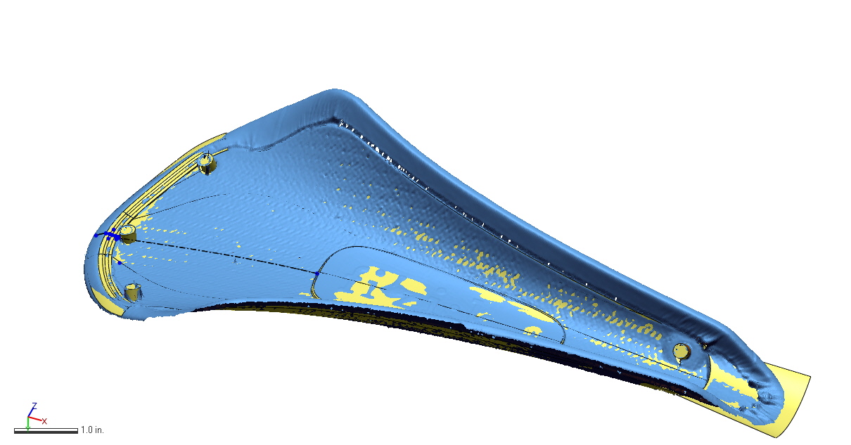
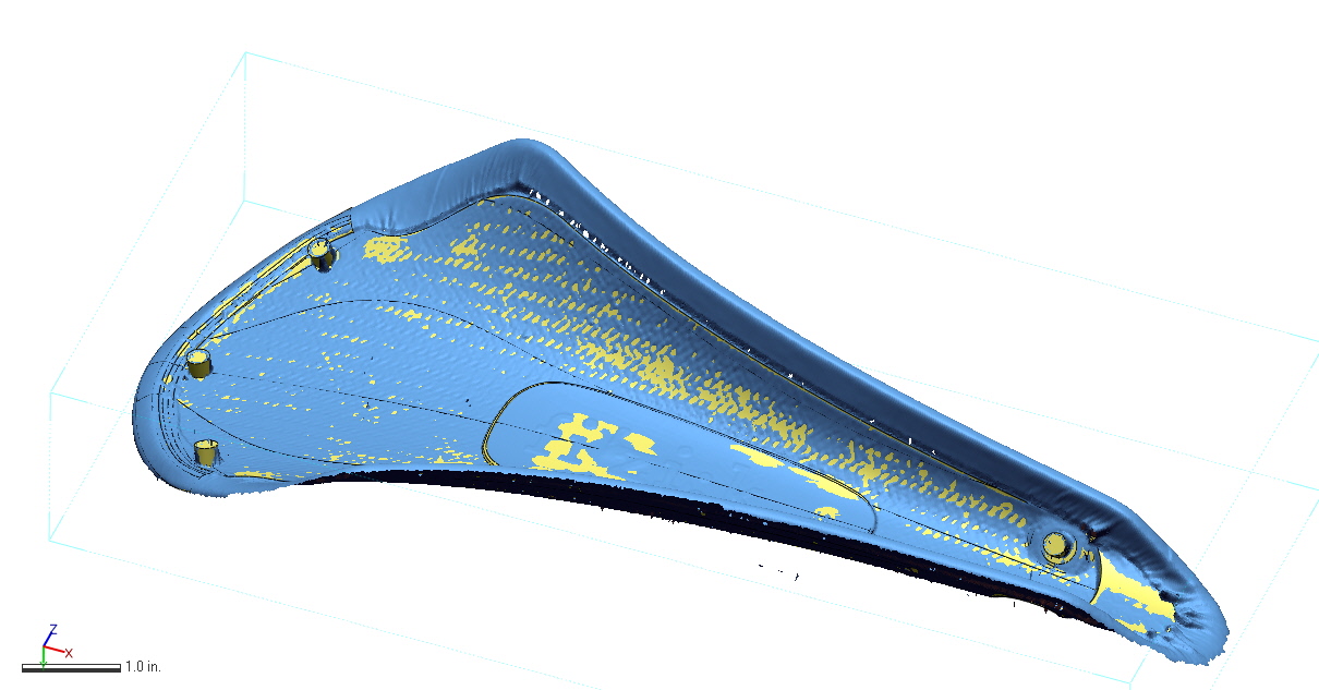
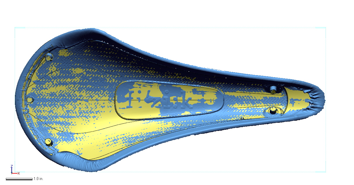
This mesh is a representation of the underside of the saddle shell; you can see the five bosses as well. It's a start, but not particularly useful for designing a mechanical assembly. To get there, Direct Dimensions used two methods:

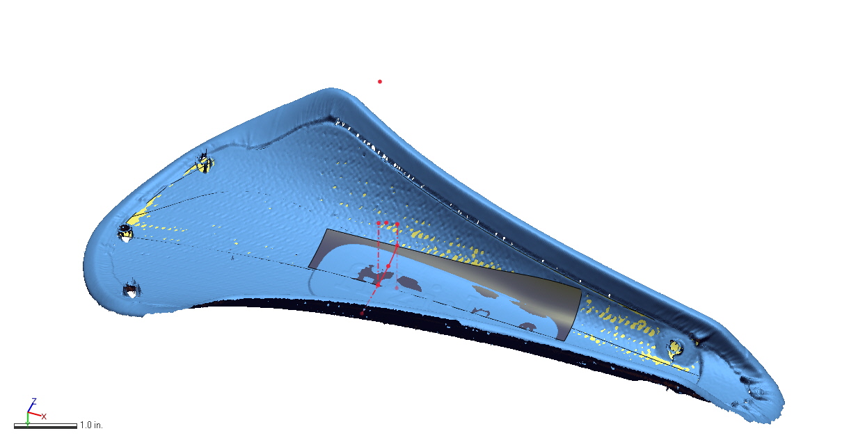
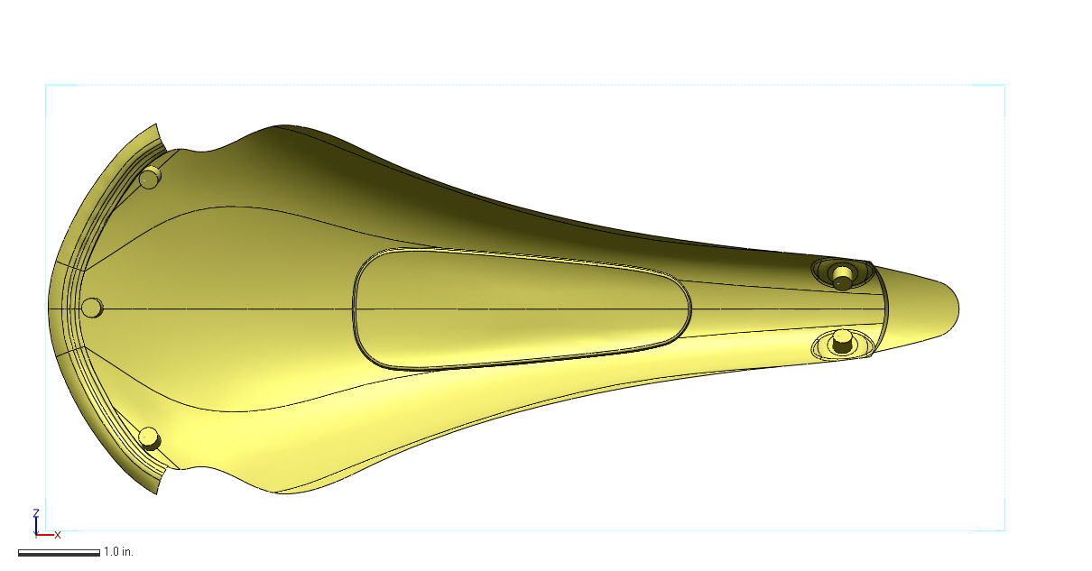
First, they used a method called "rapid NURBS" to wrap a NURBS surface to fit the complex shape of the saddle. This is a fairly quick method (an hour or two of work) and results in something that fits all the weird contours and fine features pretty accurately. As you can see here, there's pretty high feature resolution in the model, which can be useful if I need to make sure to avoid (or fit closely to) something. On the other hand, though, the surface is difficult to manipulate and a little hard (due to its complexity) for me to even open up and play with in Inventor.

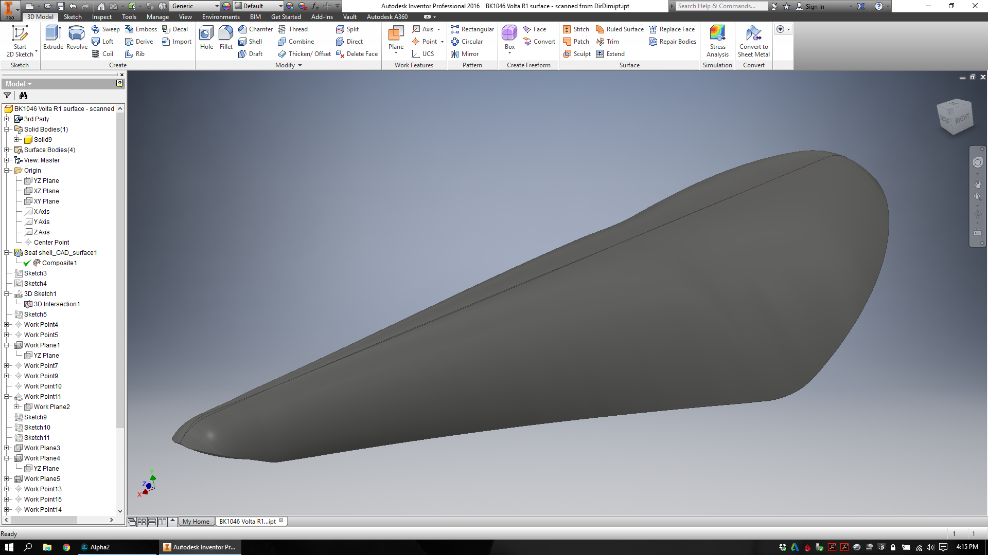
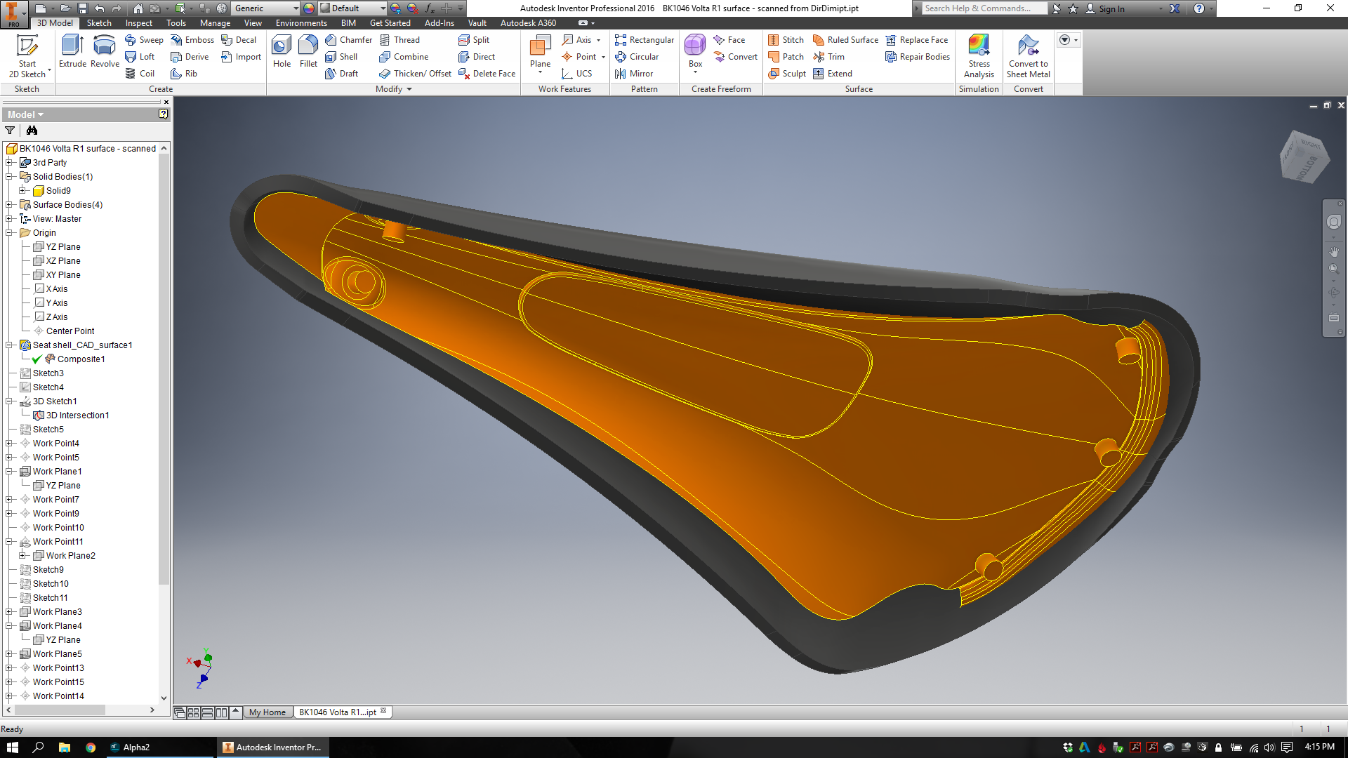
For a more useable (but less detailed) model, Direct Dimensions made a CAD surface for me as well. This is a much longer and more manual process, taking most of an afternoon. Here, individual surfaces are modeled and stitched together to create a shell that represents all of the necessary feature geometry accurately, but with a bit less precision than the rapid NURBS model. You can see roughly how the model was created below:

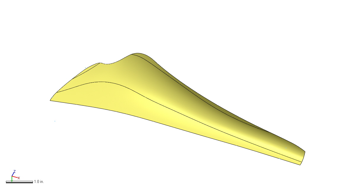
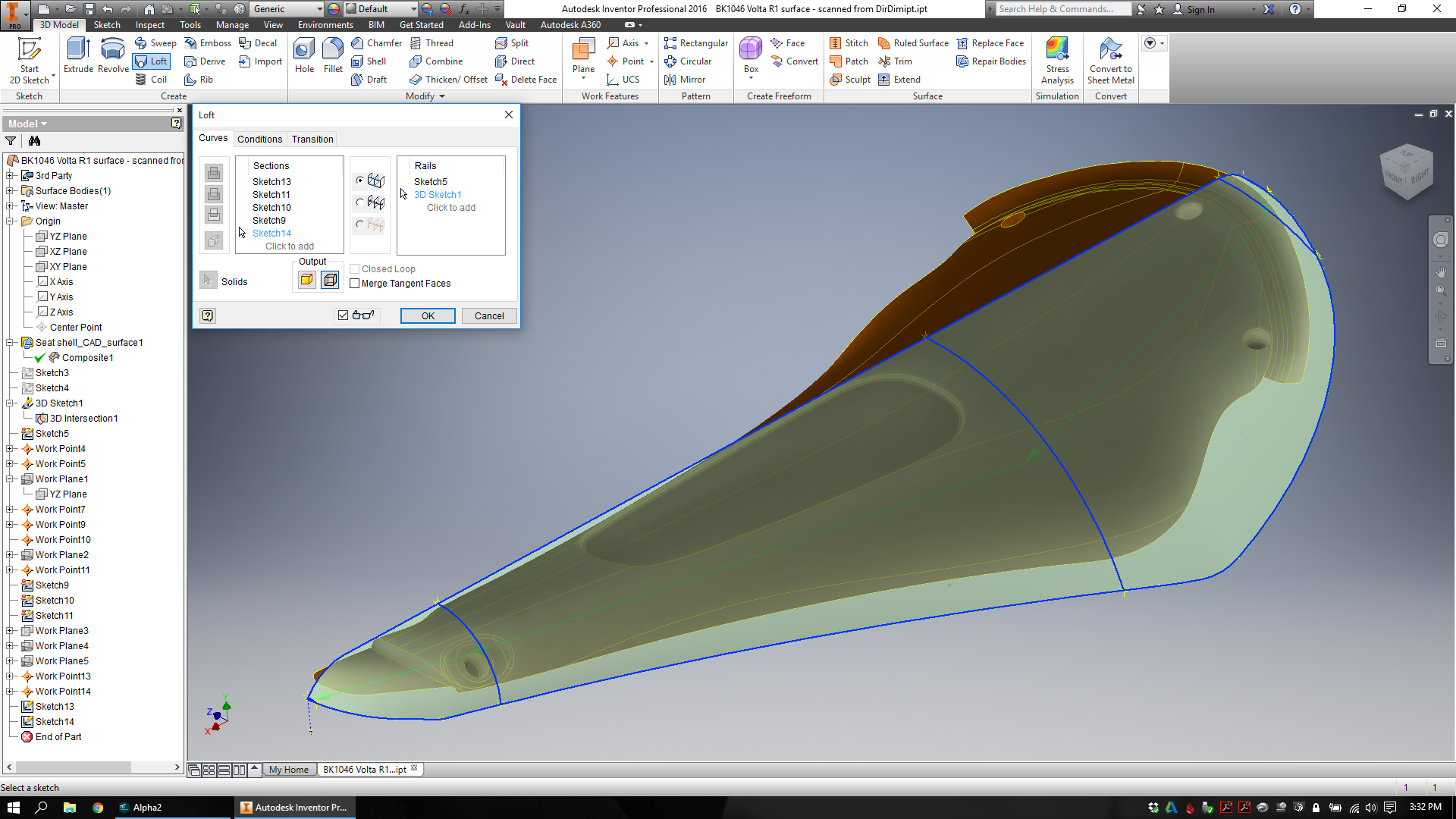
At this point, I finally had a model that I could begin to design around. I started by creating a quick lofted part that would stand in (just visually) for the saddle's exterior surfaces:

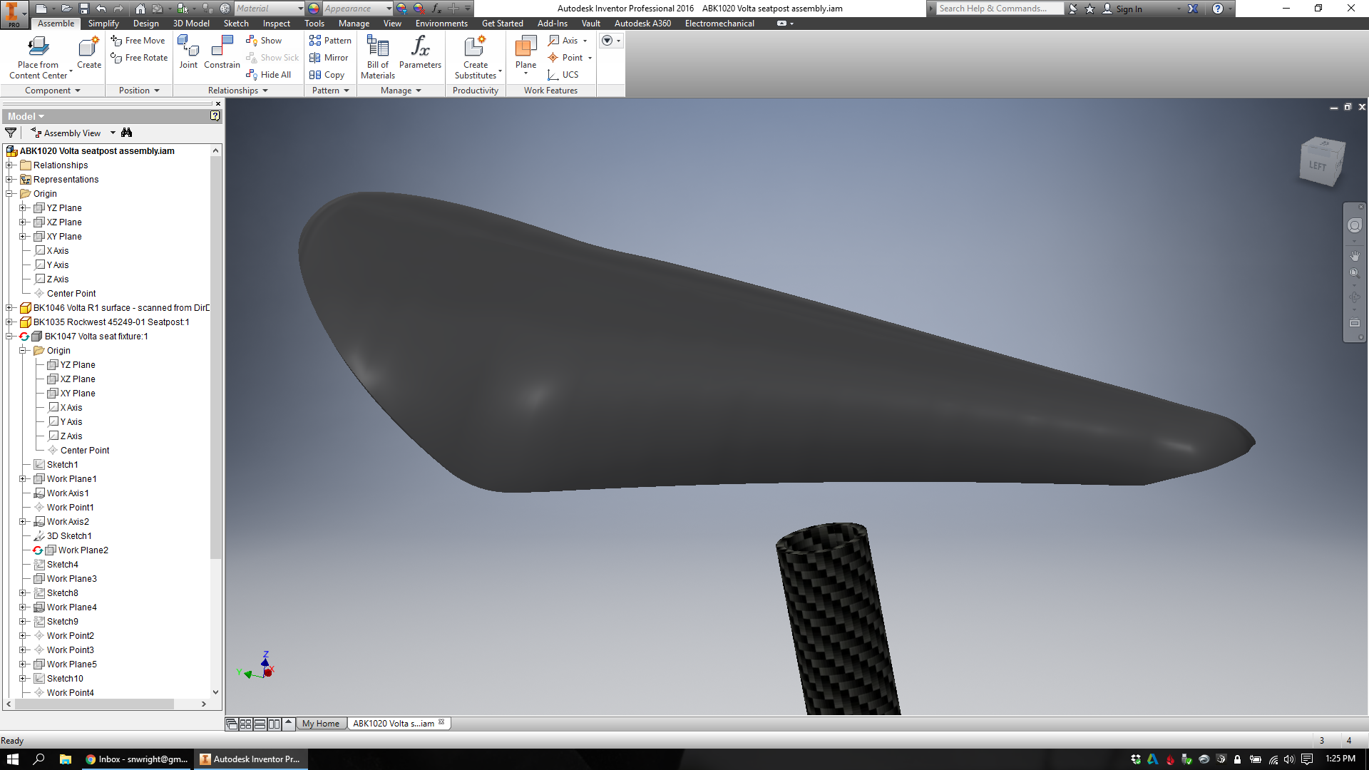
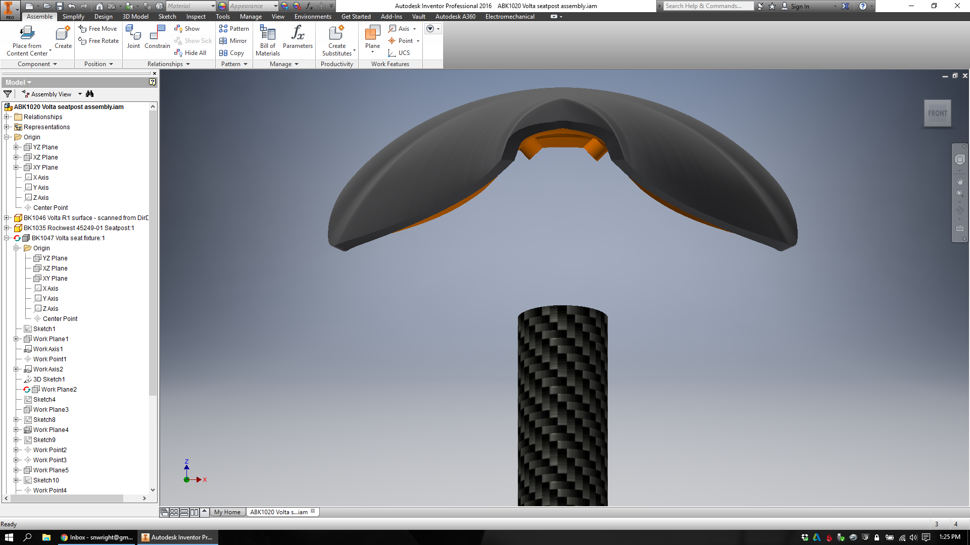
Then I placed the saddle (my lofted exterior + Direct Dimension's underside) into an assembly in Inventor, and added a carbon fiber seatpost to connect to. 

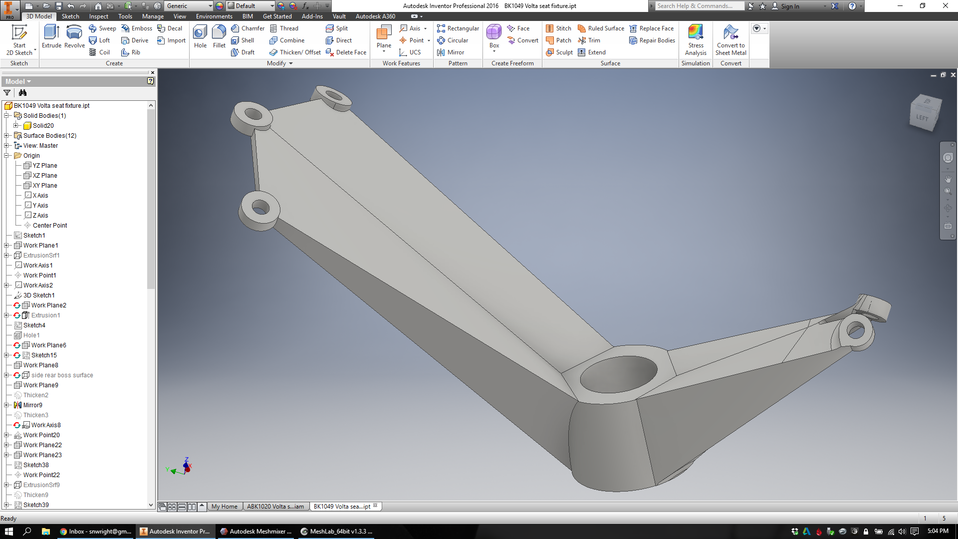
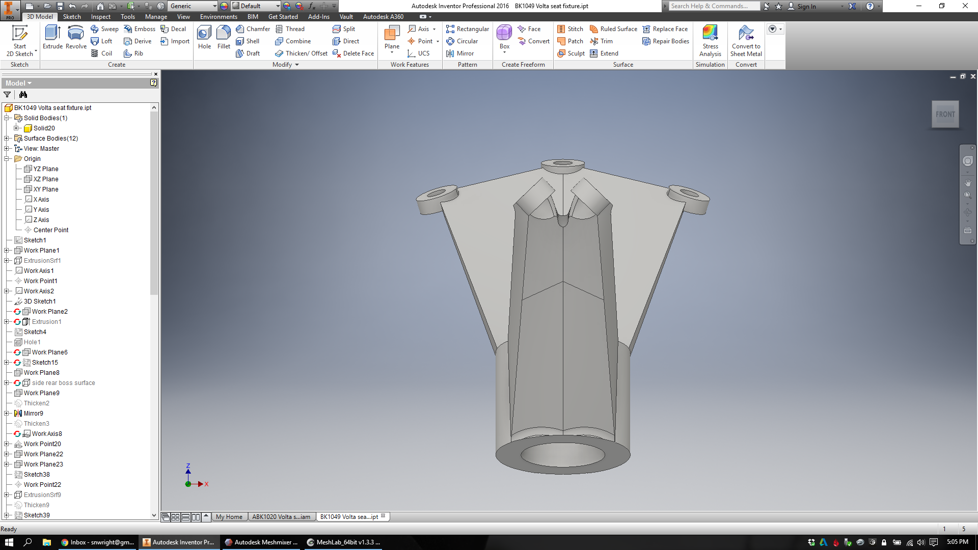
At this point I'm finally ready to start designing. I begin by creating a new part in Inventor that represents the design space available for my lattice:

Then I bring an STL of the design into MeshMixer and make the mesh way, way less precise. This process involves selectively remeshing (and reducing the mesh quality of) face groups one at a time. Eventually I'll record a time lapse video of the whole thing, but for now you can see a little of the process below:

From this low resolution mesh I'm finally able to create my lattice. I export an OBJ file, bring it into nTopology Element, and create a surface lattice with beams at each one of every triangle's edges.

Next, I create a volume lattice on the inside of the part. I've chosen a large cell size and a vertex-centroid cubic cell structure. When I generate the lattice, nTopology Element only creates the lattice cells whose centers fit within the part. In order to make sure the whole volume is at least partly filled, I step the volume lattice out a few levels, and then warp it to conform to the volume. Then I trim the outlying cells, leaving only the beams that lie fully within the design space.

Now I go into the lattice utilities and set the surface lattice as an attractor. I select the volume lattice as the one whose nodes I want to move, increase the snap range to 50mm and valence to 5 (I want basically all of the volume lattice's nodes to move, except those that have 6 connections), and then move the nodes:

Now I've got a merged structure: A surface lattice and a volume lattice, and they share nodal connections so the whole thing is tied together. I'm ready to thicken the lattice and see what it actually looks like. As before, I've added attractors in the areas where the design has mechanical features. I set the thickness range from .5mm to 1.2mm, and let it run:

Here, you can see both the internal and external structures:

spencer-wright-saddle-fixture-lattice-model.gif

And here it is with the saddle and seatpost attached:

As it's designed now, the lattice part is 18141 mm^3. In titanium 6/4, the weight of the part is 81.76g.

That's light.

Now, this part still isn't really manufacturable - there are too many overhanging faces. It also hasn't been run through FEA, and its distribution of mass probably needs some adjustment.

But it's a pretty good start :)

More soon.
Remeshing wishlist

Added on by Spencer Wright.

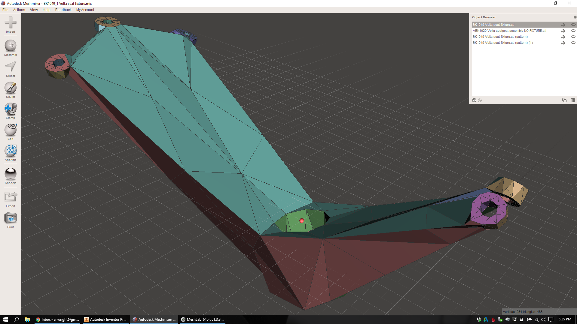
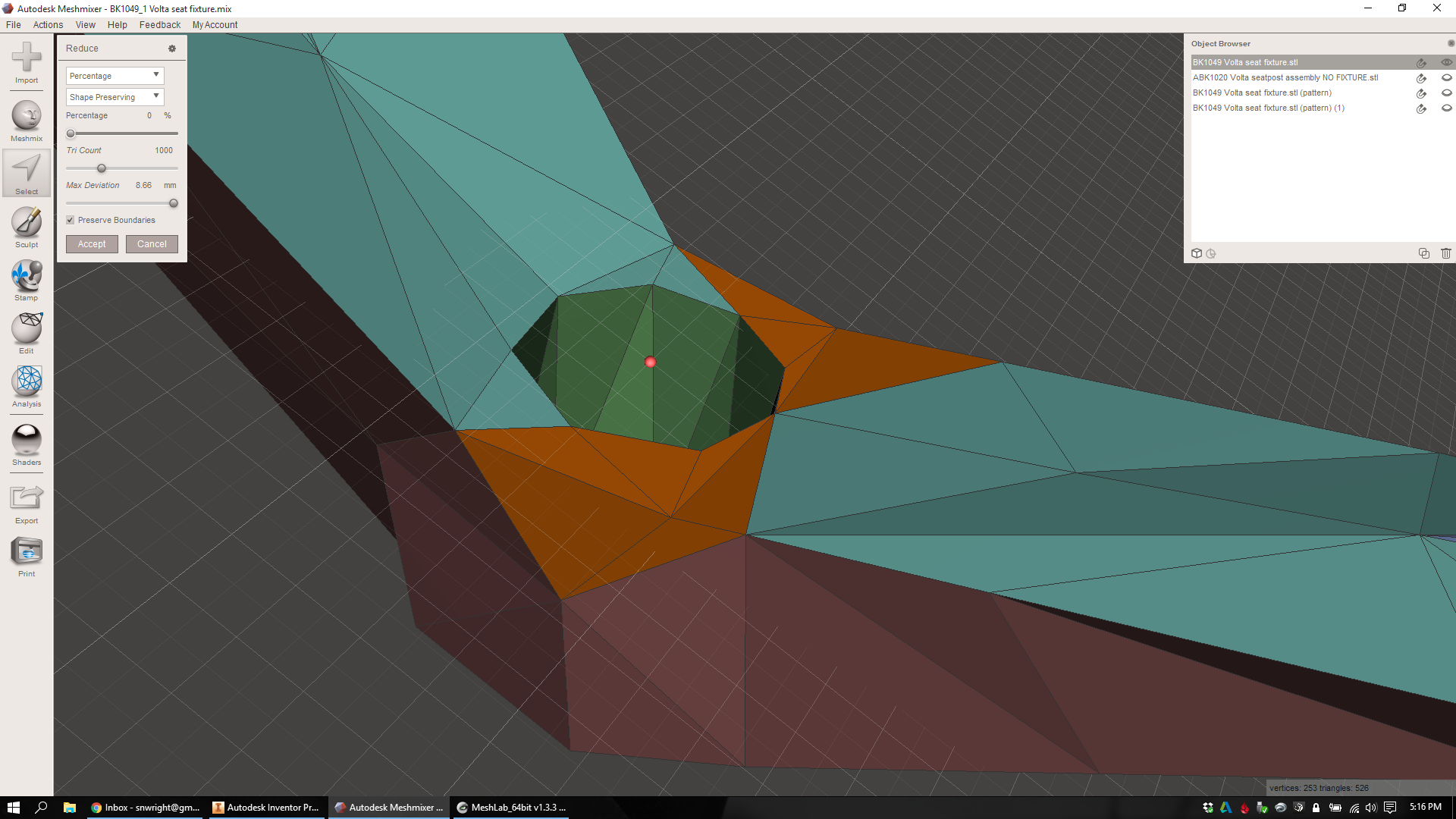
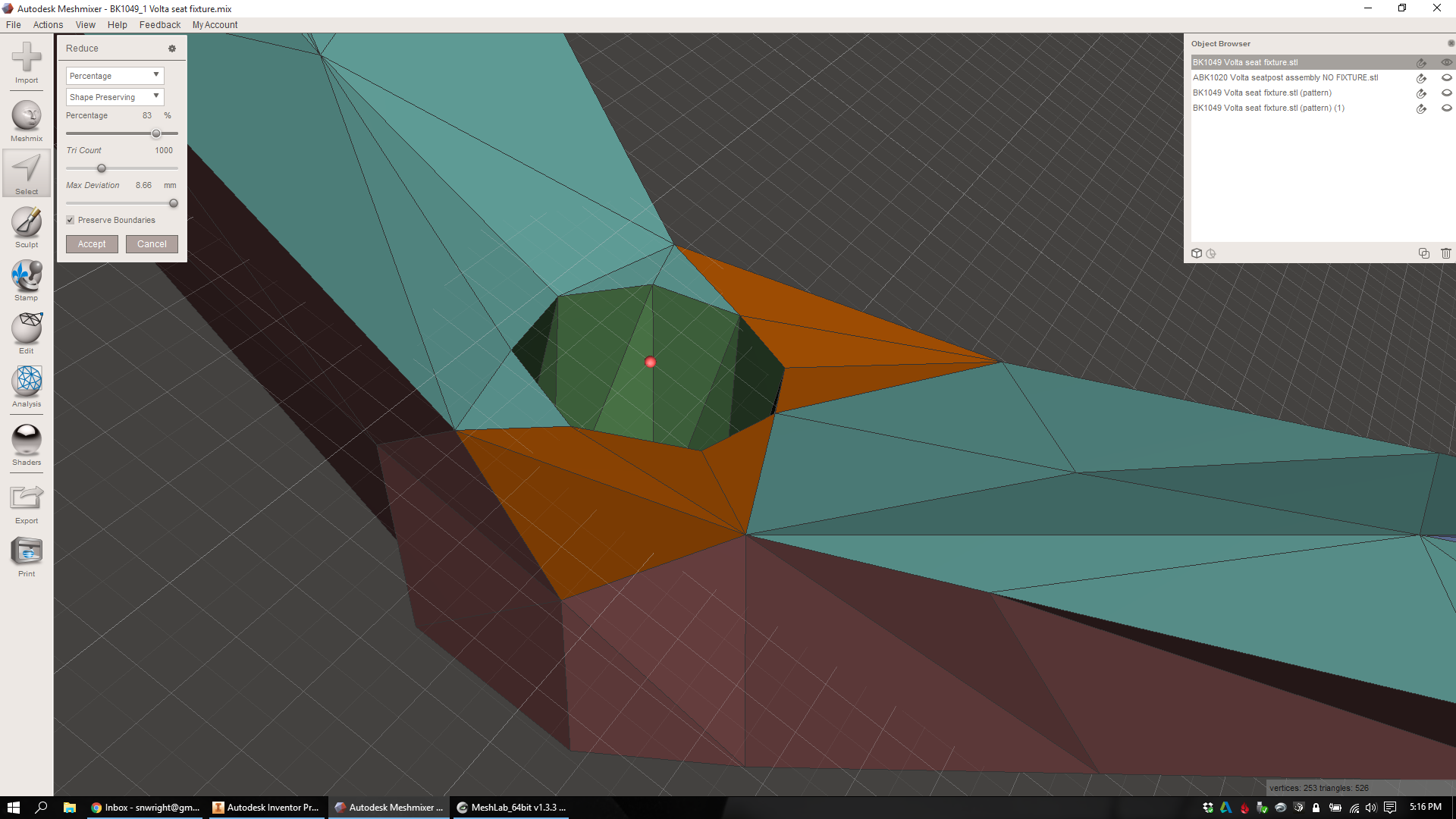
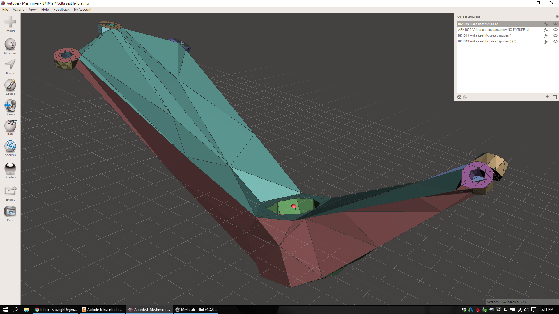
So: I need to reduce overhangs on my lattice stem design. As you can see here in MeshMixer, there are a lot of them (highlighted in red/blue):

(Incidentally: If you know of a really easy way to measure the surface area of unsupported faces in an STL/OBJ, let me know! Right now I'm doing some crazy stuff in Blender (thanks, Alex) but I'd love a one-step process if there is one.)

Now as you'll recall, I'm generating these beams (and varying their thicknesses) in nTopology Element, but the method I'm using starts by looking at all the edges in an STL/OBJ that I create in MeshMixer. When I go to generate the lattice (in Element), a beam is created on every triangle edge of the mesh (which I created in MeshMixer). So if I want to control the orientation of the beams in the lattice, I really need to start with that input STL/OBJ.

But here's the thing: remeshing algorithms tend to prefer isotropic (equilateral) triangles, which result in a *lot* of beams that are oriented parallel to any given plane (e.g. the build plane). They also prefer nodes that have a valence close to 6 (valence refers to the number of other nodes that a given node is connected to).

This is mostly because most remeshers assume that you want to preserve features - a reasonable assumption, in general. But for the vast majority of my design (basically everywhere except the clamp faces and bolt hole features), I care *way* more about eliminating overhanging faces than I do about feature preservation.

Over the next week, I'll be playing with the underlying mesh a bunch more and trying to find a way to reliably reduce overhangs in my end design. Specifically, I'm looking at remeshing methods that result in:

  • Anisotropic triangles, specifically ones whose orientation I can set as a global variable. I want my triangles to be longer than they are wide/deep.
  • Nodes with valences <6. This will essentially reduce my beam count (I think).
  • A mesh which is adaptive (as opposed to regular), so that I can preserve my mechanical features (high density mesh) and still reduce beam count elsewhere (low density mesh).

I'm also interested in using some curved beams (especially in the clamp areas), but that's prioritized below the things above.

More soon!

Lattice design workflow, part 3: Integrating full mechanical features

Added on by Spencer Wright.

Note: As before, thanks to Bradley Rothenberg (of nTopology) and Ryan Schmidt (of MeshMixer/Autodesk) for their continued help on this workflow.

As documented previously (1, 23, 4), I've been working on a multi-step workflow to create printable lattice structures for mechanical parts. In earlier posts, I described some of the techniques I used to generate the lattice itself, and at this point I'm ready to refine the mechanical features and evaluate the end result.

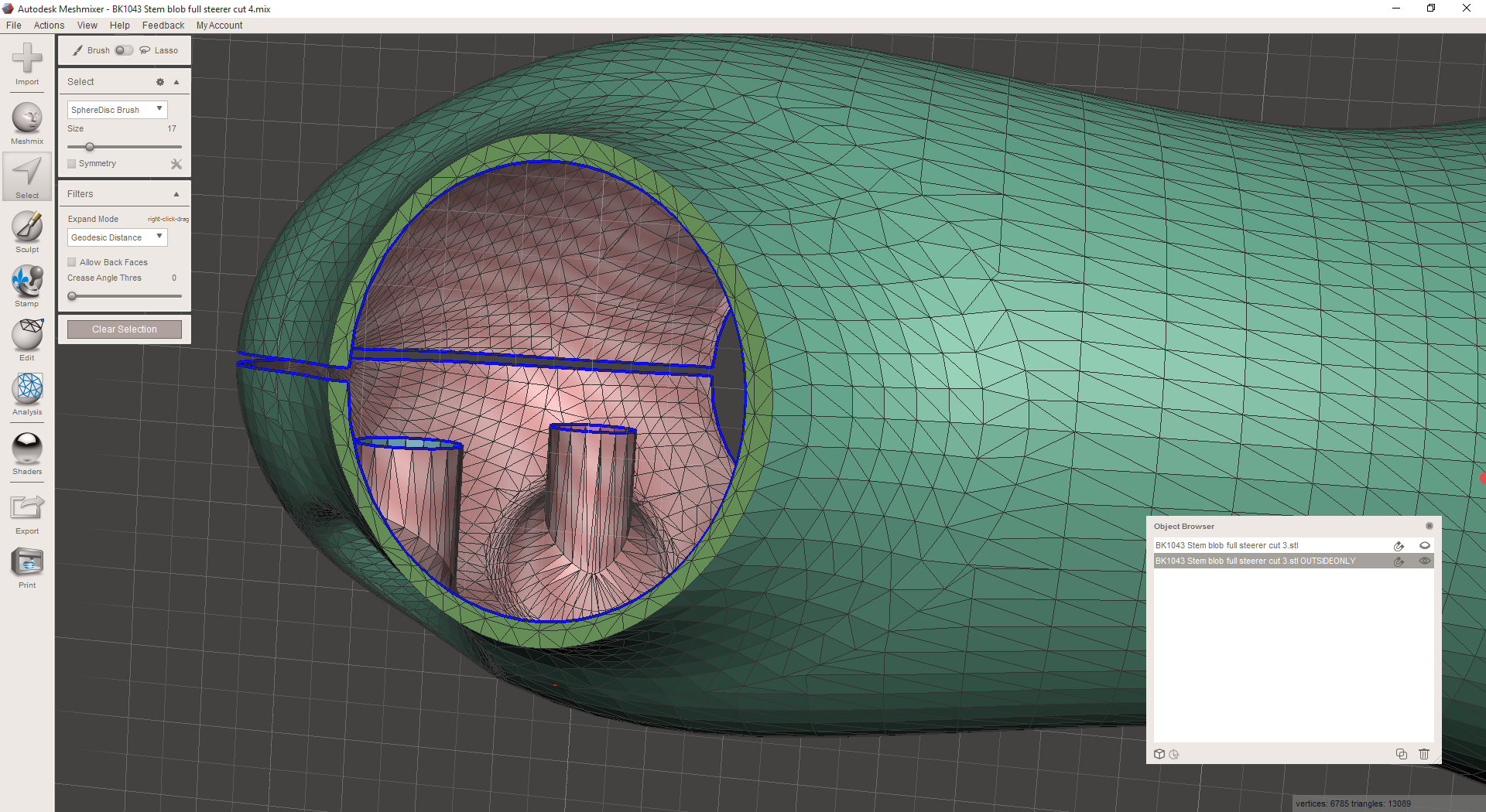
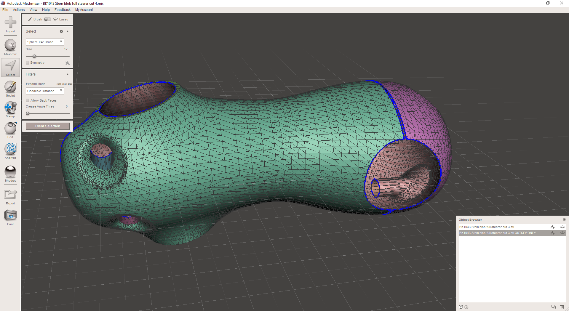
I've made a few changes to my remeshed surfaces since my last post, so I start this process today in MeshMixer. Here I've got three parts: The stem body itself, a surface that's designed to reinforce the threaded portions of the faceplate bolt holes (this is mostly hidden inside the stem body, but you can see its border still), and the faceplate itself. 

From this, I export three separate OBJ files and import the into nTopology Element. There, I generate simple surface lattices: each edge in the OBJ is turned into a beam in the new lattices.

Next, I create a set of attractors that I'll use to control the thickness of my lattice. The locations of these attractors were taken directly from Inventor; I know the XYZ locations of the general areas that I want to thicken, and so put the attractors right where I want them. Then I control each attractor's size and falloff curve to thicken just the areas I want. In the shots below I have every attractor on a cosine falloff; the bolt attractors are 12mm in size, and the clamp cylinder attractors are just a few mm bigger than the diameter of the cylinder.

Once I've got the attractors set up, I go through each part and thicken the lattice. The grey appearance is just where nTopology is showing me a wireframe, and the density of the mesh is really high:

You can see here that each part has some degree of variation in its beam sizes. In the bolt areas the mesh is dense and the beams are thick; in the middle of the stem body the mesh is sparse and the beams are thin.

At this point, I export each of the three lattices and bring them back into MeshMixer. Here you can see them overlaid on the original meshes:

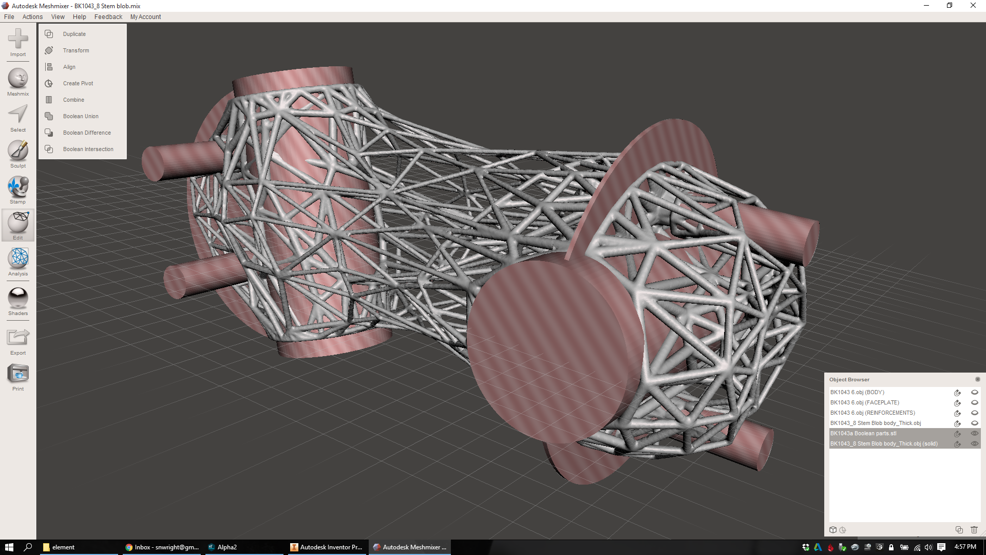
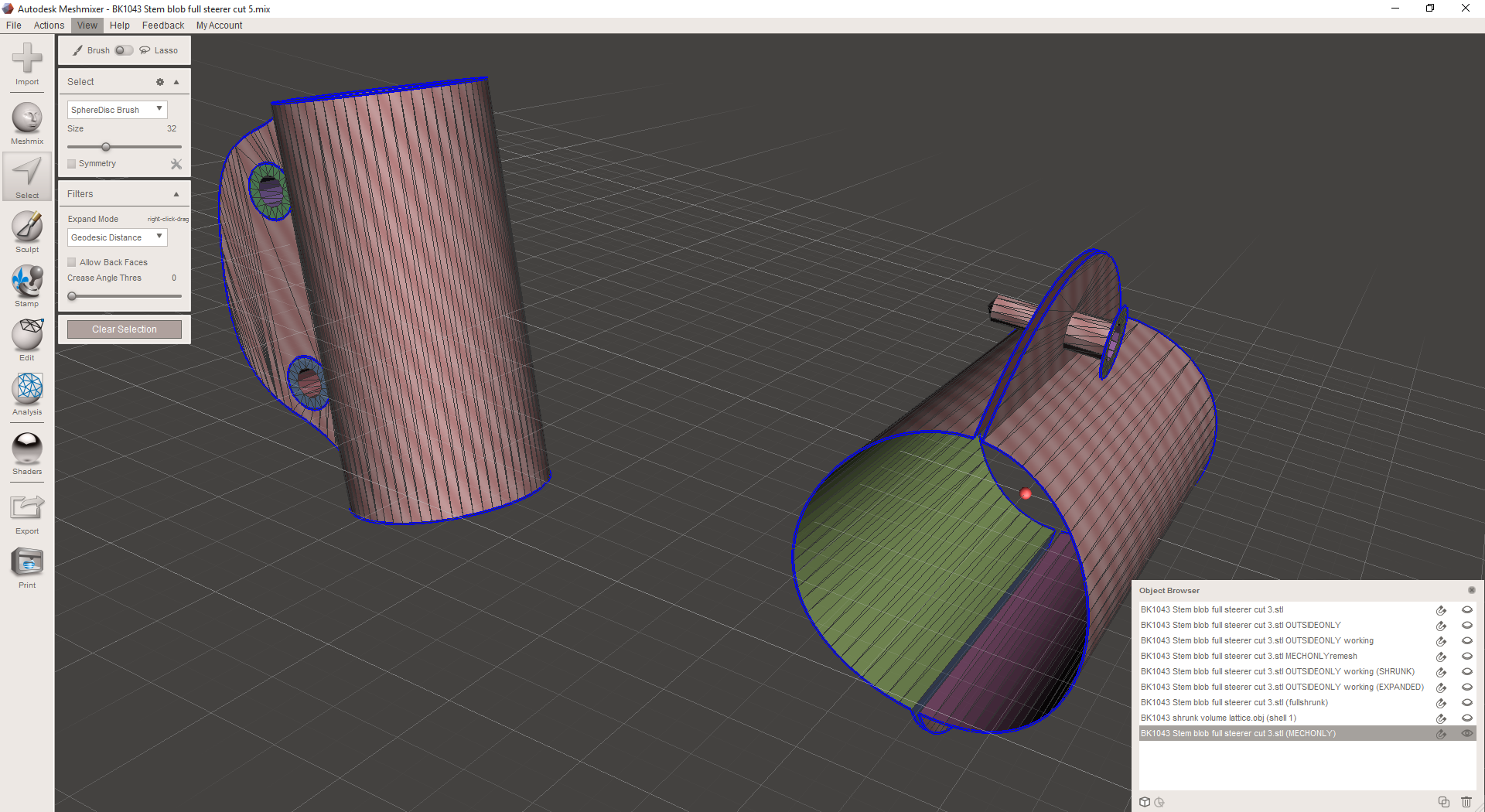
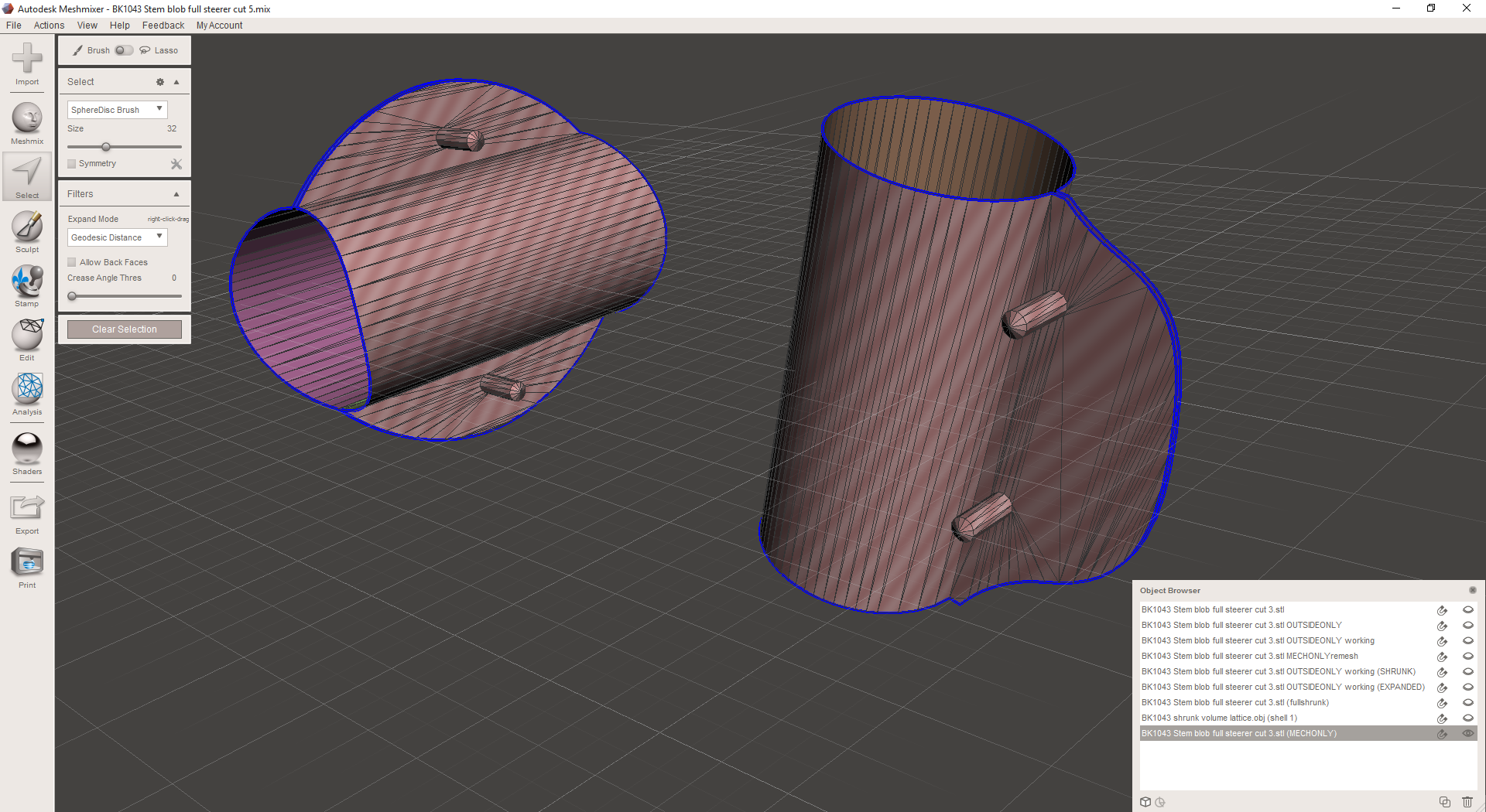
Now, I import meshes that correspond with the mechanical features I want to preserve in the part. I've taken these directly from Inventor: I created an assembly file containing the original IPT and then created a new IPT that refers directly to the mechanical features. I export that as an STL, bring it into MeshMixer, and then select it and flip all of its normals so that it's inside out. Here you can see those boolean parts - first as red bodies in Inventor, then as meshes in MeshMixer, then as inside-out meshes:

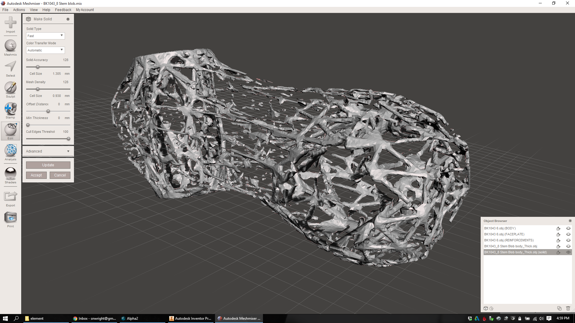
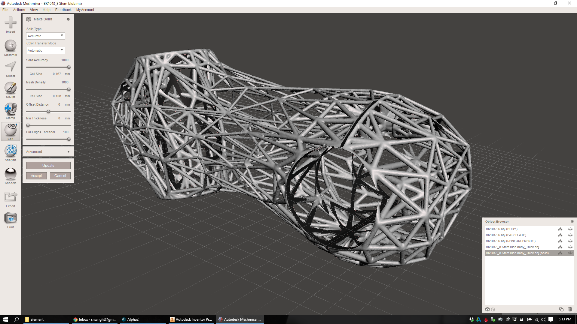
Now I select the three lattice objects, combine them into one, and run the inspector tool and fix all of the mesh problems. Then I run "Make Solid" on the whole object. I run this in "Accurate" mode and turn the "Solid Accuracy" and "Mesh Density" settings *way* up in order to keep the whole thing smooth:

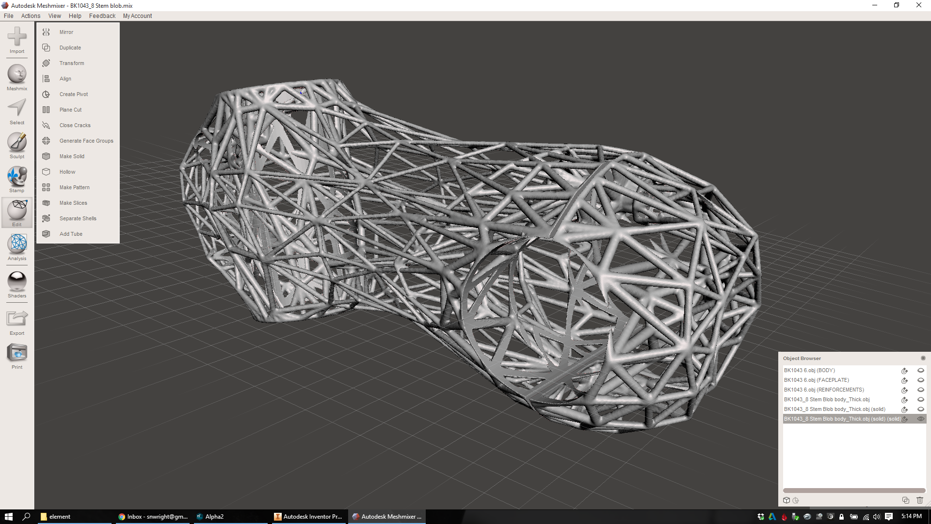
Now I've got a single lattice object that's fully solid and ready to have its mechanical features taken back out. Pretty rad. I combine the lattice and the mechanical features into one object and run "Make Solid" again, again at high density and accuracy:

I select the result, run the Inspector tool, and fix any errors. Then I look around the lattice and evaluate it. Inevitably there are a bunch of areas that are cut off, thin, or chunky - places where the lattice was thin once the mechanical features were removed, and the meshing operation rounded over the resulting isthmus. Unfortunately, that's not something that I can go back and fix; I need to move individual nodes back in my original lattice in MeshMixer. But at least I know that now, and going back through the workflow actually isn't as painful as it sounds. And anyway, the part that I have now is actually pretty good:

I should note here that I got a *lot* of help on the Boolean operations from Ryan Schmidt. Ryan also recorded a full video showing how to reintroduce the mechanical features even if you didn't have the ability to create them in Inventor. Although I went a slightly different route, there's a lot here that's super useful - and it shows the really powerful features that are built into MeshMixer:

Now that I've gone through the full process from start to finish, I see a few aspects of my design that still need some work. I also know that I still need to reduce the number of overhanging features in my design (which will probably be built on its end, with the handlebar side up). I'm also excited to test out the lattice utilities that are built into the most recent build of nTopology Element - especially in the area where the handlebar bolt reinforcements interface with the rest of the stem body. Bradley describes the process here:

I also, for what it's worth, need to do some actual FEA on my part. But by focusing on a repeatable workflow for even designing parts like this - and keeping a mind towards some basic manufacturability constraints - I've got something here that shows some promise. More soon :)

More workflow details

Added on by Spencer Wright.

The other day I got a nice email from Xavier Alexandre, which included a few good questions about my update from last week. His questions are here, along with my answers:

XA: It isn't entirely clear for me what guides your remeshing from a mechanical/strength optimization point of view. I get that you are trying to optimize for stiffness so you're trying to maximize the stem virtual hull volume. But this global shape is set at the beginning of your workflow in Inventor. Then you're trying to have an higher lattice density around the mechanical features but how did you set on edges length or thickness. Is it based on gut feeling? If so, do you feel that there will still be a lot of room for weight/mechanical properties optimization?

Yeah - you could definitely call my process "emergent." I know that my minimum practical beam size is going to be something greater than .6mm (the exact number is unclear and will require testing). I know that I want to minimize overhanging features, and that it'll probably be appealing (from a cost perspective) to build the main stem body on its end, so that I can pack more of them into a build plate. I also know that the clamp areas will need some significant surface area in order to not, for instance, damage a carbon fiber part that they might be clamped to. I also know that the threaded bolt holes (which will be M4, but which Inventor exports as 3.2mm diameter smooth holes) will need a minimum wall thickness of about 1mm, and will really want more than that. And I know that the heads of the bolts will similarly need a bearing surface of about 1mm, and that both the bearing surface and the threaded hole will need to be reinforced back to the rest of the structure in order to distribute the clamping load on the part.

In short: Yeah, it's mostly gut at the moment. But to be honest the biggest constraint right now is manufacturability; I need the lattice to be oriented so that it won't require support structures *everywhere*, and am focusing mostly on that at the moment. Once I've got that (and basic mass distribution in areas that I *know* will need it, e.g. bolt holes) mostly solved, then I'll move on to FEA. nTopology Element has an FEA solver built in, and you can feed the results back into the design so that overstressed areas get reinforced. I'm definitely excited to get there, but for now I'm focusing on making something that a job shop will be willing to make in the first place :)

XA: I didn't get the part with the interior Oct-Tet volume lattice at all. Is it gonna be merged with the exterior lattice? A lot of these beams will be surprisingly useful once the whole part is put together Huh?

Exactly - the volume lattice (which is an oct-tet topology - see this paper for a better description than I could ever give you) will be booleaned with the surface lattices to create one structure. If you look at that volume lattice on its own,  you'll notice that there are some stray beams that don't appear to be doing anything - they stick out into the middle of nowhere, and don't appear to be taking any load. But when you merge the volume with the surfaces, the situation changes, and those beams might be more useful than you would have thought.

As it happens, I've been focusing more and more on surface lattices in the past few days, as they're a bit easier to control explicitly - and the changes that I make are easier to immediately grasp the effects of. The "generate multiple individual lattices and then merge them at the end" workflow really isn't optimal for this reason: it takes way too long to understand what the finished structure will work like.

XA: You won't have skins in your design. I guess that for the stem to fit handlebars and steerer tubes you'll need the contacting beams to match the tubes curvature. Did you plan to design the beam shape for this or is it something you'll let for post processing. If so, do you plan to make those beams sturdier to account for grinding?

I'd *love* to bend the beams around the clamp area, actually. Right now I don't have a convenient way of doing that, but I'm looking into it. Either way I'll boolean out the clamp regions before printing, so I shouldn't need to grind away much. 


As you might expect, my thoughts on this workflow are changing as I use it more. It's a rather finicky process, and I'm eager to industrialize it a bit - and improve the areas that are most difficult to reproduce.

More soon!

The beginning of a workflow

Added on by Spencer Wright.

Note: Special thanks to Bradley Rothenberg (of nTopology) and Ryan Schmidt (of MeshMixer/Autodesk) for their continued help on this workflow. Also, both of them make awesome (and very weird ;) software that you should check out.


A scenario: You've got a part that you want to manufacture with metal powder bed fusion. You've got a few mechanical features that you know you need (to mate up with other parts in an assembly) and a general sense of the design space that's available for the part you're designing. You know the mechanical properties you need (via an ISO test that the part needs to pass) and you've got a target mass (which is basically "less than the competition"), and a target cost (which is basically "similar to the competition, taking into account a ~35% margin for me").

I've spent a lot of the past week going back and forth between Inventor, MeshMixer, and nTopology Element, trying to make a 3D lattice structures that are both mechanically effective and easy to manufacture. My workflow has been decidedly emergent, and it's also been counterintuitive at times; I've often found myself working backwards (away from my final design intent) in order to create the conditions where I can make progress down the line. My end goal is to design a bike stem that's sub 125g and which has minimal post-processing costs and requires minimal support structures (I'll deal with the actual dollar cost later, as it'll depend on a bunch of factors that aren't under my direct control).

I've got 27.7 cubic centimeters of titanium to play with. Where do I put it?

I began in Inventor. Setting up a design space is, counterintuitively, kind of a hard thing to do. Very few parts that I've designed have hard and fast design space boundaries; most of them could always be a little bigger, or a little smaller, and the rest of the assembly would stretch or squish to accommodate it. Nevertheless, I need to start somewhere, so I created a T-spline form that was close to what I thought I'd want:

I export it as an STL at low resolution (where we're going, resolution doesn't matter :) and bring it into MeshMixer:

From here, things start to get complicated. The way I see it, this part essentially has three components: 

  1. The mechanical features. This includes the two clamp cylinders (one, the handlebar clamp, is 31.8mm in diameter and split; the other, the steer tube, is 28.6mm and slit along the back side) and the four bolt holes (all M5, and all with one counterbored part and one threaded part) that do the clamping.
  2. The design space's exterior surface. In general, the stiffness of the part will be determined by how much volume it takes up, and I should generally make the part as stiff as possible. Therefore the exterior surface of the part is going to be made up of a big non-Euclidian 2D lattice.
  3. The volume of space between the mechanical features and the exterior surface. I'll want some bracing here to tie the whole part together and transfer loads from the mechanical parts over to the exterior lattice.

For this design, I'm using lattice structures throughout the part. I won't design any skins (I'm generally anti-skin, unless you've got fluid separation requirements in your design), instead opting to let the lattices vary in density from zero (in the middle of the part) to 100% (in areas like the threaded and counterbored bolt holes). 

Because the different surface regions of the part (the mechanical features and the exterior surface) will have different mechanical requirements, I begin by duplicating my lattice in MeshMixer and isolating each of them in its own object:

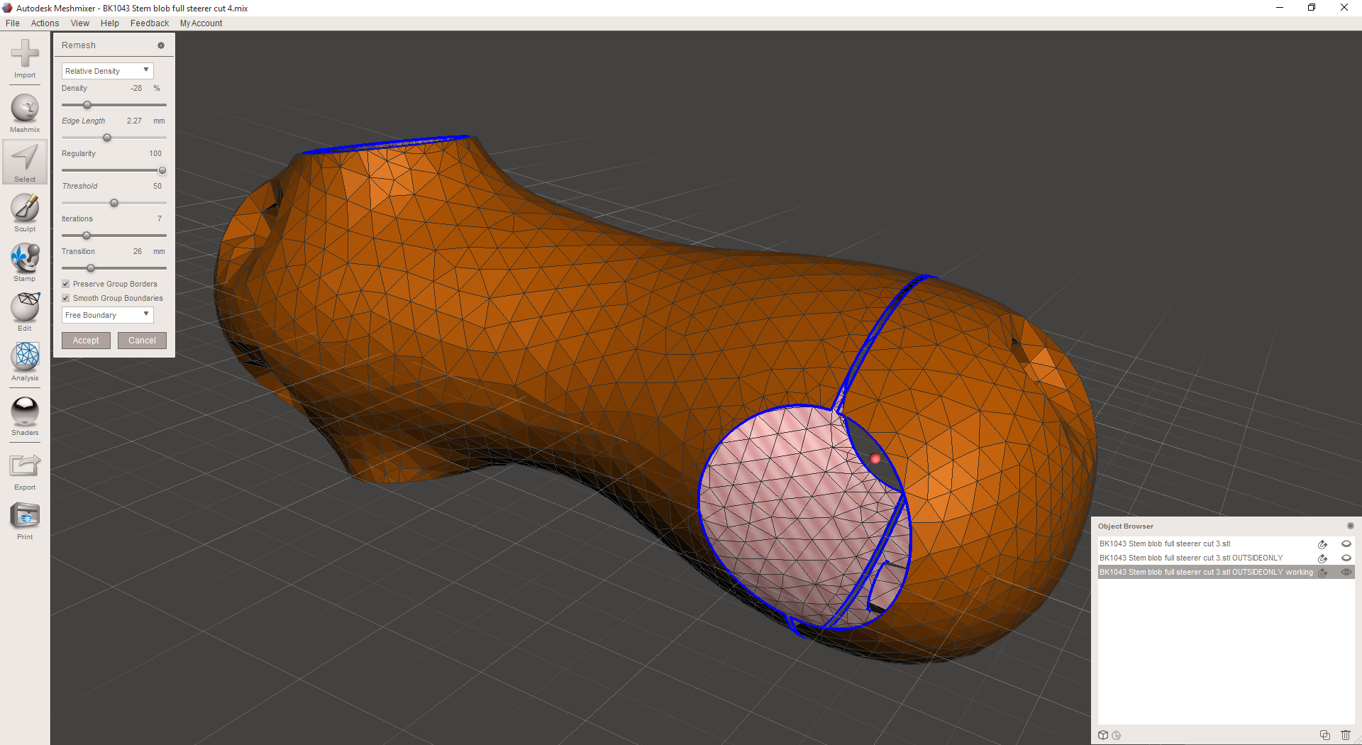
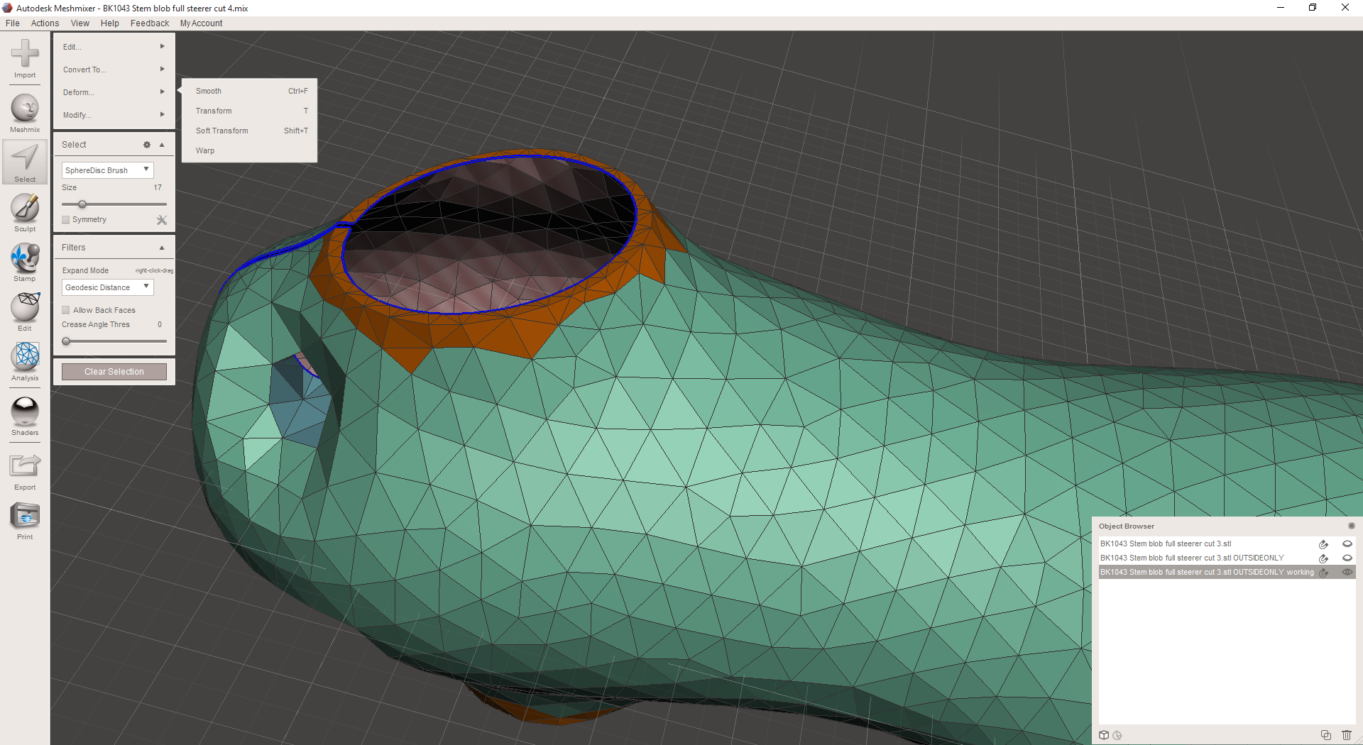
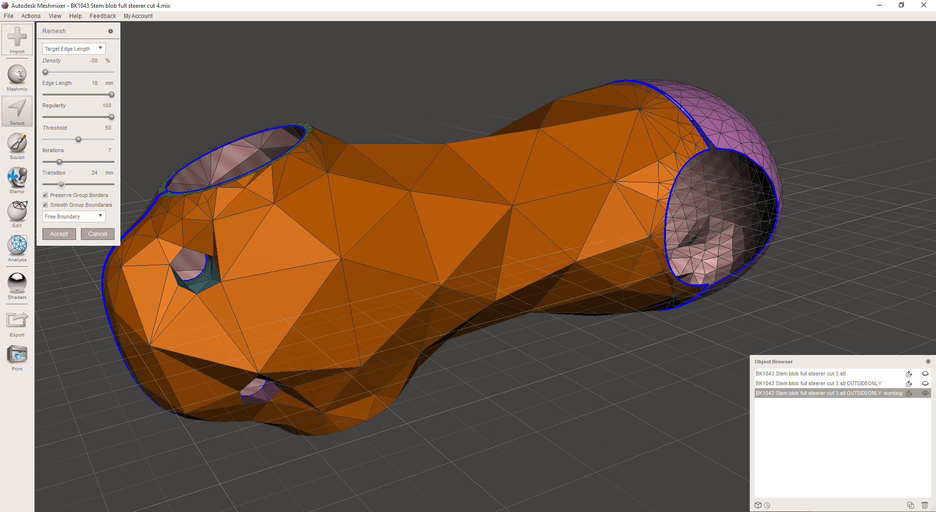
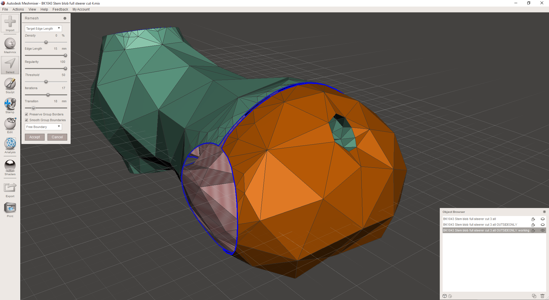
I then go through each region and remesh it in MeshMixer. A few notes here:

  • I generally begin by remeshing the entire object at a medium-high resolution, just to get rid of the dense lattices that Inventor creates at edges and small fillets. 
  • I then choose the area that I want to be at the highest resolution (which is almost always lower than the one I chose in the first step) and remesh it. On the part's exterior, that was the bolt counterbores.
  • Then I work my way down to the lowest resolution areas. On the part's exterior, I targeted edges in the 15mm range, but I play around with the remesh settings a *lot* until I get something I like.
  • Then I'll go back and find areas that are still a bit high-res and remesh them again until they look good. There's a bit of back and forth here, and I haven't really figured out a one-size-fits-all workflow yet.

I DON'T worry about geometric accuracy much during this process; I assume that I'll need to clean up the geometry at the end (after I've generated the full lattice structure - more on this in a future post) anyway.

Then I export the lattices as OBJs, bring them into nTopology Element, and see what they look like:

At this point, I decided that I really wanted to stretch the entire exterior lattice out so that more of the beams would be horizontal. The part will probably be built on its end, so these will be easier to build as a result. So I go back into MeshMixer, transform the part down (it happens to be the Z axis here) by 50%, and remesh the outer skin. Then I transform it back up to 100%, stretching everything out.

As you can see in the last few shots, the lattice has been stretched significantly. I've also remeshed a few of the higher resolution areas individually, evening them out a bit. Back in nTopology Element, you can see the difference between the old lattice (the last shot below) and the new one:

Meanwhile, I've used nTopology element to create (and warp) an Oct-Tet volume lattice for the interior of the part. This may look odd (and to be sure it needs some work) but a lot of these beams will be surprisingly useful once the whole part is put together. The red stuff here is a zero-thickness representation of the mechanical features' lattice structures; the white/yellow structure is the volume lattice:

When you put the whole thing together, it starts looking pretty good:

Now, there's still a lot wrong with this. There are a *lot* of overhanging faces. The threaded bolt holes aren't very well connected to the outer mesh, and there's probably too much material on all of the flat faces (where the slits/slots are). I'm also over my mass target - my total is 34.1 cubic centimeters, and my target was 27.7.

But there's a lot right with the design, too. My beams are about the right size throughout, and I've been able to (more or less) distribute my mass where it will matter most. And while the aesthetics of the part aren't exactly what I'd like them to be, they're not far off either. 

So, a few things I need to work on:

  • First, I need to make overhanging faces easier to eliminate. Some part of this *needs* to be happen when I remesh a surface (assuming I'm using the surface topology to determine the lattice topology). Ditto with volumes - I need to be able to stretch the lattice out so that it isn't horizontals all over the place.
  • I also need to be more careful about directing my volume lattice where it'll be more effective. It's possible I should break it up into a few regions - some near the mechanical features, and one in the middle of the part - but I'm concerned that if I do that, I'll never get the two to tie together. Either way I need a denser volume lattice at the bolt holes, and I need to be able to tie the volume lattice beams up to the other regions of the part.
  • I should probably play with modifying my mechanical features back in Inventor to make them more conducive to lattices. This might involve warping the clamp cylinders somewhat to reduce overhanging faces... or drilling the threaded holes through the part so that they connect to the exterior surfaces... or puncturing the flat faces so that they aren't as massive as they are in the current design.

Clearly, there's a lot to do here still. But I'm beginning to get the hang of this workflow, and hoping to have some printable (and extremely lightweight) designs to make soon :)

Remeshing

Added on by Spencer Wright.

I get the feeling I'll be doing a *lot* of this in the coming month:

Here I've taken an STL from Inventor and brought it into MeshMixer, where I'm remeshing the outside skin. I'm doing this so that I can then create a surface (as opposed to a volume) lattice in nTopology Element. If I tried to create the mesh directly from Inventor's STL, it would be much to fine and have a bunch of artifacts from the way that Inventor processes T-Spline surfaces (Inventor breaks the surface up into panels, and then subdivides each one individually - you can see the panel boundaries in the beginning of the gif), and would also be *way* too fine to be used as a scaffold for a surface lattice. By remeshing at a lower resolution - and playing with MeshMixer's remeshing settings a bit - I can get to a topology that's way better.

The design that I'm pointing towards here still isn't manufacturable - and is missing a bunch of mechanical features that the end part will need too - but it's starting to come together a lot better:

Special thanks to Ryan Schmidt (of Autodesk/Meshmixer) and Bradley Rothenberg (of nTopology) for pointing me in this direction - and for helping me out with the even cooler stuff I hope to do in the next week :)

Notes on Magics

Added on by Spencer Wright.

This month I'm doing a deep evaluation of Materialise Magics 19 and SG+, and trying to understand both the major features of the software and the philosophical perspective that Materialise views additive manufacturing through. I'll post more thoughts on the overall process chain later, but for now I wanted to work through some of the observations I've had in my first encounters with Magics.

For background: The cost of this software is in the neighborhood of $20,000. It's generally NOT purchased by people who don't themselves own industrial (i.e. $250k+) 3D printers. But I feel very strongly that without some knowledge of how it works, independent designers will be doomed to creating inefficient, difficult to manufacture designs. So, I signed myself up for a 30 day demo and got working :)

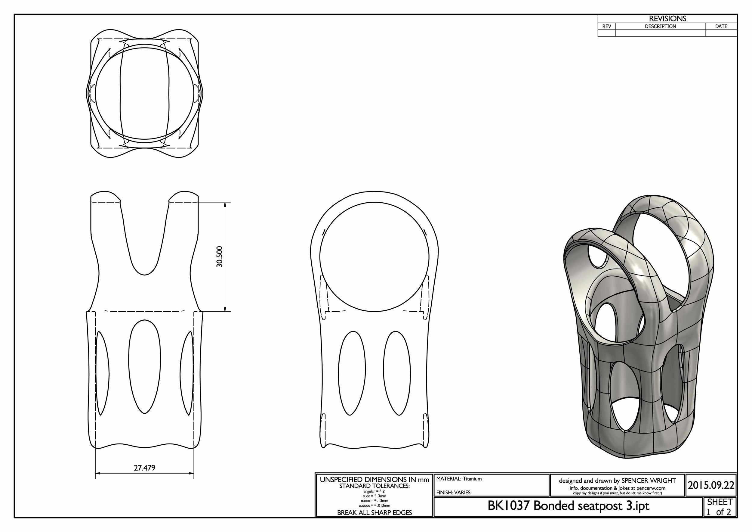
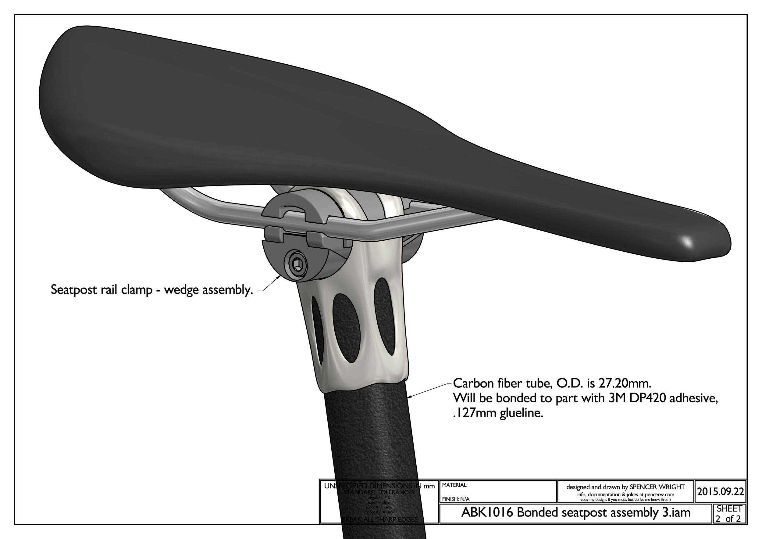
Note: Throughout this post, I'll be showing screenshots of my titanium seatpost part. I've already had one of these parts EBM printed by Addaero, and expect to have versions of it printed in both EBM and laser metal powder bed fusion (which I'll refer to as "DMLS" throughout this post) in the near future. In order to simplify the descriptions below, here's a key to the part's features:

My part's nomenclature.

Overview

I believe Magics to be a classic example of a piece of industrial software whose development has been driven by customers who are large, powerful, and often have divergent interests. 

In many ways its functionality probably benefits as a result. Materialise has close relationships with a number of industrial 3D printing machine manufacturers (notably Renishaw, SLM, and EOS, all of whom have agreements in place to allow Materialise access to their machines' build parameters, and develop build processors to work natively on those machines). They also collaborate closely with many of the large manufacturers (both OEMs and service bureaus) who build 3D print parts on the machines that Magics supports. Through these relationships (and through their own internal parts business), Materialise can get an up close view of what their biggest users need out of the software, and prioritize their efforts accordingly.

On the other hand, by relying heavily on key accounts to drive the product's development, Materialise gives up much in the way of product vision - accepting, instead, a steady stream of feature creep. Every additional feature (while I'm sure they're all valuable) makes the entire application more difficult and clunky to use, and it often feels like Materialise has given two different customers two distinct ways of doing the same thing - simply because each one demanded that the workflow fit their way of working. This kind of path is ubiquitous around the world of industrial software, and Materialise is, to be fair, ultimately at the whim of its (enormous) industrial stakeholders. But as someone coming in from the outside, the result feels schizophrenic.

The core issue is that independent designers like myself are seen as customers, while Magics' development is driven by client relationships. Again, this isn't Materialise's fault, and nor is it ipso facto bad. But I don't believe that the incentive structures that drive Magics' development are optimal for the industrialization of additive manufacturing, either. I'll explore this topic more in a later post; for now, just ponder this. In the meantime, here are my initial observations of how this big, important, and powerful piece of software works.

One important note: Materialise is a member of the 3MF consortium, which is working to create a file format which apparently contains "the complete model information" within "a single archive." My hope is that 3MF allows for more of the process chain to be accessible from a single interface, and that Materialise is a key part of that development. I'm looking forward to learning more about 3MF in the near future; stay tuned for more.

UI

Magics has two or three ways to do basically everything. At the top of the window is a drop down menu bar. It changes depending on context, but generally has a lot of functionality; in the default view, it has eleven menus - a mix of standard stuff (File/Edit etc) and context dependent stuff (Fixing/Scenes etc).

Directly below that is a tool bar, which mostly contains standard tools (undo/redo, Print 2D, Zoom/Pan/Rotate, etc). As far as I can tell, every command in the tool bar is also accessible via the menu bar AND via keystrokes & mouse gestures.

To the right of the tool bar is a series of tabs, which toggle the appearance of another tool bar below. These are a bit more context dependent, and as far as I can tell the correspond 1:1 with what's shown in the "Tools" drop down menu above. Most of these functions, though, *can't* be accessed by keystrokes or mouse gestures.

Overall, Magics' multiple, competing UIs are not unlike most of what's out there in industrial & B2B software today. Most companies (including Materialise) tend to bill this as a feature: the user can interact with the software in a wide variety of ways (keystrokes, mouse gestures, drop down menus, or toolbars), so almost anyone will be able to get comfortable with the interface quickly.

Personally, I prefer opinionated UIs in industrial/B2B software. The best one I'm aware of is McMaster-Carr's, which is built specifically for MRO professionals and makes everyone else adjust their mindset to that of someone looking for replacement parts. I'm not an MRO professional, but once you figure out how they work, the experience is wonderful. 

Magics doesn't act this way, though. The UI doesn't guide me at all; it simply offers a multitude of options, and lets me decide which one I prefer.

Orientation

Magics' "Orientation Optimizer" is very straightforward, and seems in some cases like it'd be useful. I used it only briefly, but to be honest I had already decided more or less the orientation I wanted the part to be printed in. As it happens, the Orientation Optimizer confirmed my plan, but I take that confirmation to be a bit of a false positive. As I discuss below (and have written about extensively in the past), setting an orientation angle really requires an understanding of the part's design intent and manufacturing life cycle, and Magics lacks these. As a result, it can only optimize for the factors that it understands: in this case, some combination of Z-height, XY projection, Support Surface, and Max XY Section. I chose the middle two of these, and Magics gave me exactly what I already knew I wanted.

The orientation that Magics suggested for my part

This tool is probably more useful in high mix environments (service bureaus), but most of the people in the industry I've spoken to say that when they use it, it's just as a starting point; the final orientation is almost always set by a human being.

Support generation

Generating support structures in Magics is really straightforward; it's possible (though almost definitely not ideal) to simply choose a machine, plop a part on the build plate, and hit "generate support." Magics has some understanding of the technology you're using (in my case, either EBM or DMLS), and it creates support geometries that are (reasonably well) tuned for the process. 

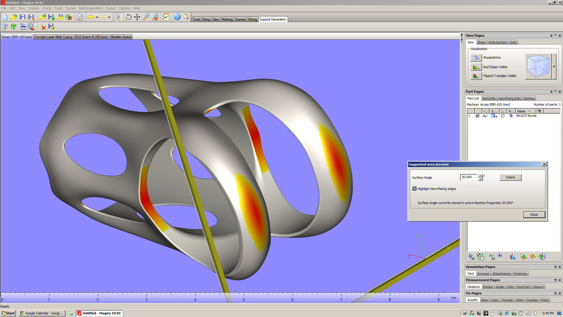
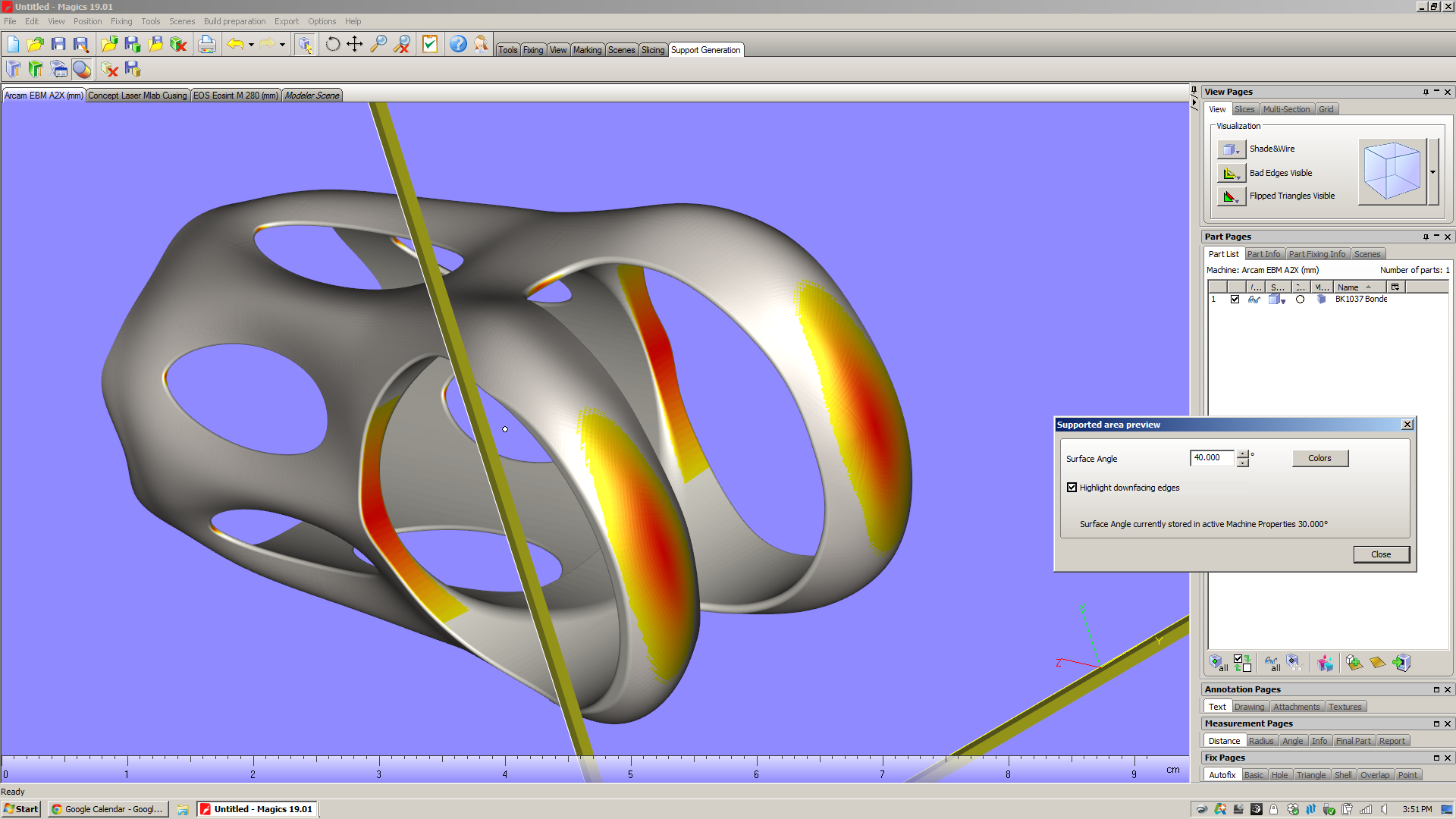
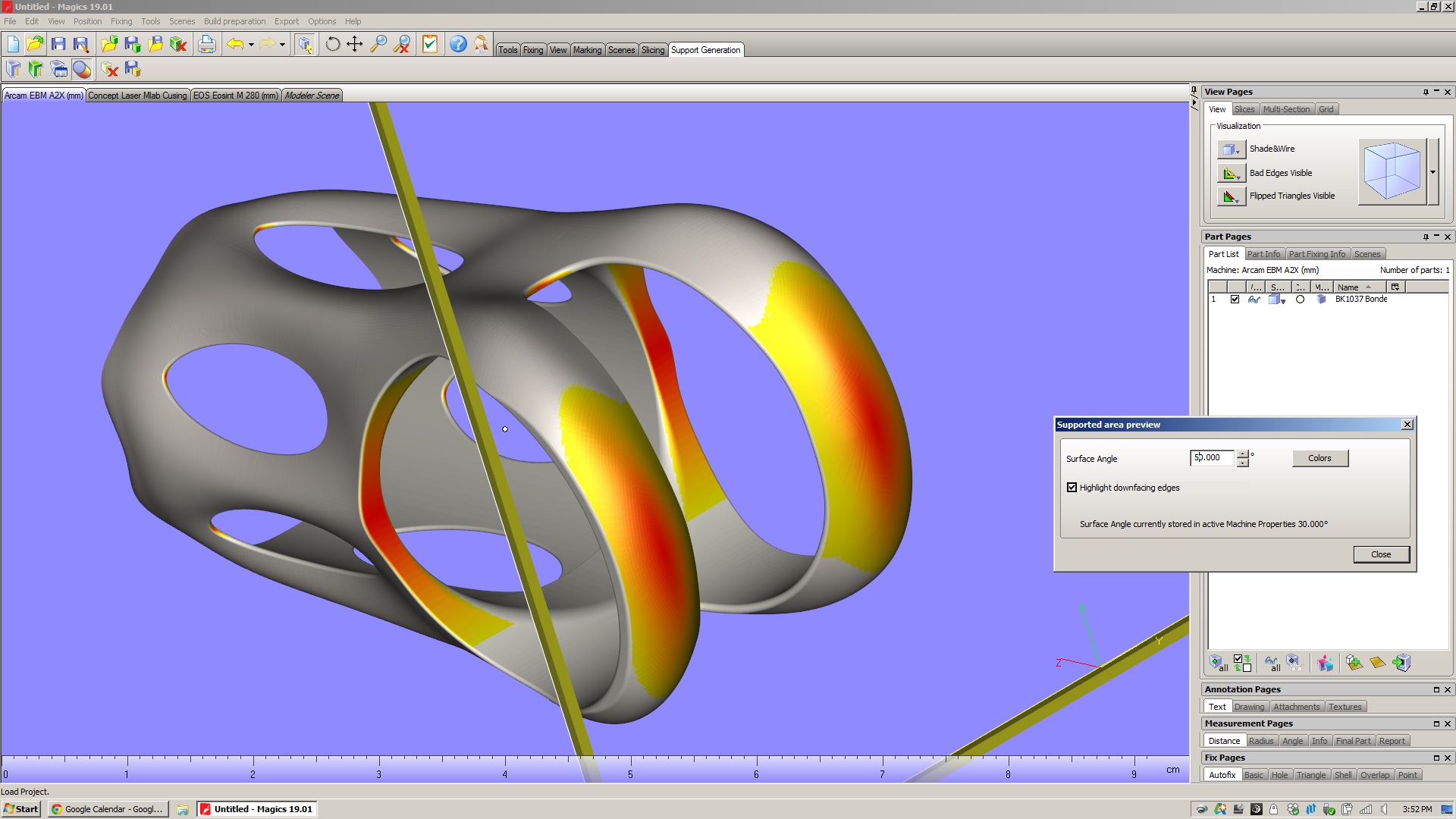
But before you even get that far, Magics has a nice feature that allows you to preview which surfaces will need to be supported - the "Supported area preview." Presumably this would be used while the operator is setting the part's orientation in the build chamber. It allows you to view downfacing edges as shaded, and it shades them on a color gradient depending on what you want to see. Here I'm looking at the underside of the part, and varying the angle that Magics highlights:

On my part and in this orientation, there are two large areas that need support structures (inside the saddle clamp cylinder, and from the shoulder straps down to the build platform). But if you look closely, you can see that there are also a series of tiny areas with downward facing surfaces:

  • At the v-necks, there's an surface below 30˚ whose area is .91mm^2. If you change the selection angle to 50˚, the area grows to 2.58mm^2.
  • At the window tips, there are surfaces with 30˚ whose areas are about (they vary slightly from window to window) .22mm^2. If you change the selection angle to 50˚, the areas grow to about .73mm^2.

For comparison, the cross sectional area of a "medium" grain of sand (as described by ISO 14688) is about .4mm^2. Which is to say that these are relatively small surfaces. My hope is that even though they face downwards, they won't require support structures at all.

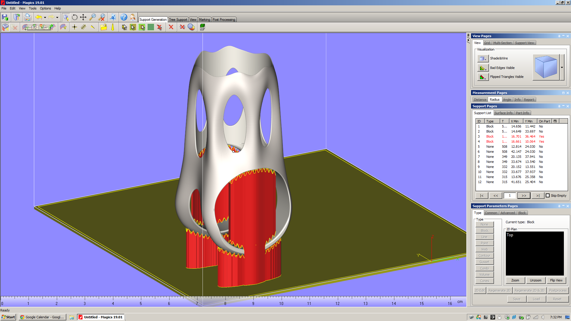
When you enter the support generation module and hit "generate support," Magics simply looks at the faces that face downward, chooses a support type that's appropriate for the surface size & shape, and projects that support directly downward. Here are the automatically generated supports for both my part in EBM and DMLS:

Throughout Magics' UI, there are "tool pages" on the right of the window that offer a variety of context dependent functions. When you're in the support generation module, there's a section of "Support Pages" there that let you analyze and modify the support structures in your build. Looking at the support pages in the pictures above, you'll notice that I've got the "Support List" page open, and that there are 12 supports listed in that view. For each of these, a variety of data is displayed: ID; type of support; some basic geometrical data, and an "On Part" column. You'll also notice that the supports that are "On Part" are keyed red in the list. This is a very useful piece of information: those supports, when they were projected downwards, ended up falling onto the part itself. The result is that when the part is printed, those supports will tend to be more difficult to remove. In the case of the MLab build above, supports 3 and 4 run the full inner diameter of the saddle clamp cylinder. In the Arcam A2X build, supports 3 and 4 are in the same situation - but a whole series of point supports (7-12) are also partly trapped in the part's windows.

In my experience, this is *not* desirable. Especially with EBM, supports that fall onto the part itself are a real pain in the ass to chip out (for a bit of context, see the photos I took of the first parts I had EBM printed). In addition, they tend to make the surface they're hitting rough, and as a result the part often requires more post processing.

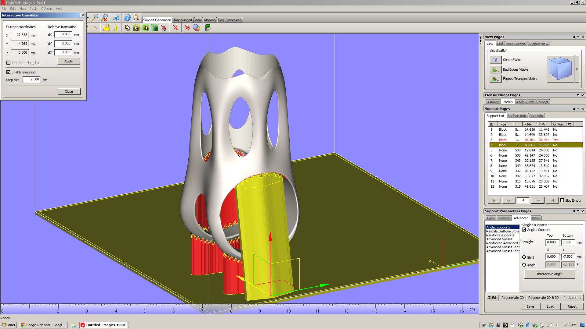
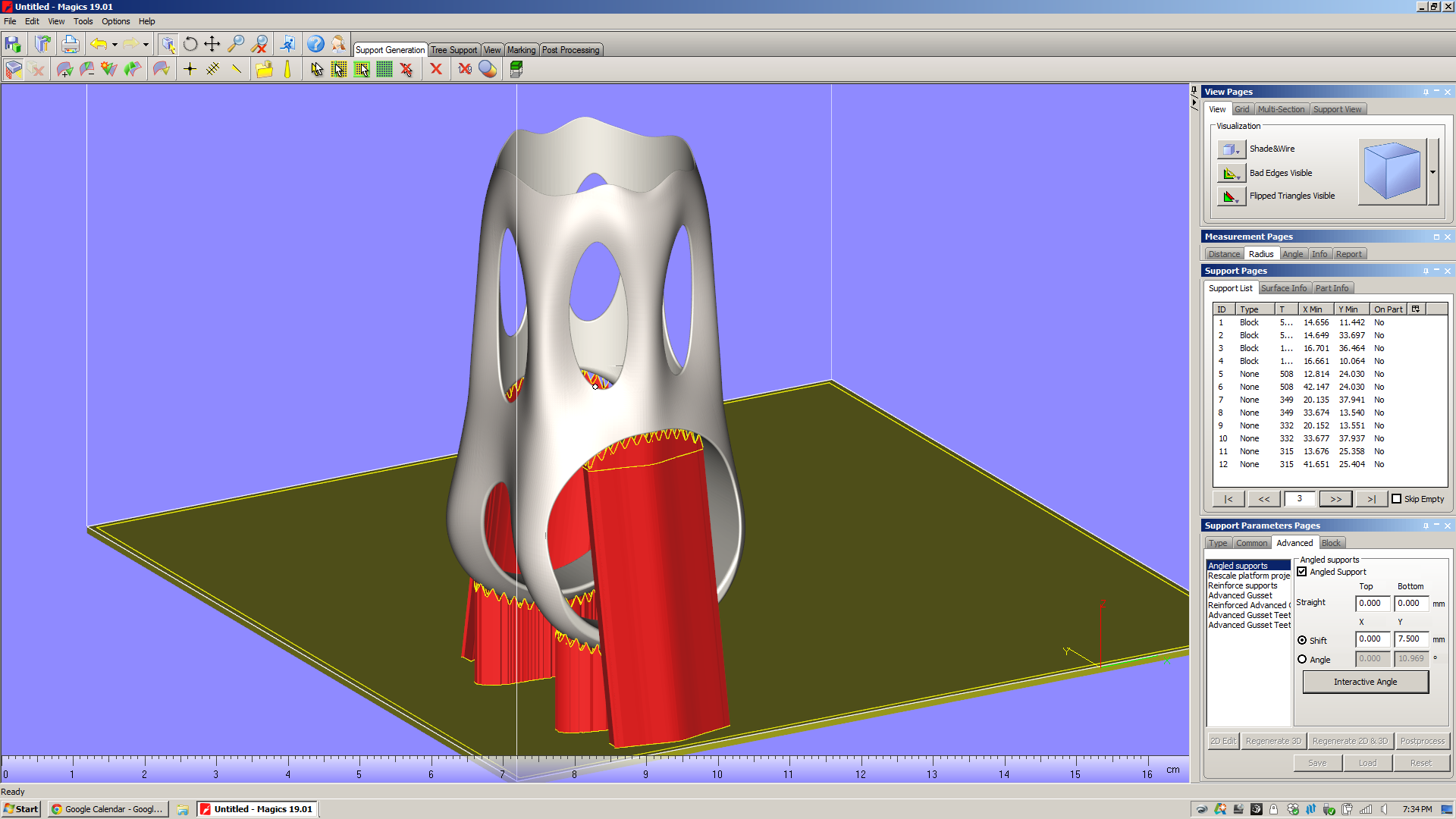
In order to avoid this, I need to modify the support parameters. By going into the "Advanced" section of the Support Parameters Pages and checking off "Angled supports," I can pull the two big Block supports (ID 3 and 4) away from the part:

(I'm working on similar edits to the EBM build, but want to get a little clarification from Arcam on those point supports first.)

I can do a variety of other things to these supports, including "Rescale platform projection," which essentially flares the support in/out as it goes down to the platform. There are also a slew of parameters (hatching, hatching teeth, teeth synchronization, perforations, etc) which seem mostly designed to make the supports easier to remove from the part. All of these can be preset in the Machine Properties screen (which, frustratingly, isn't accessible when you're in Support Generation mode) or adjusted on a support-by-support basis from the "advanced" tool pages.

To be sure, I'm only scratching the surface on Magics' support generation features here. Magics will let you play with a *ton* of support parameters. I get the impression that there's a lot of nuance here, and that there are many parameters that you'd only play with in edge case builds. Regardless, the number of possibilities generated by varying just a few of the options is staggering; in order to know how they affect part quality, you'd need to run thousands upon thousands of test builds.

Eventually, it's very likely that Magics (or whatever replaces it) will have thermal & residual stress simulations built right into the software. Today, however, machine operators have remarkably little info about the finished part before they actually print it. Except...

Build time estimation

This is a key part of the additive design-for-manufacturing process. Knowing how long a part will take to print is a *huge* factor in what it costs, and is critical in comparing two build configurations for the same part.

Magics has a build time estimator, but it's not plug-and-play. Instead of shipping pre-loaded with estimates of how long a given machine will take to build a part, Magics requires the user to run "Learning Platforms" - and you need to own your own machine to do that. And, of course, I don't own a metal powder bed fusion machine.

I was *really* excited to get a build time estimation, but no dice.

The reason for this is that in order to estimate build time, you need to know how both the slicer and scanning strategy work - as well as mechanical factors like scanning speed and recoating time. And while certain machine manufacturers (see below) share this information with Materialise, for many it simply isn't worth it. They see those process parameters as valuable, and don't see the benefit of sharing that data with a third party software developer. Moreover, most of them can provide very accurate build time estimations in their own software, and the manufacturing engineers that use the machines take it as given that they need to use that at some point in the process anyway.

This strikes me as a big failing. Magics needs a way of sharing data about their builds: a public repository of machine parameters and build times. Without that - or without, on the other hand, convincing the machine manufacturers to share that data themselves - Magics is left with a huge disconnect between the build setup and the end product. This undercuts Magics' claim to be "The link between your CAD file and the printed part." If it lacks basic data on build speed for the most common machines in the industry, what exactly is it linking to?

So: As of the time I'm writing this, I've got emails out to a handful of the biggest metal powder bed fusion machine manufacturers in the industry, asking for Magics learning platforms. If anyone out there can share that data with me, please send me a note!

Build Processors

My demo doesn't include these, but they're worth touching on. For a few big machine manufacturers (Renishaw, SLM, and EOS), Materialise has developed build processors that are tuned to those machines' capabilities and specifications. Presumably, these companies provide Materialise with in-depth data about how their machines work, some of which is either patented or proprietary. Materialise then builds software modules that, through a few intermediate steps (the most notable of which are slicing and subdividing/hatching), produce a job file that can go directly to a machine.

Materialise bills the build processors as reducing complexity in the manufacturing life cycle, and allowing both Materialise and the machine manufacturers "to focus on their core competencies." Having not played with them myself, I can't really comment. I hope to learn more soon.
A few things Magics *can't* do

To reiterate: It's my impression that Materialise built Magics to fill a really big hole in the existing work chain, and the bottom line is that that work chain is something that no single party (let alone Materialise) created. It's also, in my opinion, *not* the right work chain for the future of additive manufacturing, and Magics' role in it highlights a lot of the problems in the industry today. Here are a few things that I noticed that Magics can't, for various obscure and not-so-obscure reasons (many of which are decidedly *not* Materialise's fault), do.

Understand the underlying design

This is something I've touched on in previous posts, but it struck me again when I was in the "supported area preview" screen. It's *very* likely that I could, with a relatively small amount of work, edit the underlying geometry in order to reduce the number of supports needed significantly. But I'm not aware of a way of showing downfacing regions in solid modeling software (Solidworks/Inventor, etc), and it's rather cumbersome to bounce back and forth between Magics and Inventor to try to optimize the design for additive. 

All across the industry today, I hear people talk about design software that understands the intent of the designer, and responds to accommodate it. This may be feasible in the near future, but the bottom line is that Magics (as it stands now) is *not* part of that process chain. Once a designer transitions from parametric modeling to surface tessellations, all of the geometry data is lost. If manufacturability feedback (like the supported area preview screen) is provided in software that reads surface tessellations (as Magics does), then going back to edit the underlying parametric model is *always* going to be cumbersome - and necessary.

Understand/display surface quality issues due to orientation

In all additive processes that I'm aware of, surface finish will vary significantly depending on the orientation of a surface relative to the build direction. Given the layer thickness of the printed part, this is relatively straightforward to simulate - not to a high degree of precision, but with a good amount of accuracy, at least. Magics doesn't do this, and it leaves me feeling like I'm missing a key piece of information about the printed part. Sure, I can imagine what the part will look like if I just think about it for a minute, but it does strike me that having some indication of areas with high stepover (which will occur wherever a surface is oriented close to the XY plane) would be really helpful - and not particularly hard to implement (caveat: everything I said above about feature creep, etc).
Understand the place of additive in the process chain

This may seem like I'm splitting hairs, but I think it's worth reiterating: Magics bills itself as "The link between your CAD file and the printed part." It is NOT concerned with the end product, which in almost all cases will have additional (subtractive) processes performed on it.

Why does this matter? When I had this part EBM printed recently, both the saddle clamp cylinder and the seatpost cylinder came out undersized. I know now that one of two things needs to happen there: either I need to compensate for the printing process in the underlying model (by making the designed dimension larger than I actually want it to be), or I need to remove material from the as-printed part (by machining, grinding, or similar).

Magics doesn't know any of this. If it did, it might be able to give me intelligent advice on what surfaces to take extra care with - and which I should ignore, as they'll be machined away in the end regardless.

In the end, Magics is a piece of CAM software - but it only deals with one step in the production chain. Changing this is a monstrous, complex task, but it's one whose impact will be hugely positive.
So

Magics is pretty cool - it does a *ton* of really useful stuff. You'll note, also, that I'm basically not interested at all in its "fix" feature, which (I'm told) is used a lot with models that come out of Rhino.

But it's also representative of a lot of what's going on in industrial additive manufacturing today. This isn't Materialise's fault; it's just the way things evolved, and is the result of (I'm sure) a lot of collaboration, competition, and plain old hustling (all of which I fully support) in the industry over the past few decades.

Regardless, Magics is a place where you can see a lot of the implicit assumptions that industrial additive manufacturing has been built upon. More on this soon.